Overview
Unable is a digital and strategic agency specialising in high-end web experiences. Their previous logo didn’t reflect their sharp, pixel-perfect design culture. They approached me to create a wordmark that would embody their essence — digital precision meets minimalist aesthetics.
The challenge
Design a wordmark that feels unmistakably digital yet timelessly simple—the kind of mark that looks effortless but hides careful logic beneath.
Key objectives
- Design a geometric, grid-based wordmark that scales flawlessly across screens.
- Maintain a minimalist aesthetic true to the agency’s ethos.
- Develop a micro-guideline for usage consistency and tone.
My approach
Geometry as language
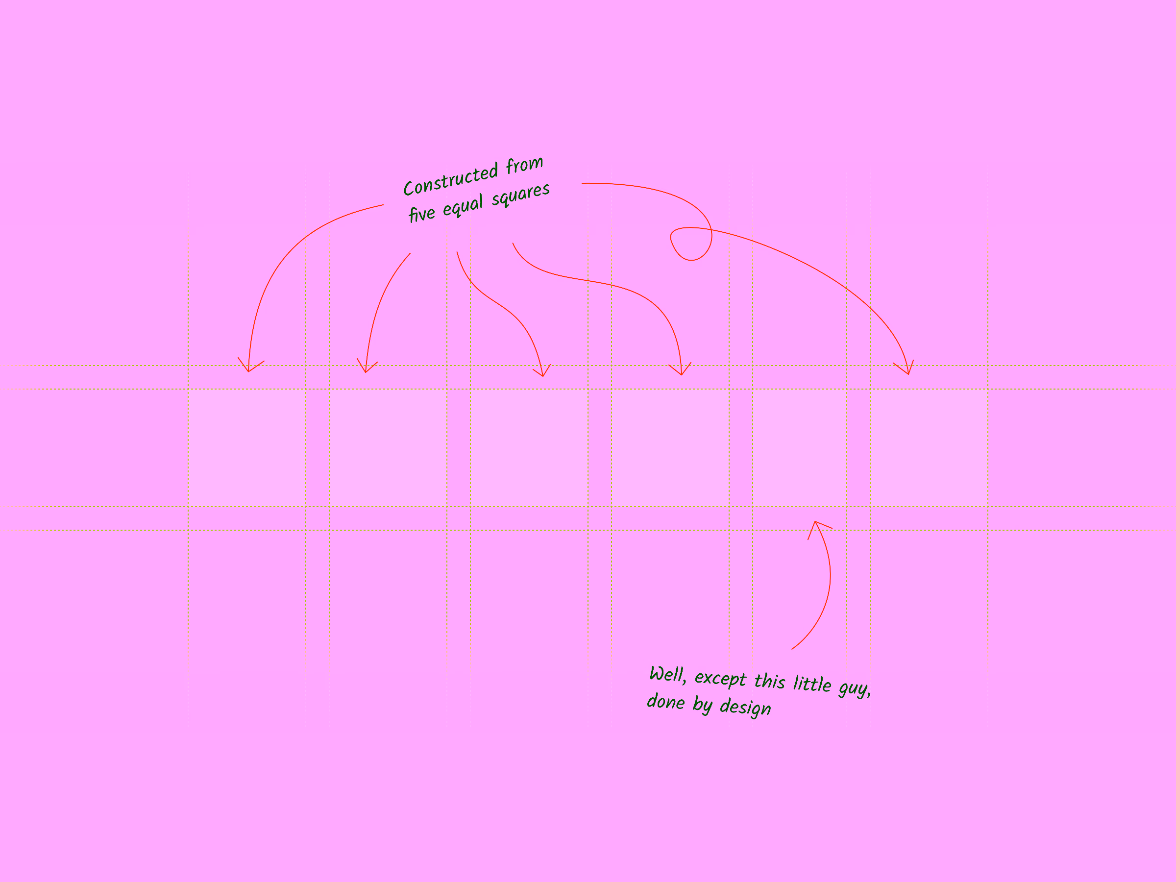
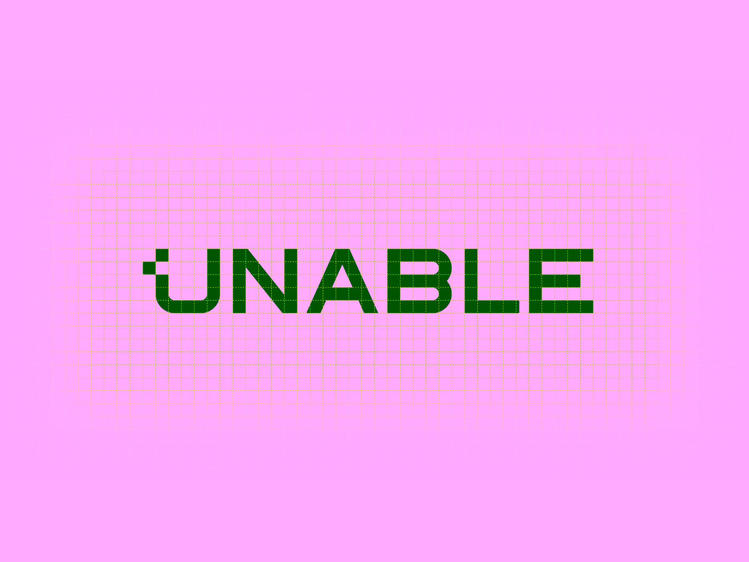
The final wordmark is built on a grid of six equal squares—a visual system that dictates proportion, rhythm, and spacing. Every letter follows that grid, creating mathematical harmony. And because I couldn’t resist, I offset a pixel — just enough to keep perfectionists slightly uneasy.
Precision that scales
The underlying geometry gives the logo a rare kind of confidence: no matter how it’s resized, it always aligns perfectly to the pixel. That precision ensures clarity on high-resolution screens and devices, reinforcing Unable’s digital-first character.
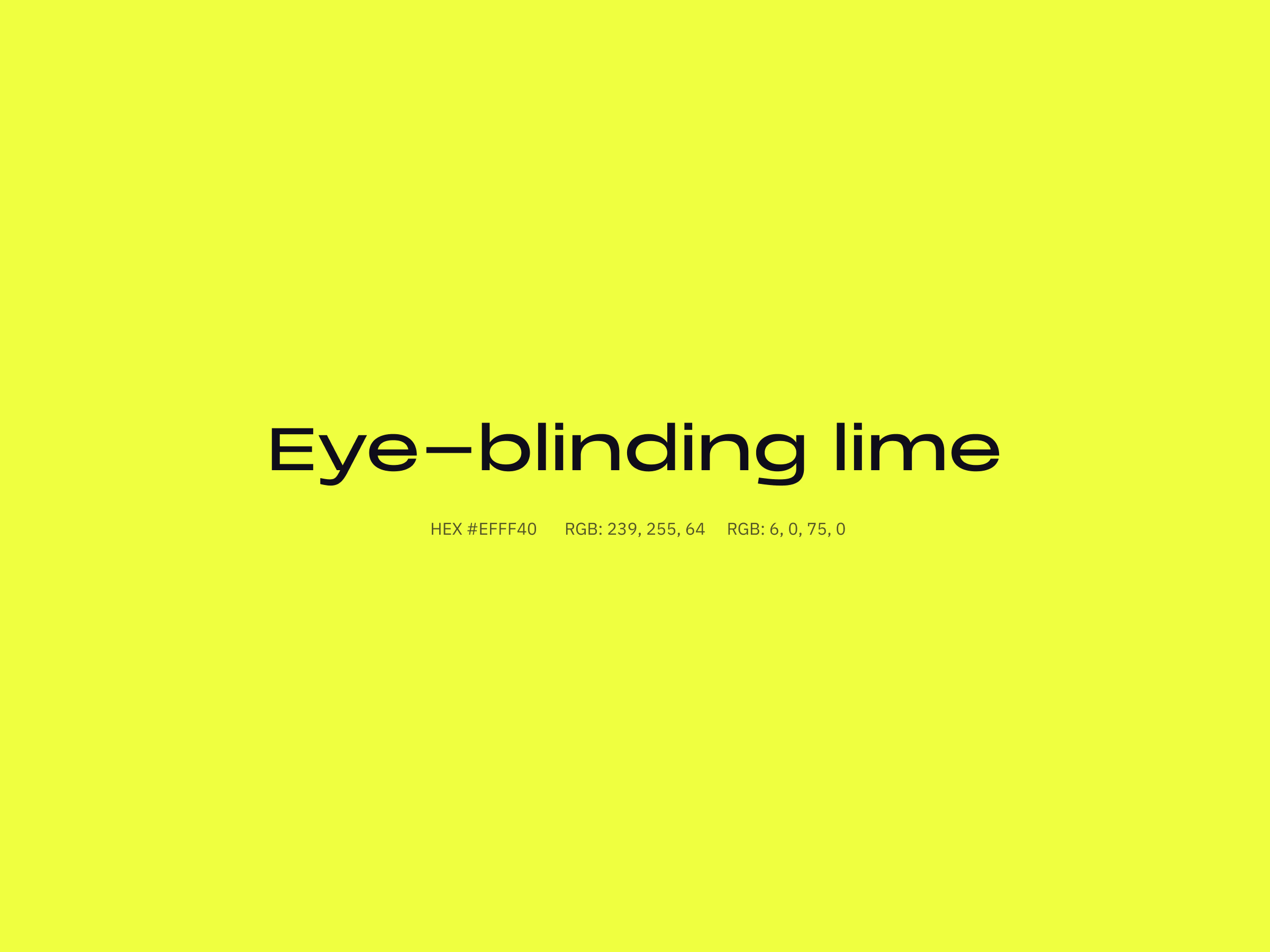
Colour with conviction
To balance the purity of the form, we went bold on colour—a striking lime hue that commands attention in digital environments. Sure, print shops might groan, but that’s fine. This brand was made for pixels, not paper.
The brand system
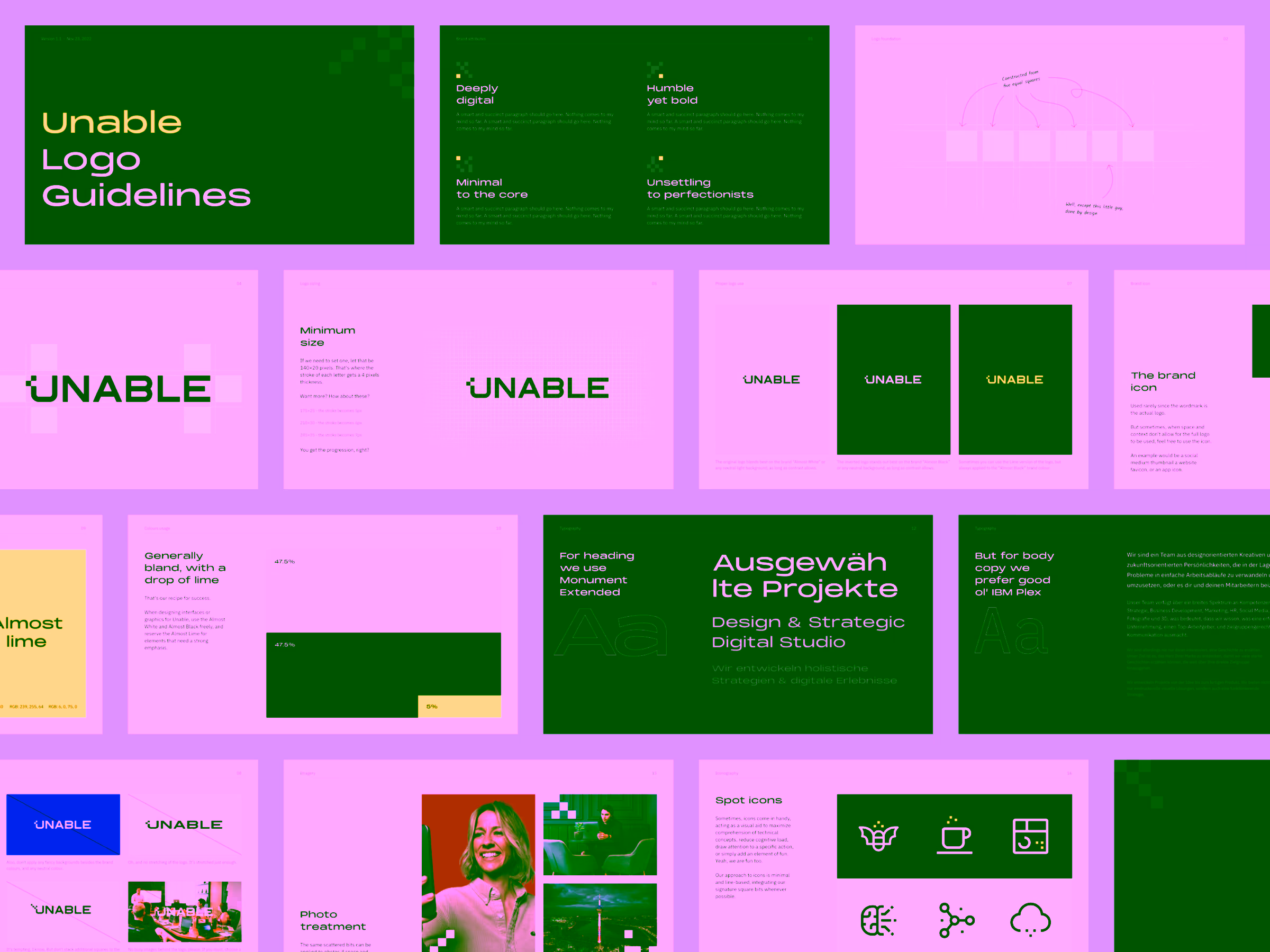
As the final step, I created a compact brand guide capturing logo construction, colour usage, and spacing rules, which are the essentials that keep visual integrity intact as the agency grows.