Overview
Right at the tail end of the pandemic, Global Passport approached me to raise their brand and digital presence so they could cement themselves as the category leader in global mobility. Their mission? To democratize access to international residency privileges and unlock the freedom to live anywhere in the world.
Over the next few months, I gave their entire brand a creative overhaul—from a new identity system and refined visual language to a redesigned website and a modernised web application that helps users understand their passport eligibility and discover which mobility assets they’re best suited for.
The Challenge
Working in the global mobility space means navigating an ocean of overused visual tropes: globes, stamps, flags, planes, borders, dotted lines. Everything risks looking like either a bureaucratic office or a tourist agency. On top of that, the industry deals with personal, high-stakes decisions. That means the brand must look not just stylish, but knowledgeable and responsible.
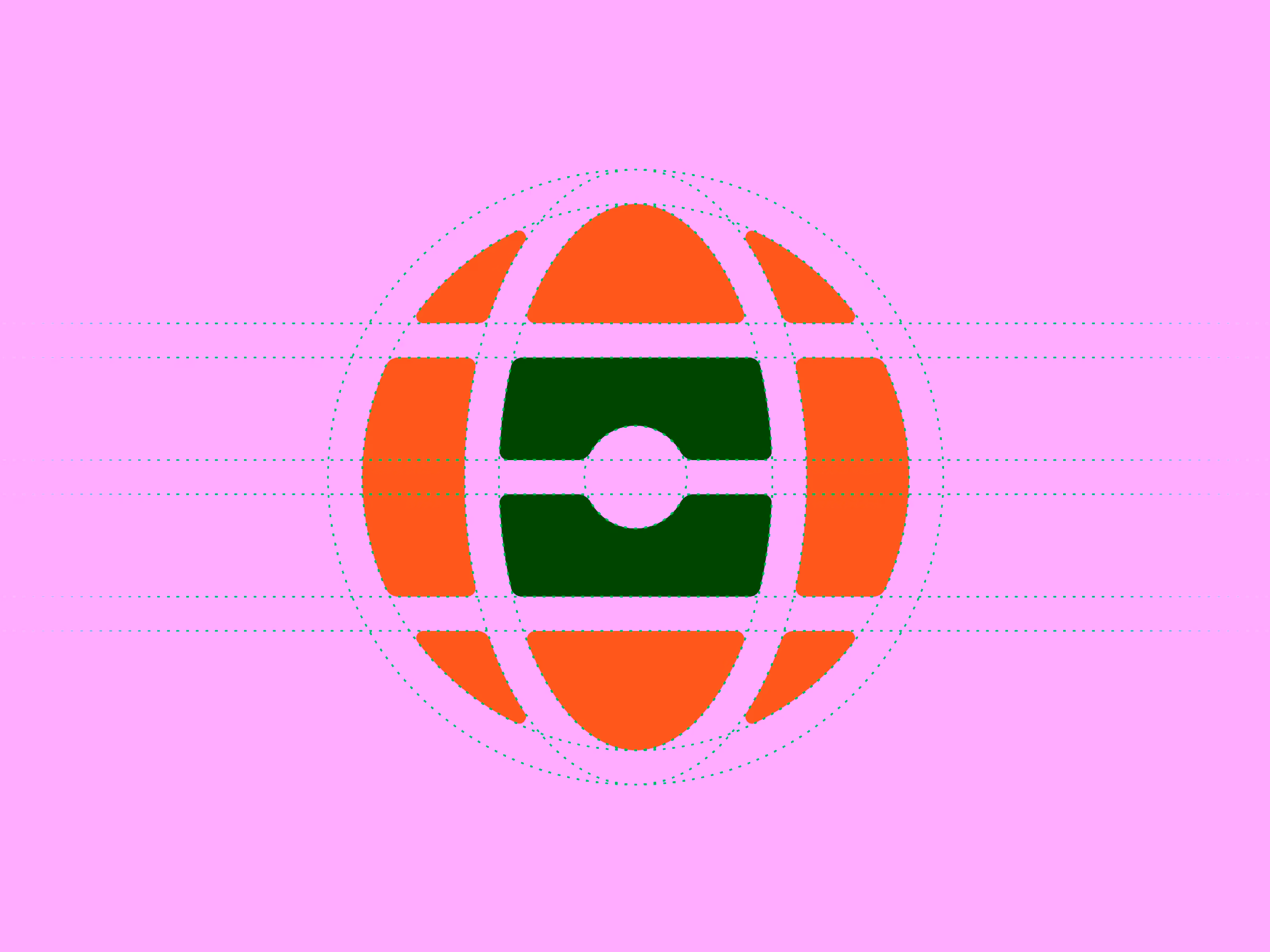
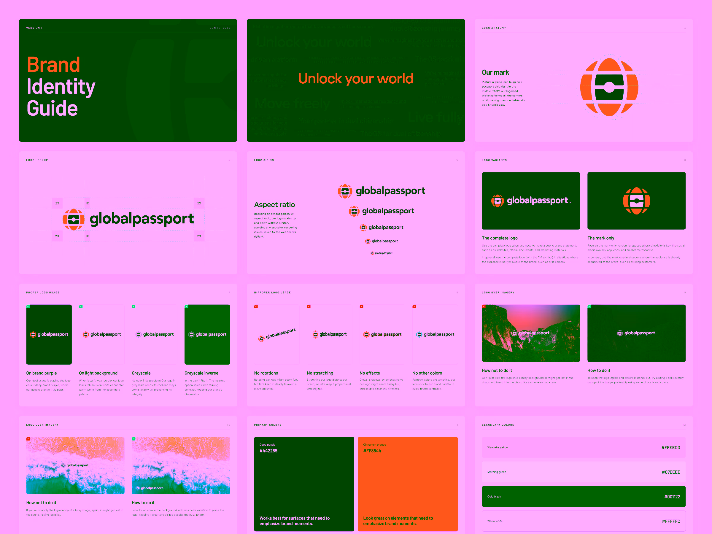
There was another layer of complexity. From the very beginning, GlobalPassport’s co-founder, Rogelio Caceres, was convinced that the biometric passport chip needed to be part of the logo. The problem? By itself, the chip looks suspiciously like a flag. It carries strong national symbolism and could mislead users into thinking we’re representing a specific country.
This constraint eventually became the creative starting point for everything else that followed.
Key Objectives
- Create a meaningful and distinctive brand identity.
- Build a flexible and accessible visual system.
- Develop a scalable foundation for long-term growth.
My approach
Creative restrictions as creative direction
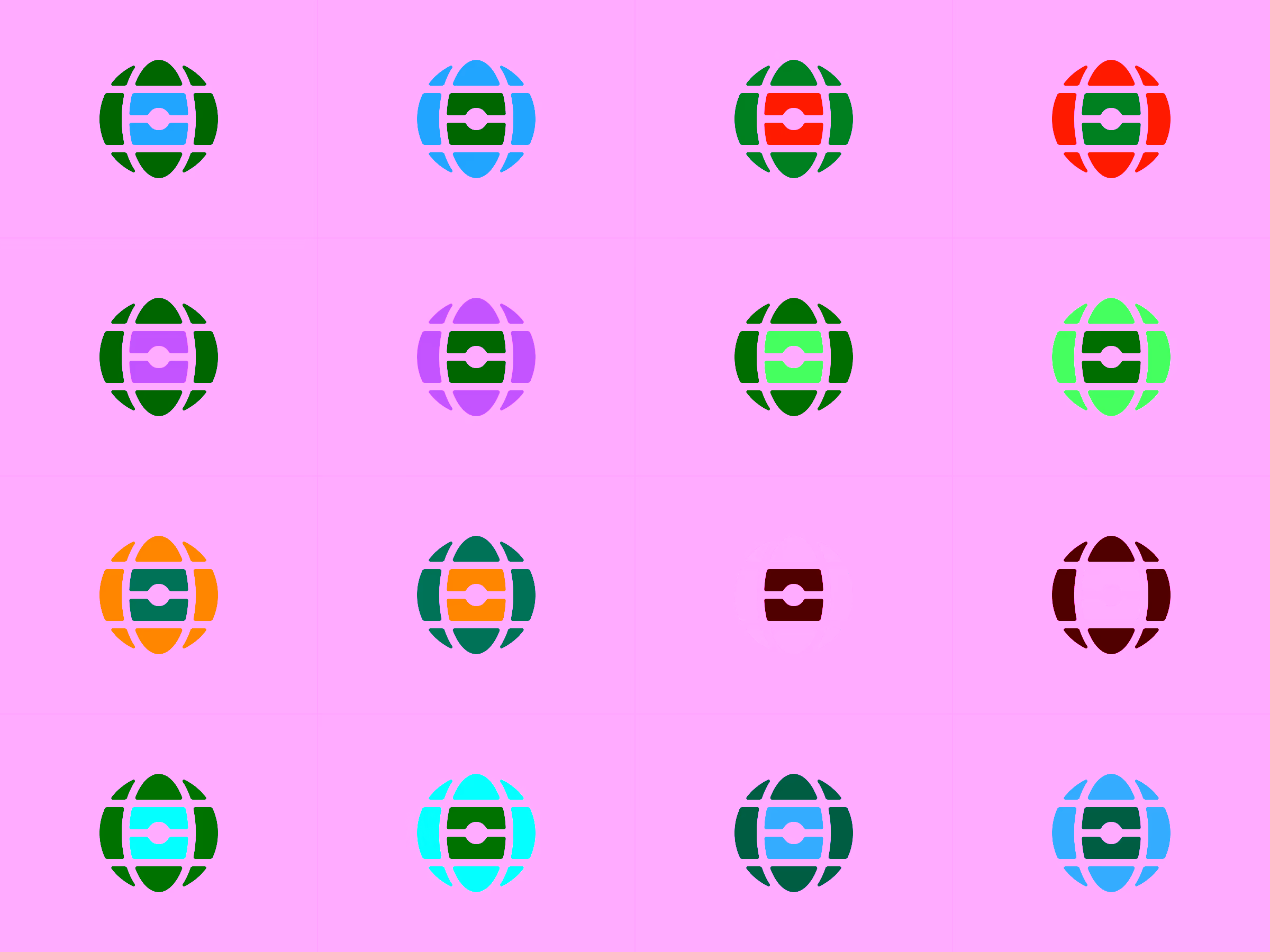
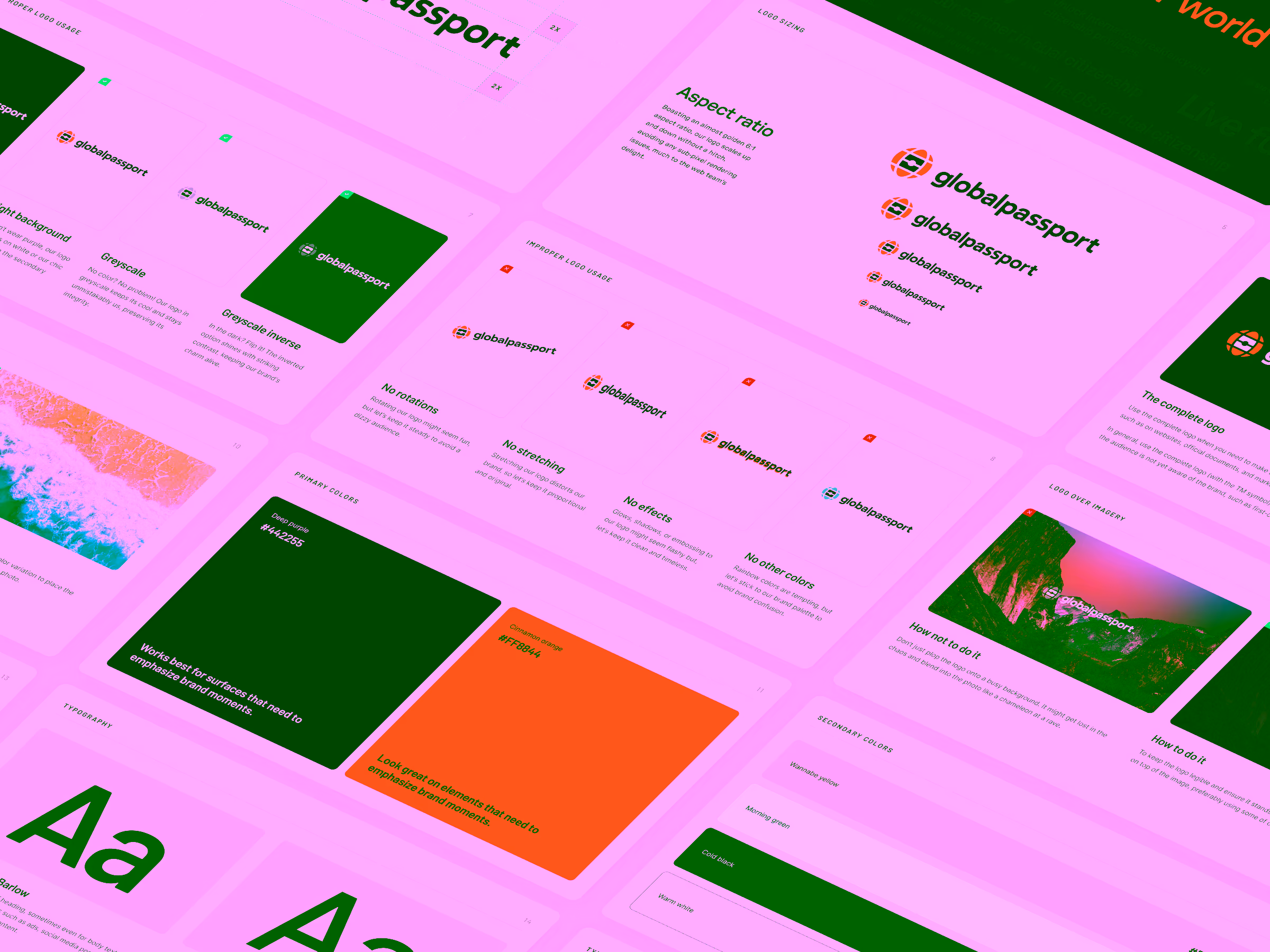
The biometric chip was non-negotiable. But standing alone, it looked too much like a flag. So I proposed wrapping the chip inside a stylised globe, and adding just enough meridians and parallels to be readable, but not so many that it becomes cluttered or corporate.
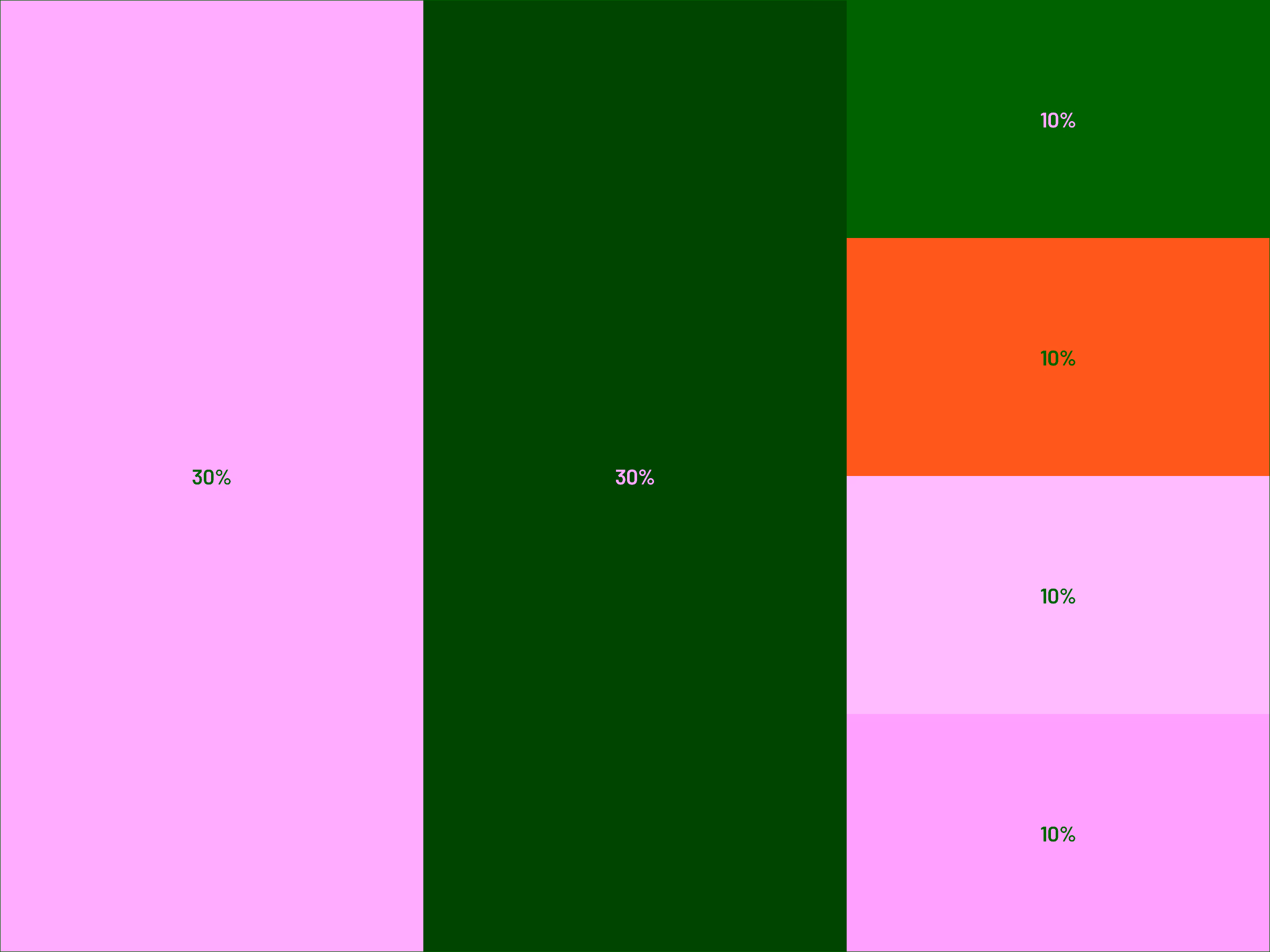
Colour combinations that are accessible
Because the logomark combines two distinct shapes into one, colour harmony became critical. The logo had to work on light and dark backgrounds, to feel warm, trustworthy, and premium, and to maintain high accessibility contrast.
After dozens of iterations, I landed on a deep purple paired with cinnamon orange. Purple carried the sophistication and trust; orange added warmth and human touch.
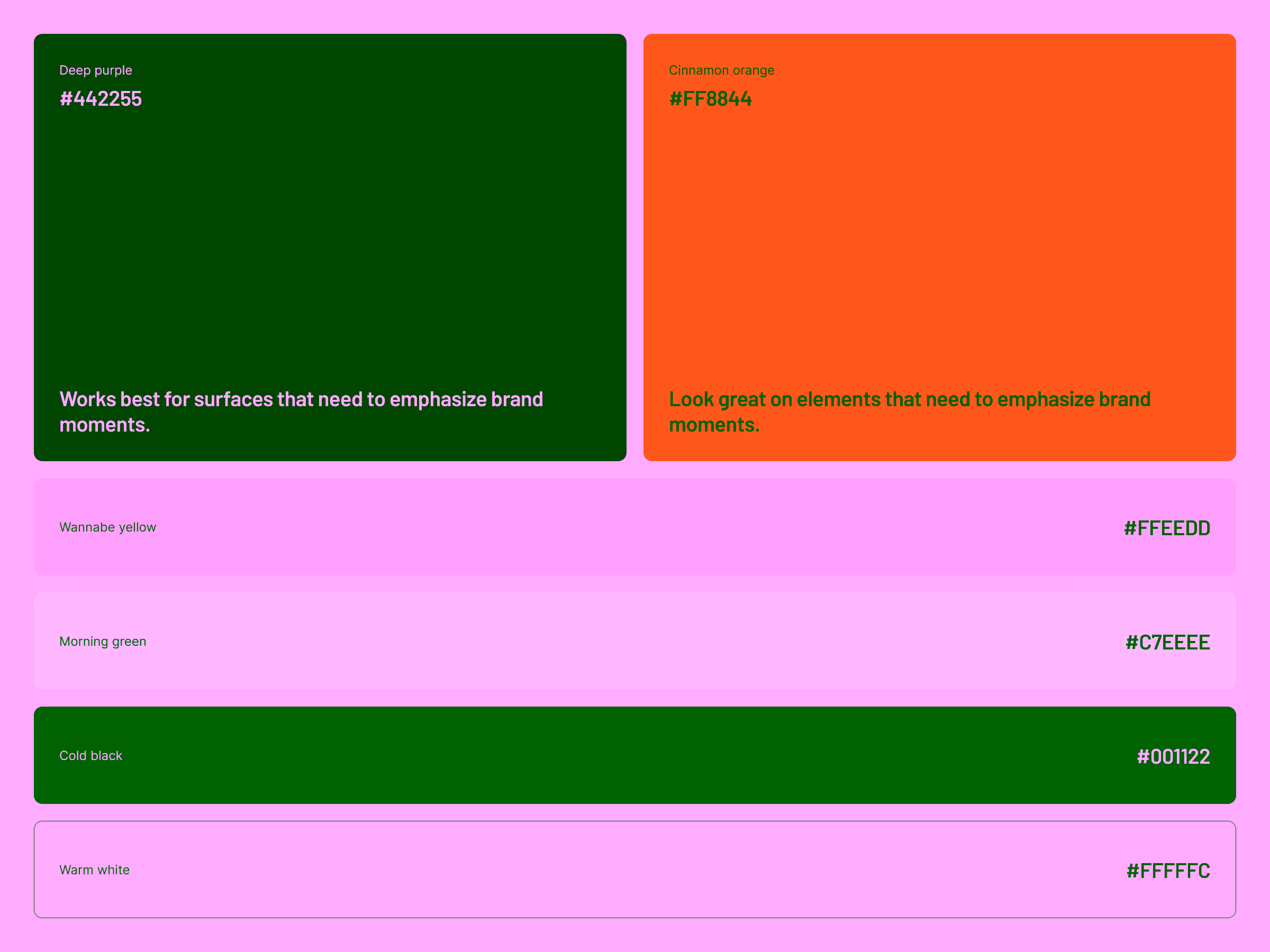
To avoid visual overload, I set up a rule: Use the deep purple for surfaces, and reserve cinnamon orange for accents and highlights. This created a calm, warm, and balanced visual identity.
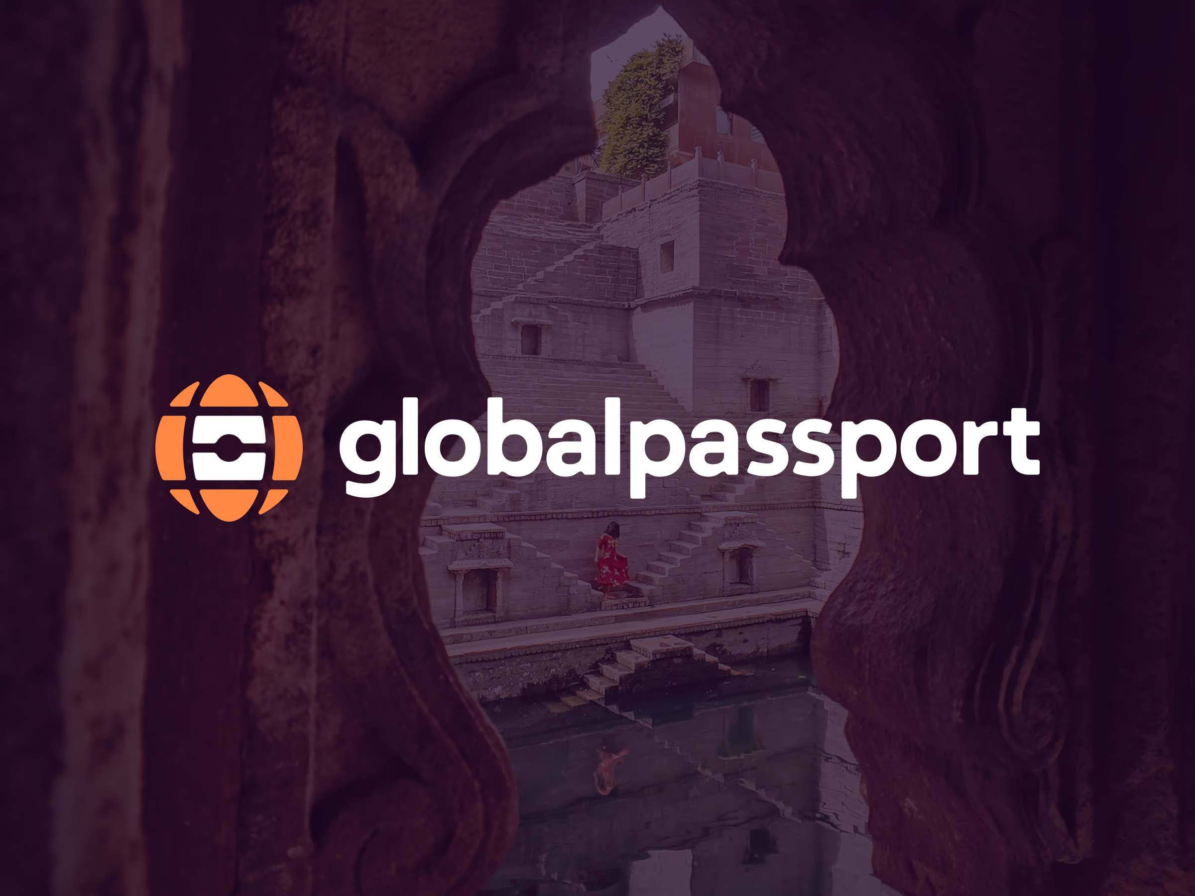
The globe-chip logomark
Once the colour system was locked, the final logomark emerged naturally: the biometric chip nested in a minimalist, curved globe grid—friendly, modern, and unmistakably tied to global mobility.
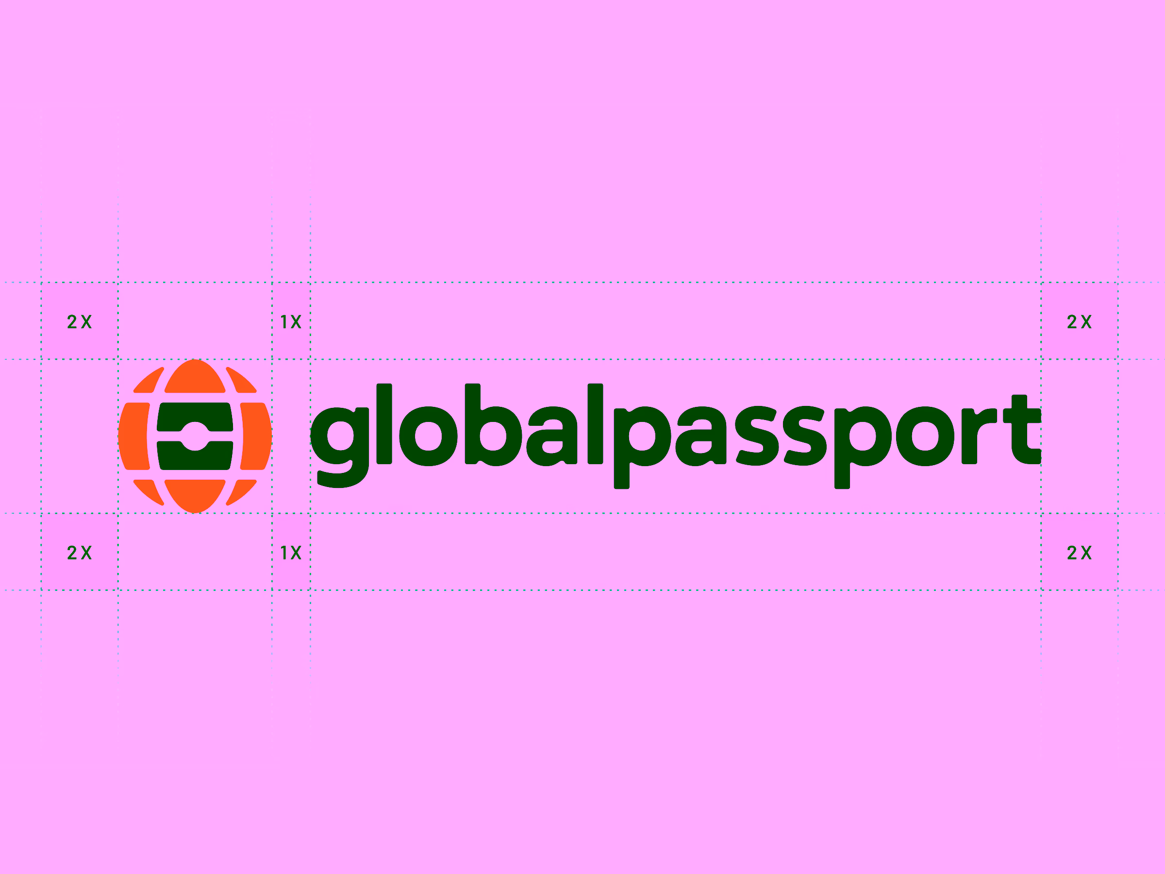
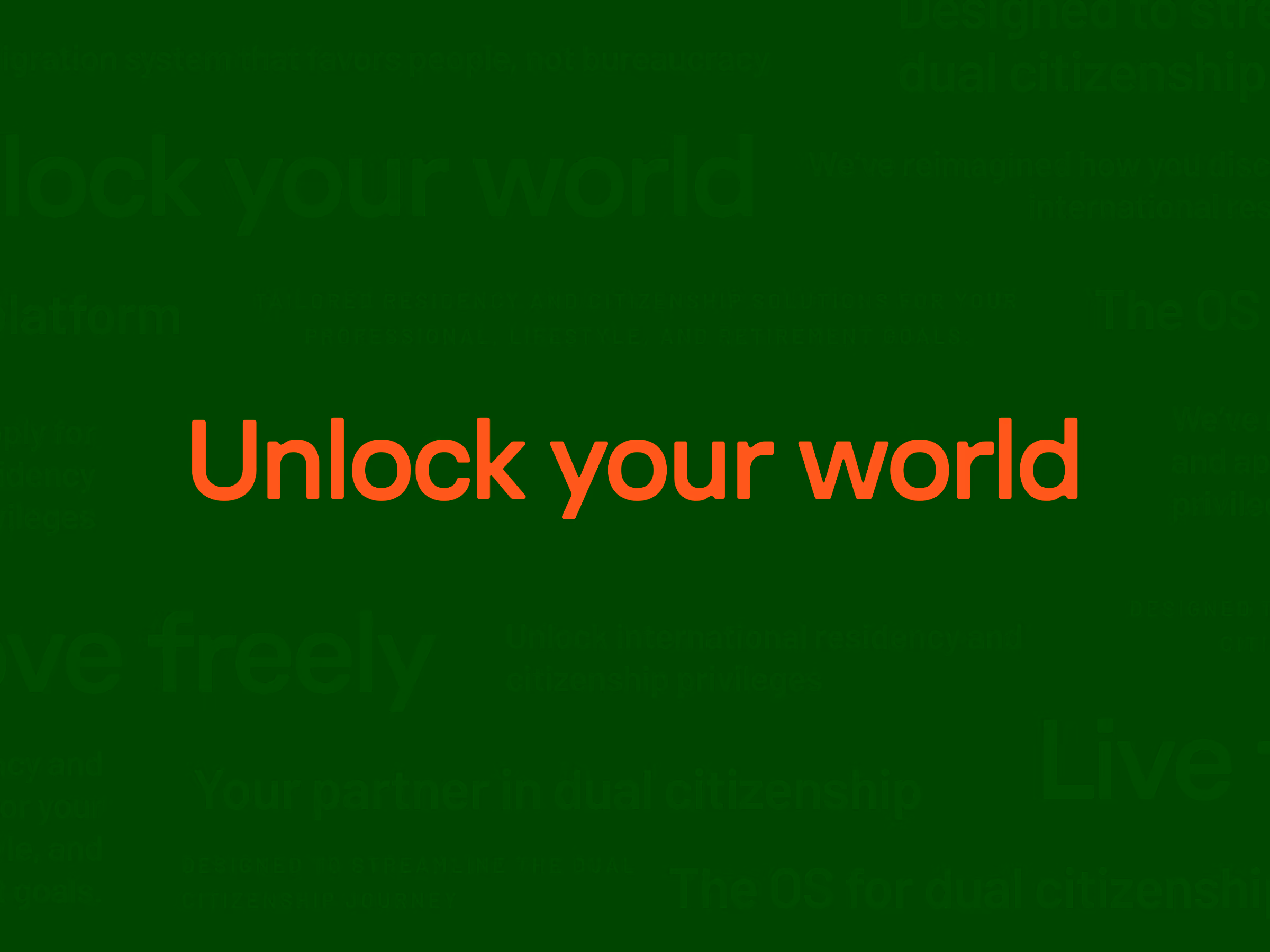
Friendly and rounded typography
I needed a headline font that could mirror the rounded softness of the logomark. Enter GT Pressura—a geometric yet warm typeface with subtle rounded edges.
For body text, I paired it with Inter, the universal “lingua franca” of digital typography, ensuring clarity and legibility across all devices and screen sizes.
Iconography with character
To extend the curved design language, I created a custom line-based icon set, where each icon incorporates a small accent in cinnamon orange for instant brand recognition.
These icons began to appear across the website, the web app, presentations, pitch decks and various print materials. They formed a subtle emotional bridge between the product and the brand.

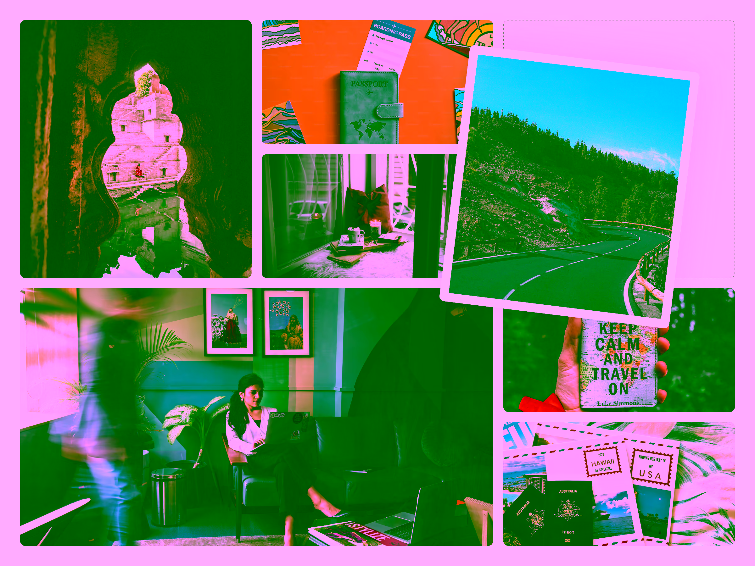
Photography that feels authentic
I curated a direction for photography centred around natural light, action-oriented moments, real people, and real places. In other words, the photography used by Global Passport should tell the story about authenticity in movement.
A consistent usage of such a photography style helps GlobalPassport distance itself from sterile stock photos with artificial smiles common in the travel-tech space.
Brand guidelines and design system
Finally, I compiled all components—logo, colour, type, icons, photography, tone of voice, and usage rules—into a comprehensive brand guidelines booklet.
This eventually became the creative pillar to help with the redesign of the marketing website, the social media materials, and the entire web application interface.
Most importantly, the revamped identity gave GlobalPassport the visual confidence and professional edge they need as they scale their mission of helping people build a more mobile, border-free future.
Post-brand work engagement
Although the public-facing brand and website were the most visible parts of my collaboration with Global Passport, a significant portion of the work happened behind the scenes. I also redesigned the entire web application and built a fully tokenised design system supporting light and dark modes.
This part of the project sits under NDA, but it formed the backbone of Global Passport’s product experience and ensured the brand could scale consistently across all digital surfaces.