Overview
Music Atlas is a learning platform designed to help students understand music theory in a fun, engaging, and progress-driven way. Built primarily for teenagers attending music schools, the app turns traditionally dry theory lessons into interactive journeys where students can learn, experiment, and track their own development, while teachers monitor their progress from the classroom.
Challenges
Music theory is an inherently complex subject, and its instructional materials often lean toward rigidity: static sheets, monochrome diagrams, sterile terminology. The challenge was to create a user experience that remained faithful to established music-theory principles while making them accessible, lively, and intuitive to teenagers.
Another constraint came from the devices used in most music schools: older tablets with narrow viewports and inconsistent performance. This required thoughtful, mobile-first design that prioritised clarity, tactile interaction, and responsive layouts across every screen.
Finally, while UX best practices served as a baseline, many flows and interactions had to be reinvented so the app felt native to the world of music, not borrowed from generic ed-tech patterns.
Objectives
- Create a fun, engaging learning experience that transforms music theory from intimidating to enjoyable.
- Design a brand and visual language that feels colourful and welcoming, without relying on childish or overly bubbly aesthetics.
- Build a mobile-first web app that performs beautifully on older tablets commonly used in schools.
- Introduce moments of delight—visual and auditory—to sustain student motivation and reduce cognitive fatigue during learning sessions.
Approach
Branding: playful, but with discipline
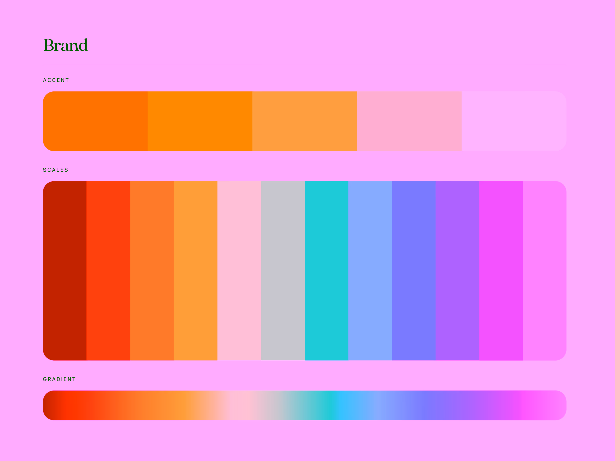
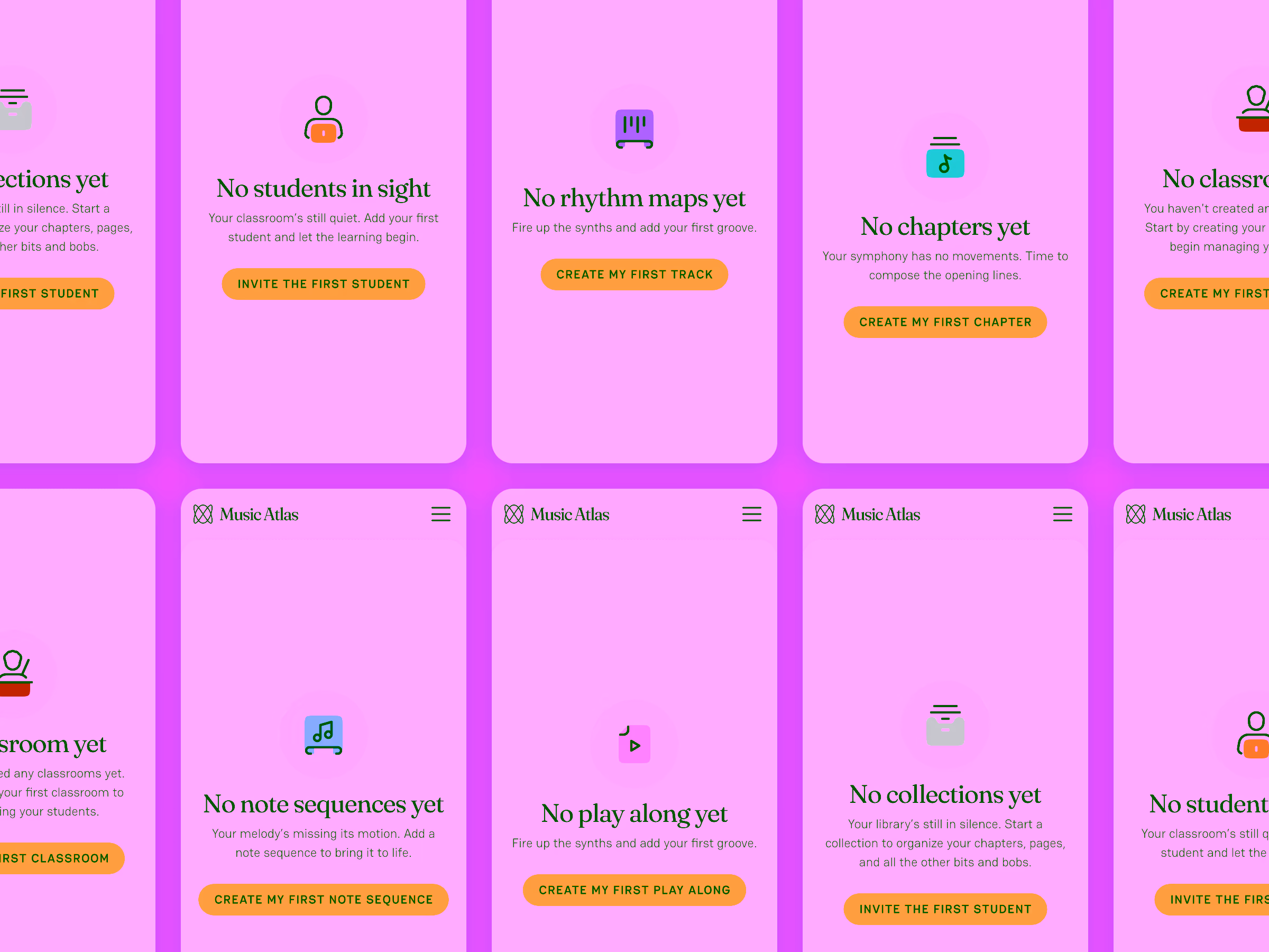
The brand needed to appeal to teenagers while maintaining credibility with teachers. I developed a colourful, rounded identity built around curved UI elements, soft geometries, and intentional colour usage—each hue tied to a purpose, not decoration. The result was a brand that felt friendly and lively, without tipping into cartoon territory.
Visual system: curved, clear, and intentional
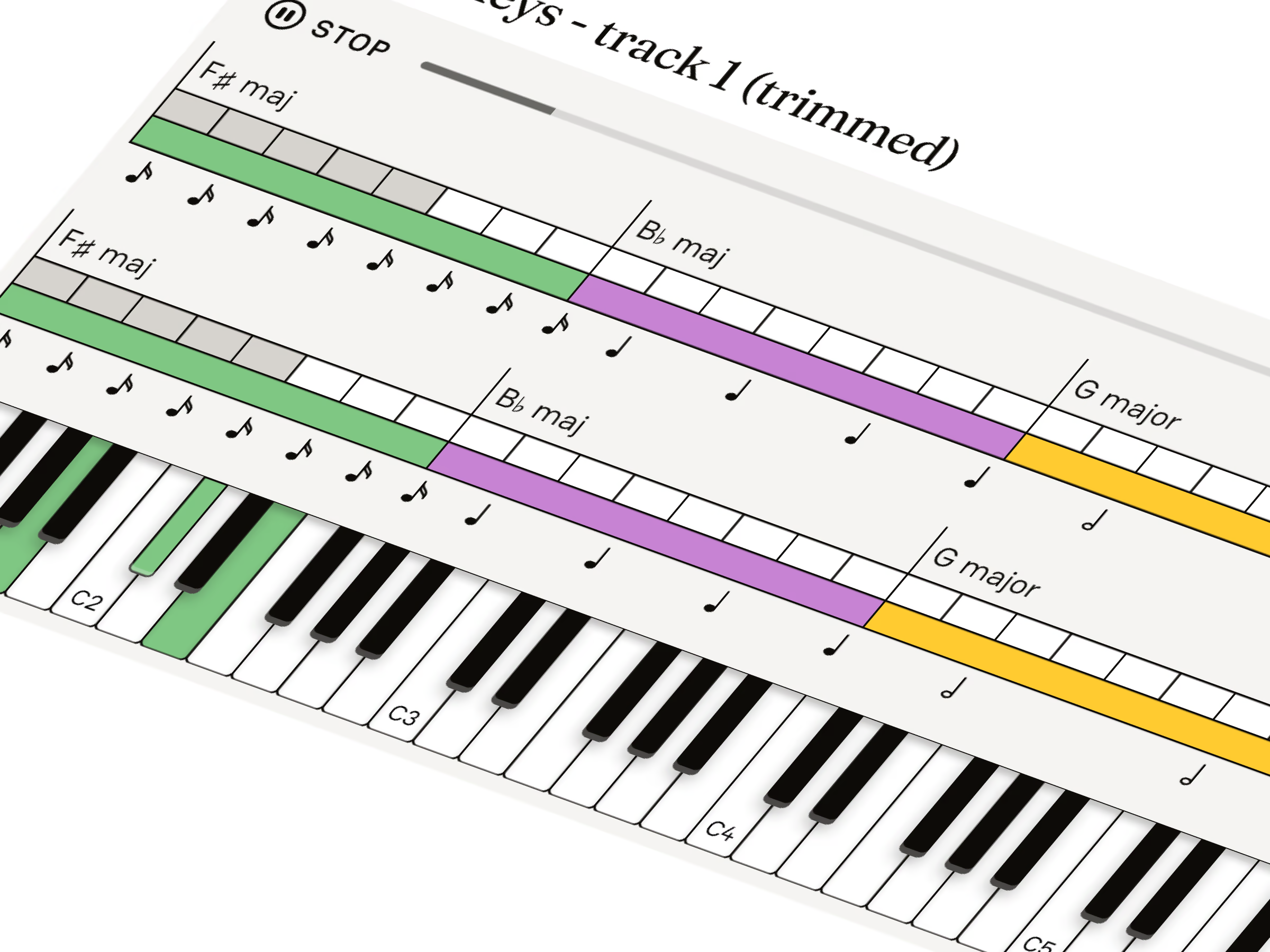
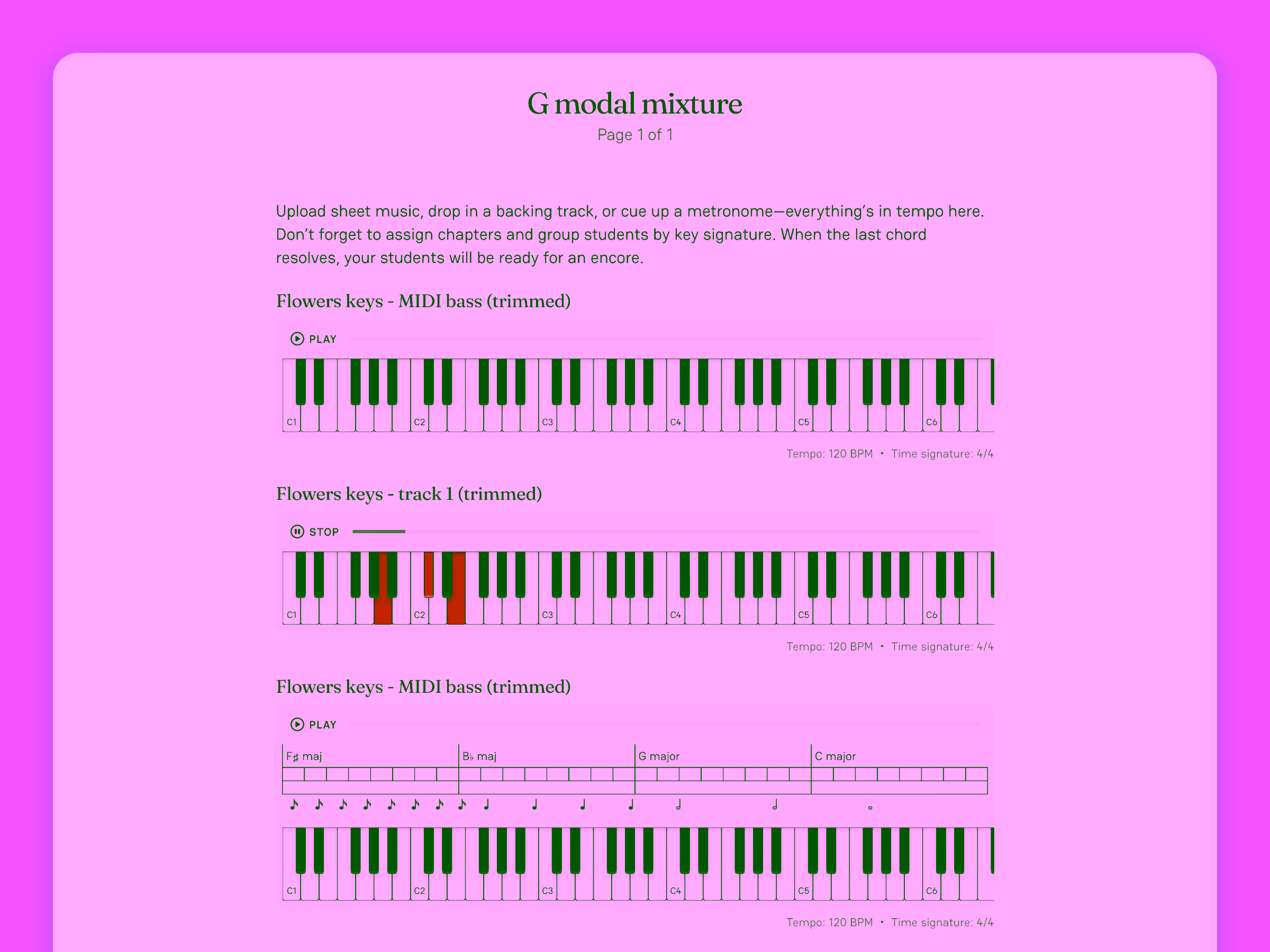
The interface emphasised rounded boxes, soft shadows, and approachable iconography. Students interact with music every day, so the UI had to echo that sense of rhythm—nothing too rigid, nothing too ornamental. Just enough visual personality to spark curiosity, and enough clarity to support learning.
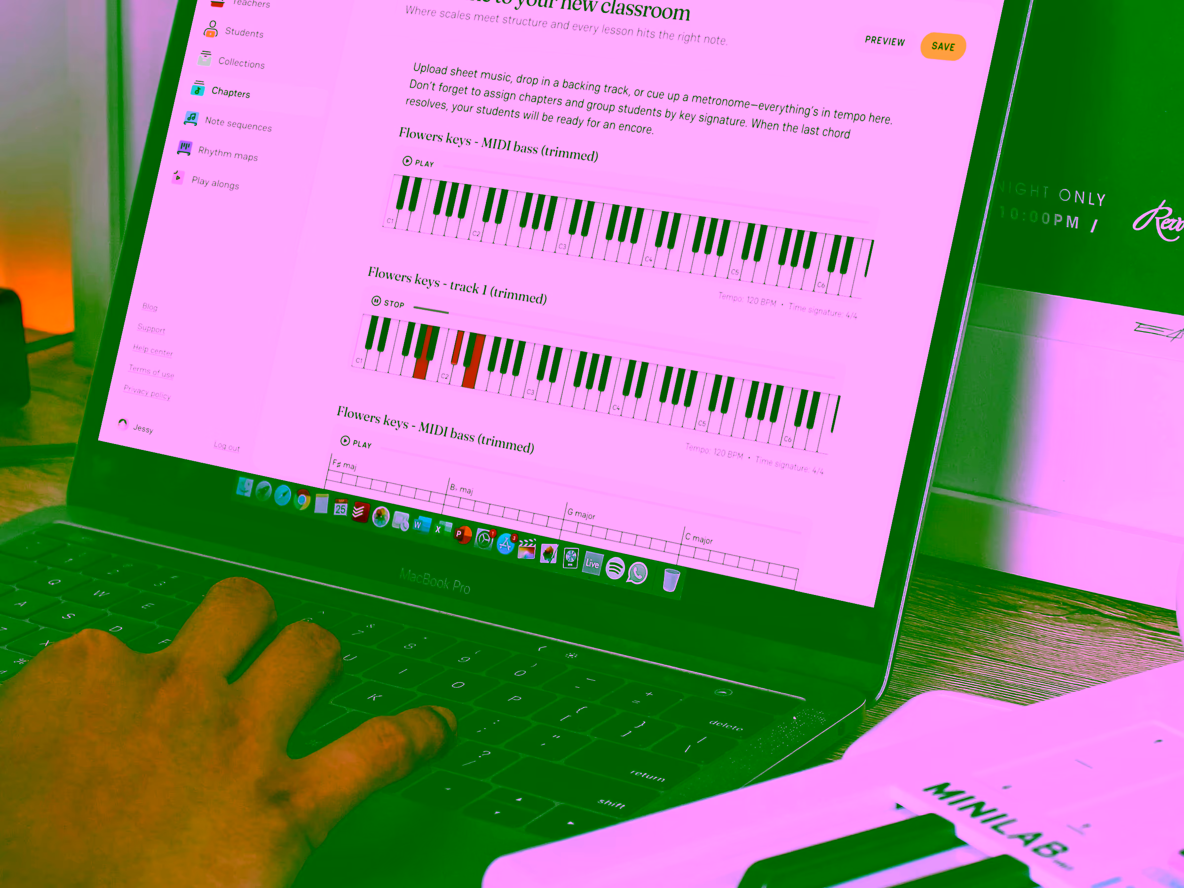
Mobile-first design for old school tablets
Knowing that many classrooms still rely on older tablets, I designed Music Atlas from the smallest breakpoints upward. Every layout, from lessons to exercises to progress screens, had to scale gracefully, load quickly, remain readable on narrow viewports, feel tactile and responsive. This constraint ultimately shaped the product’s strength: a clean, focused learning environment where every element had purpose.

Sound moments of delight
To elevate traditionally boring touchpoints—login, register, progress confirmations—I introduced small, tasteful sound cues. These weren’t gimmicks; they were musical micro-interactions that made even mundane screens feel alive.
When learning gets tough, a tiny spark of joy can make all the difference.
For teenagers especially, these moments turned friction into encouragement.
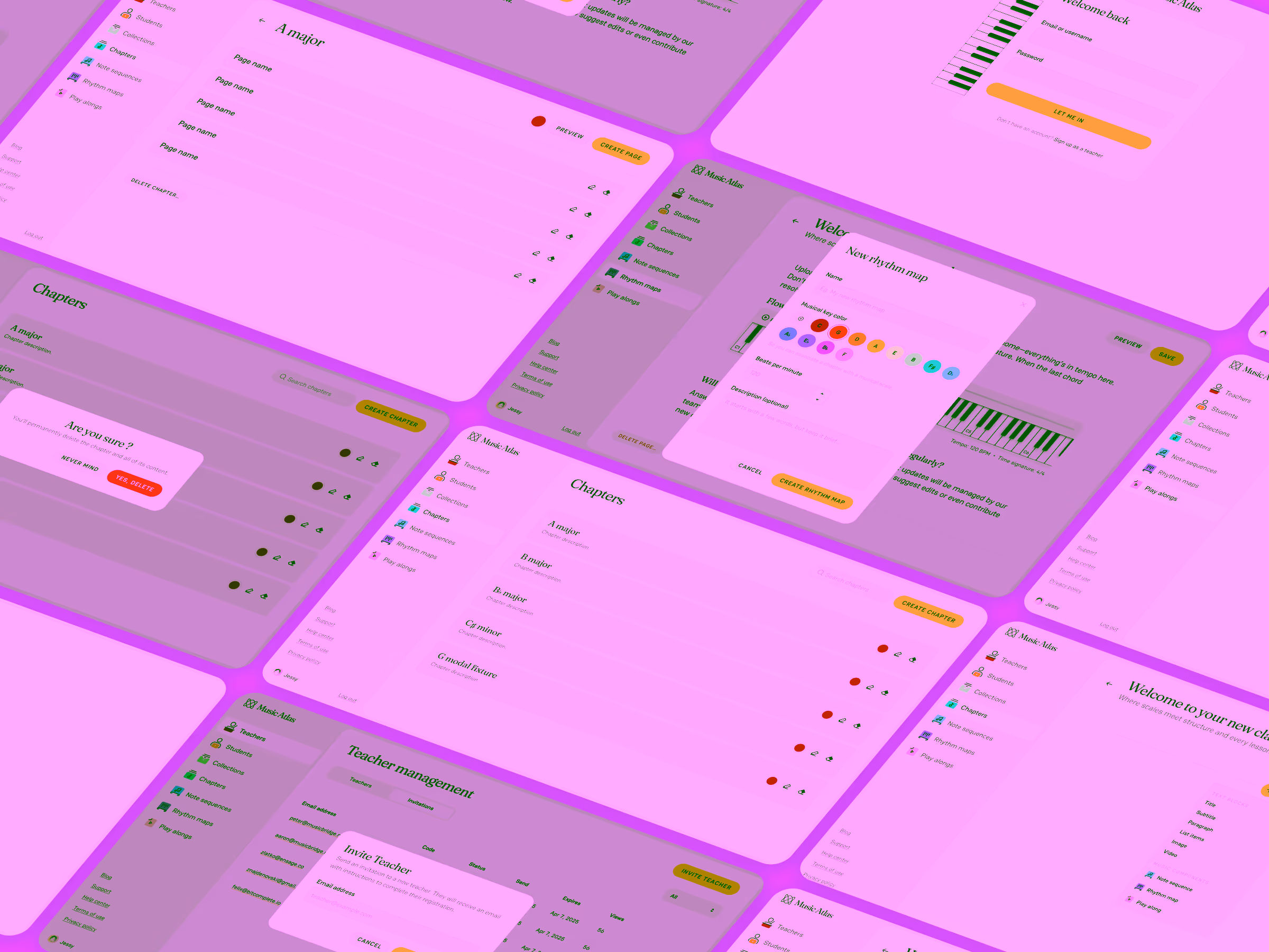
Designing for three distinct user roles
Music Atlas wasn’t a single experience. It was three parallel versions of the same product, each tailored to a different role: Student, Teacher, and Admin. Each group had its own needs, constraints, and mental models, which meant the app had to feel unified while still offering custom functionality.
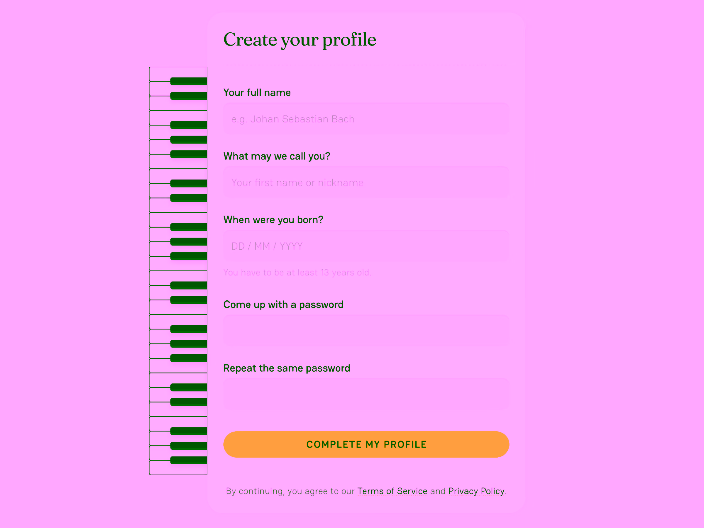
Students needed simplicity, clarity, encouragement, and a sense of progress. Their interface focused on learning modules, exercises, achievements, and delightful micro-interactions that made theory feel less intimidating.
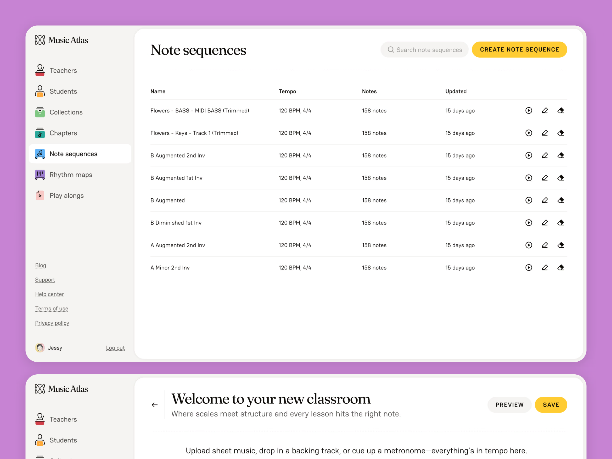
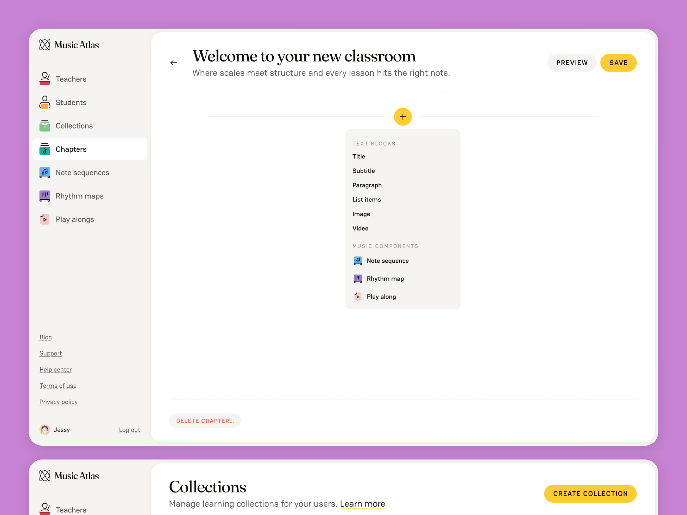
Teachers required visibility and oversight. Their dashboard surfaced student progress, classroom groups, assignment tracking, and insights into where learners struggled—all presented in a clear, low-friction layout to support classroom flow.
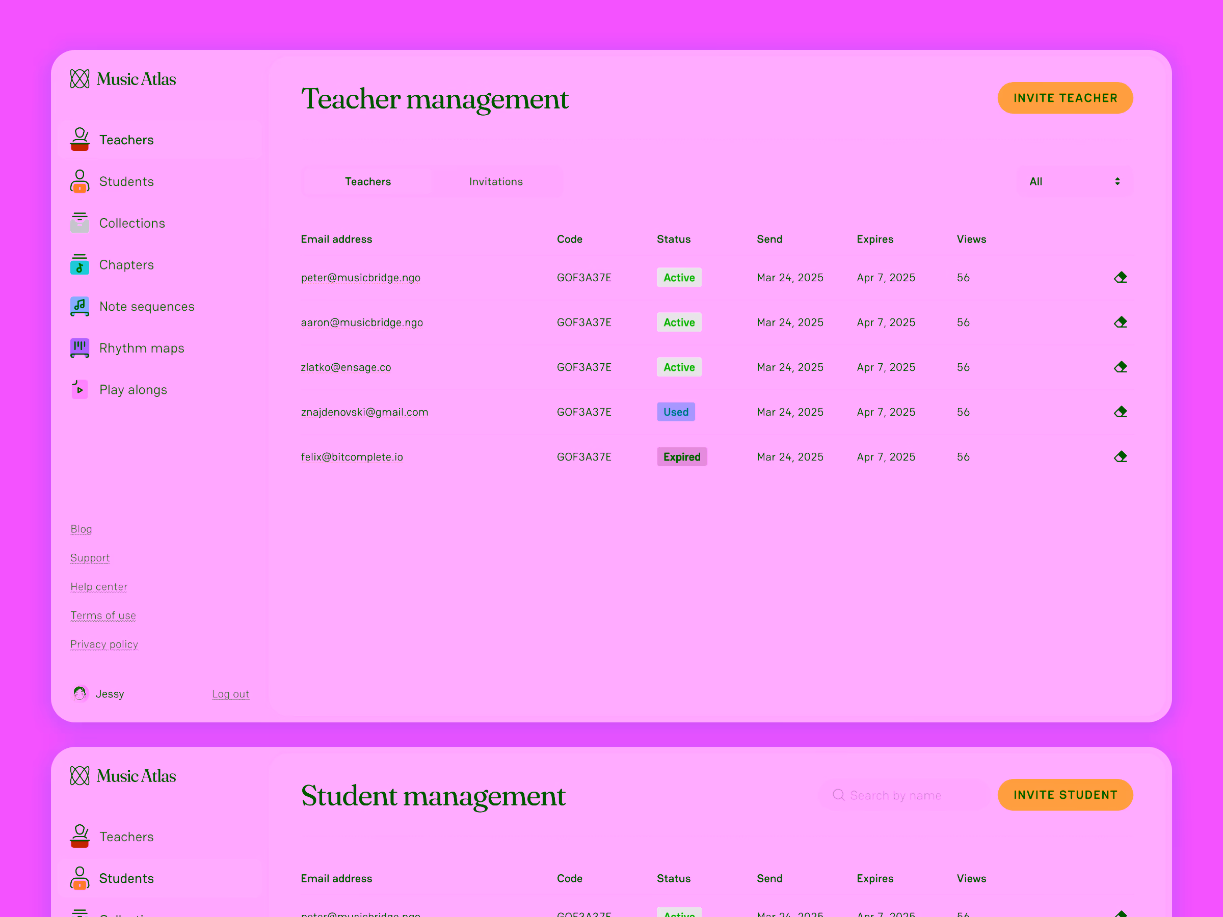
Admins needed system-wide control. This version included management tools for content, roles, permissions, and overall platform configuration. The Admin view leaned more functional and structured, without the gamified elements of the Student interface.
Designing these three branches meant carefully balancing consistency (so the app still felt like one product) with purpose-built variations that respected the responsibilities and expectations of each role. It was essentially three products under one umbrella.