Overview
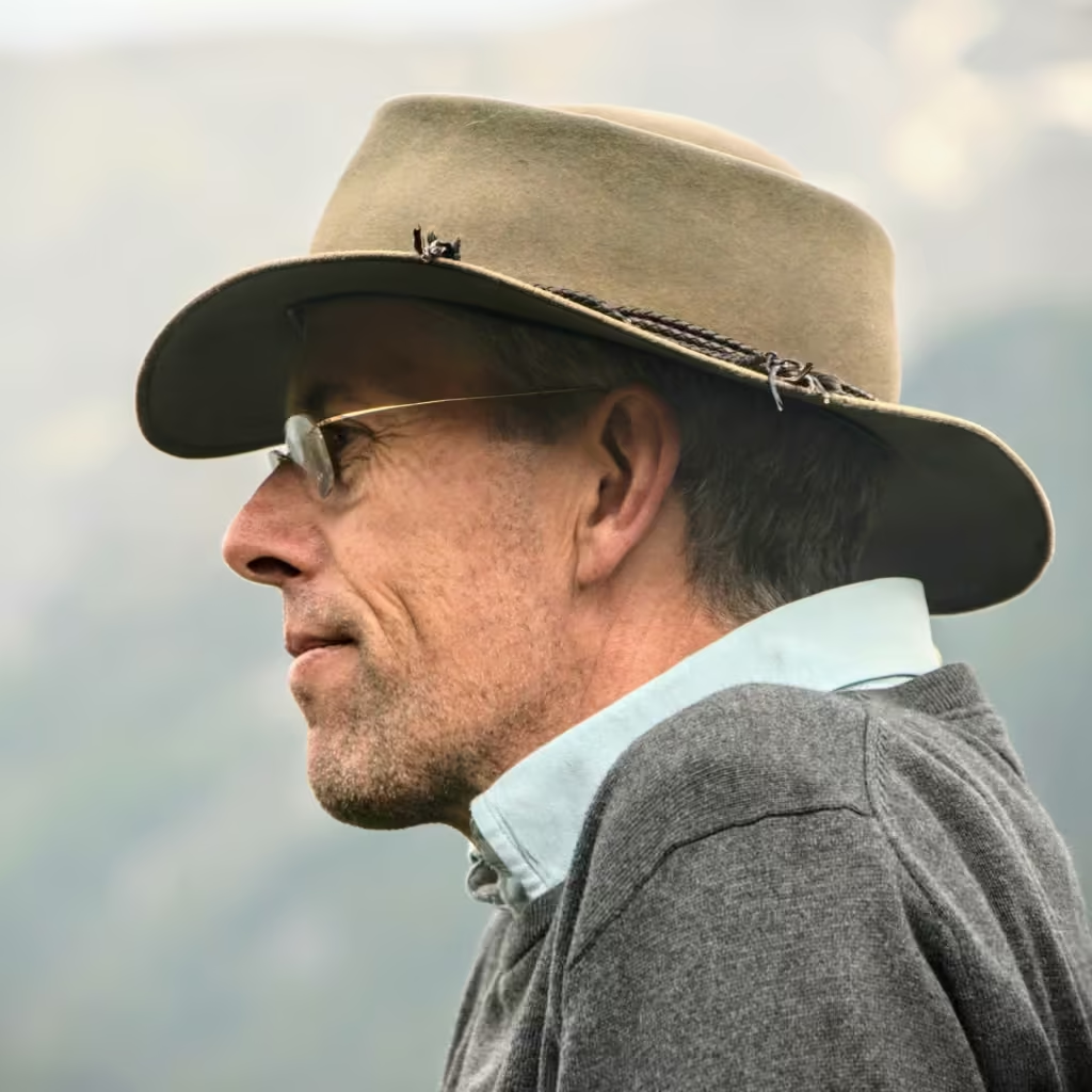
Some collaborations begin not with a brief, but with shared intent. Scott Poynton—the founder of A Different Way—reached out after discovering my earlier work on Tribevibe, recognizing the same values: connection, consciousness, and meaningful impact.
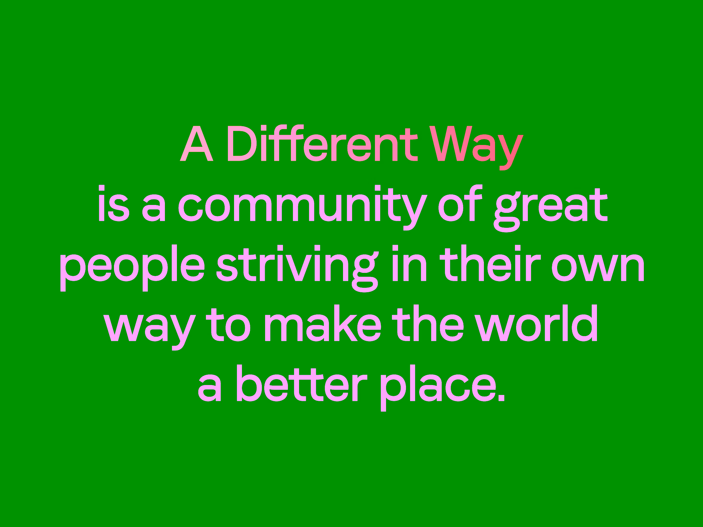
His mission was clear: to help businesses create a chain of values, empowering social entrepreneurs, sustainability leaders, and change-makers to generate positive impact at scale. My role was to transform that philosophy into a visual and digital language that felt as authentic as the mission itself.
Challenge
Scott’s vision was deeply human and experiential, yet his brand needed to live online, where purpose often gets diluted into corporate tone. The challenge was to create a brand identity and website that preserved the warmth of human intention while maintaining professional clarity.
Objectives
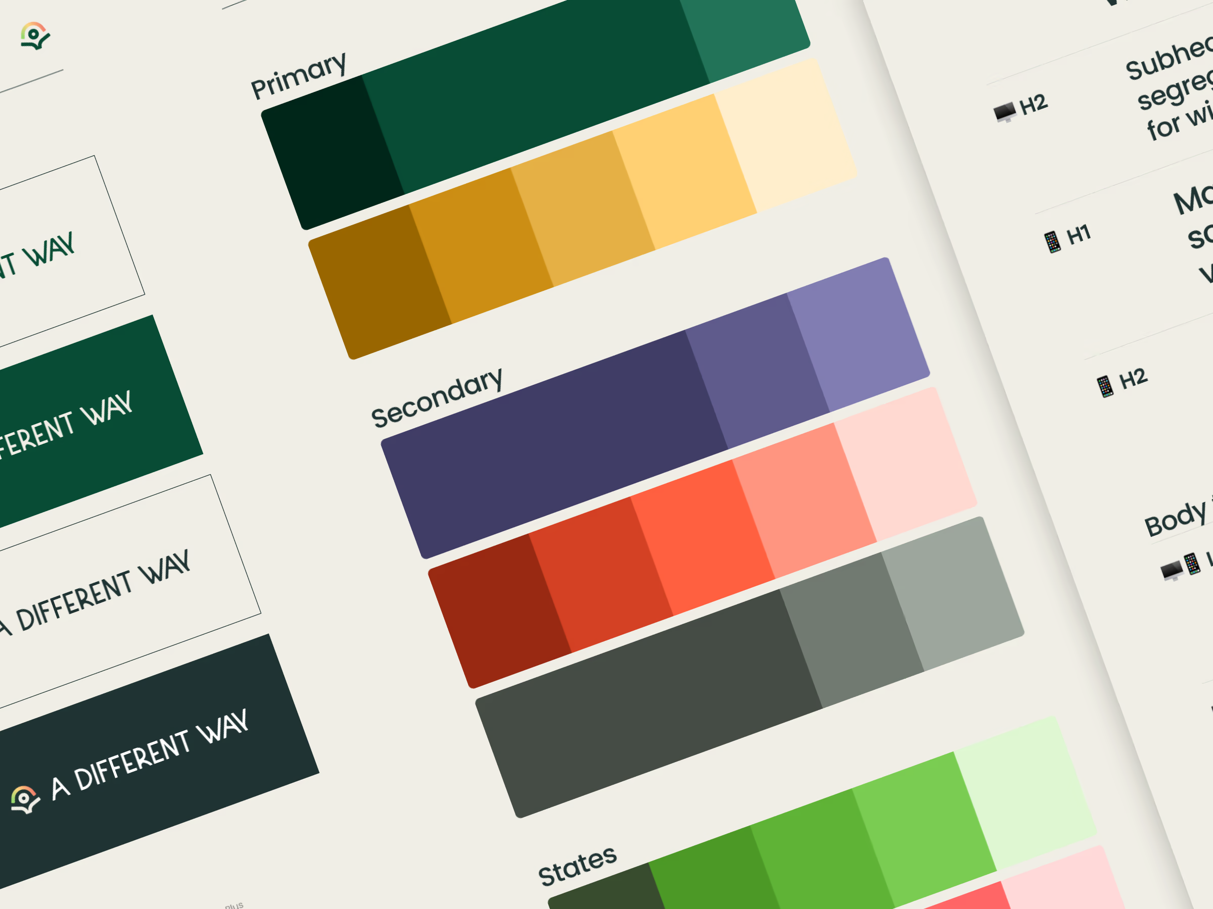
- Craft a visual identity that feels human, hopeful, and imperfect in the best way possible.
- Design a logo that becomes a symbol of heart-led business and new beginnings.
- Build a minimal yet expressive website that serves as a gateway into the A Different Way community.
- Extend the design language into Circle — creating a unified visual experience beyond the website.
Approach
This wasn’t about inventing a brand; it was about listening to its essence. I approached A Different Way with a design-through-empathy mindset, letting emotion lead form, and form follow meaning. The process evolved organically, reflecting Scott’s grounded energy and his devotion to working “with the earth, not above it.”
Process
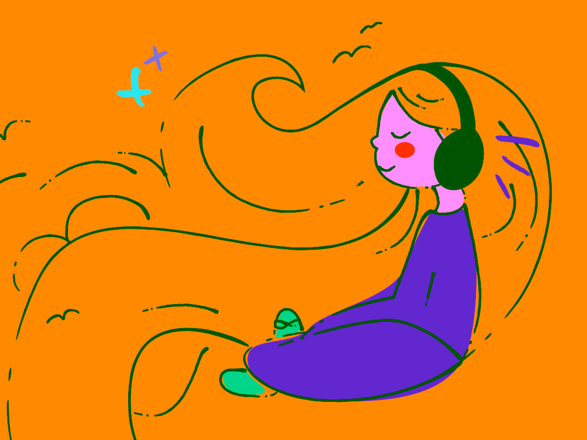
Searching for the right vibe
Every brand begins with a feeling. The A Different Way logo needed to be less of a corporate mark and more of a symbol of joy and renewal. By intentionally setting aside structure and rationality, I explored spontaneous sketches — playful, hand-drawn, rule-bending. The goal was not perfection, but sincerity — capturing the warmth of human-to-human connection that Scott’s work stands for.

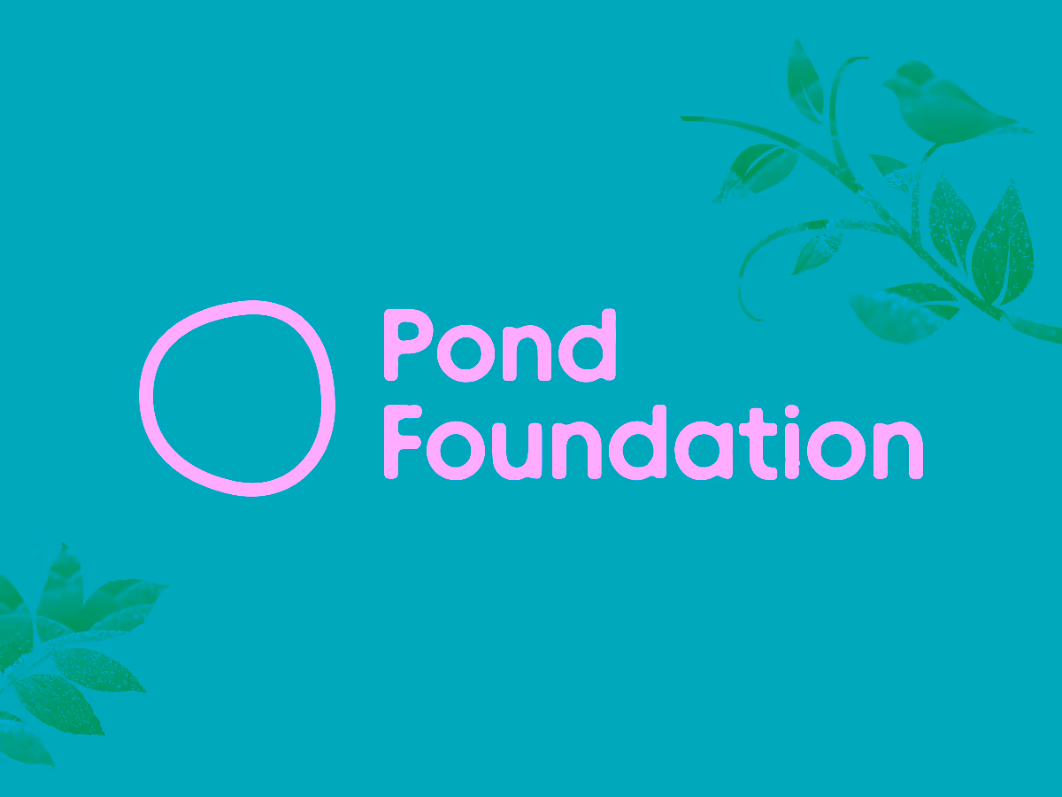
A winning logo from the archives
Sometimes, the best ideas resurface when the mind relaxes. Amid endless sketches, I recalled an old unused mark—something with organic rhythm and flow.
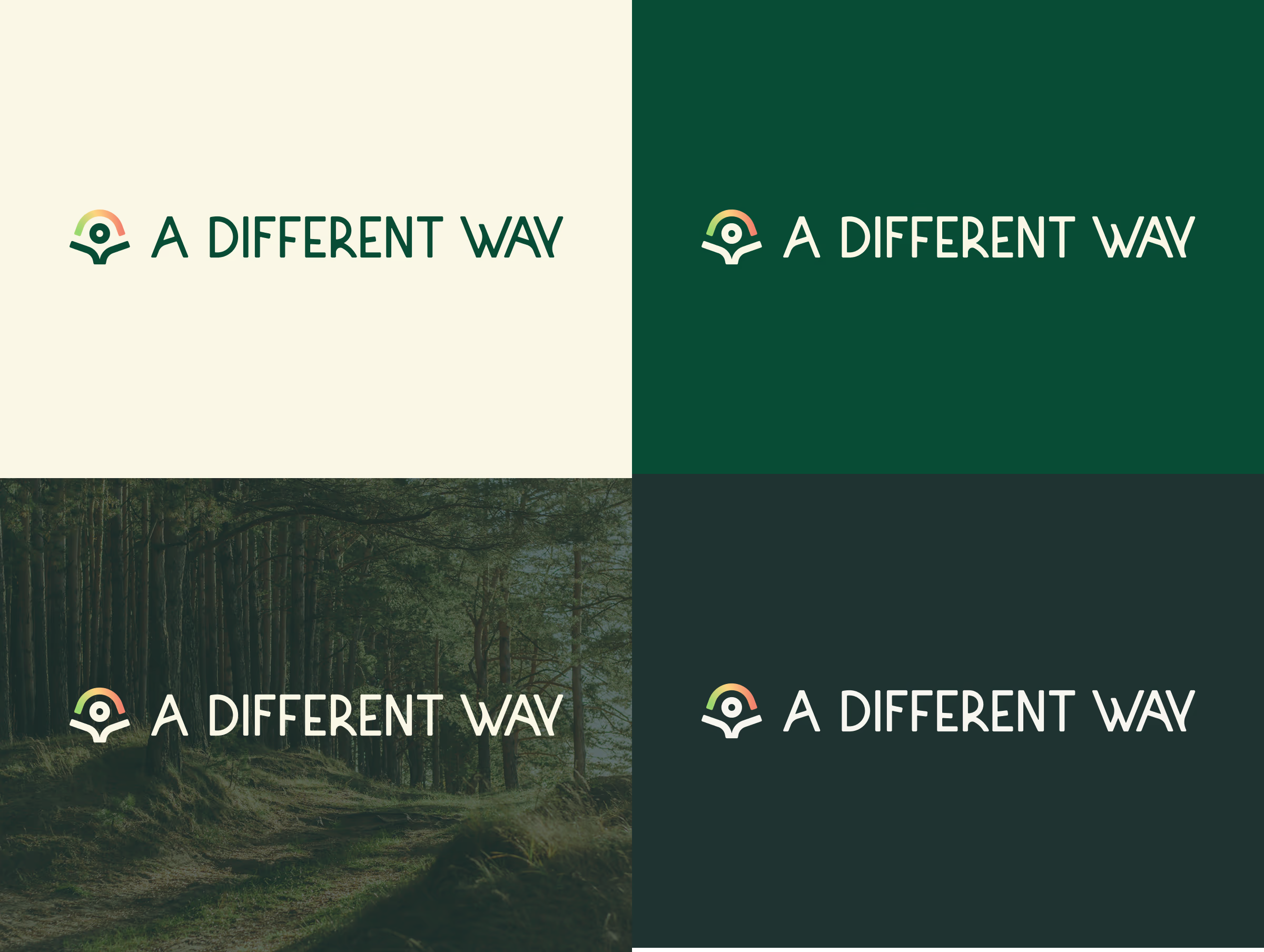
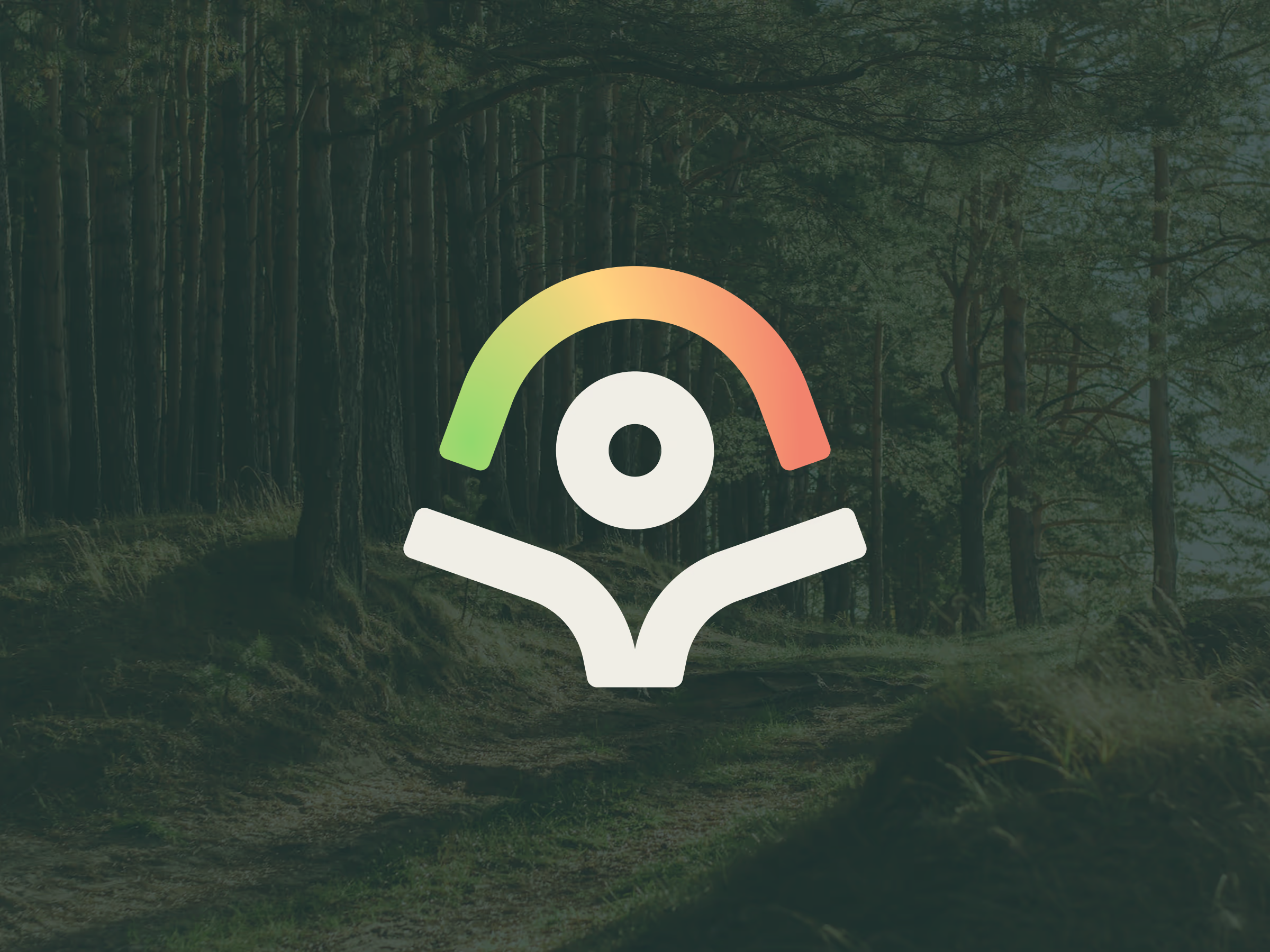
After refining it and pairing it with custom lettering, the symbol came alive—effortlessly representing movement, balance, and care. The logo became the visual leitmotif for the entire brand system: natural, human, and quietly confident.
Onwards to the website
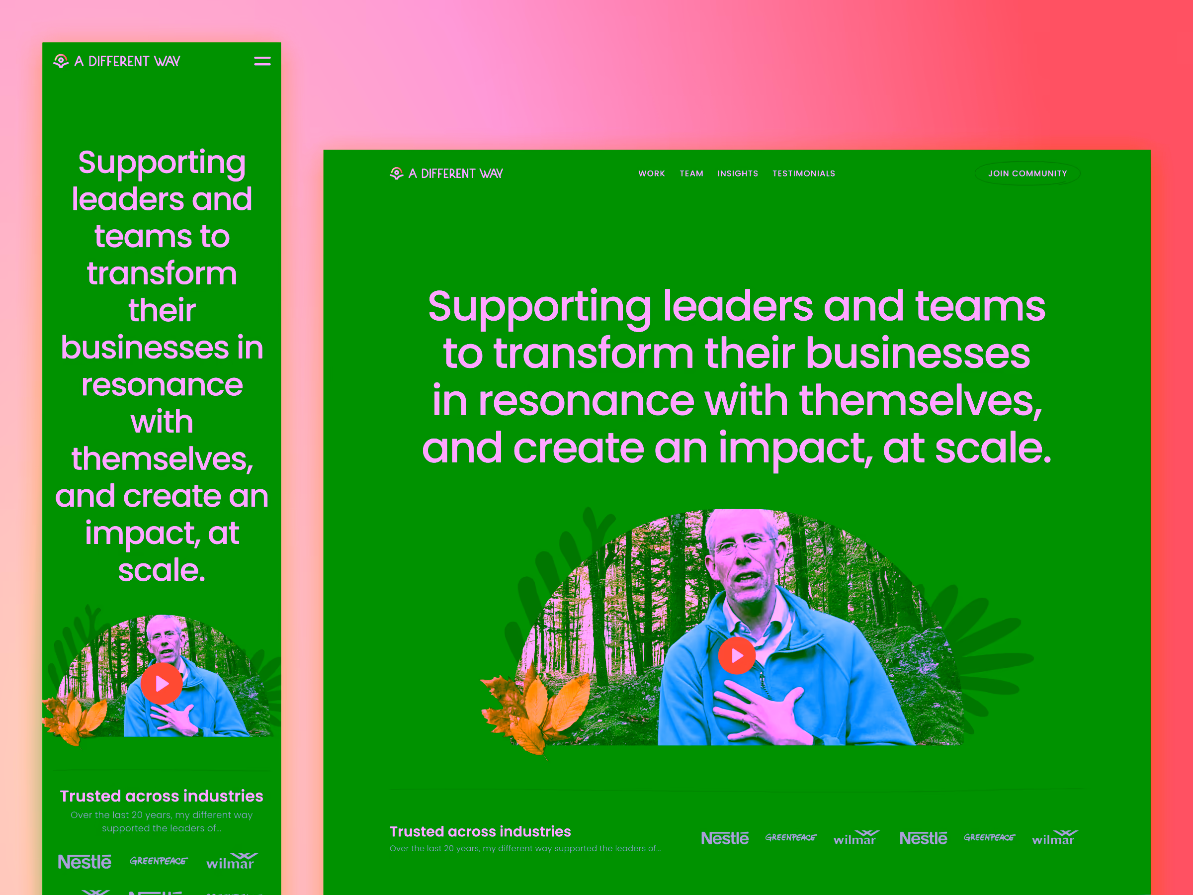
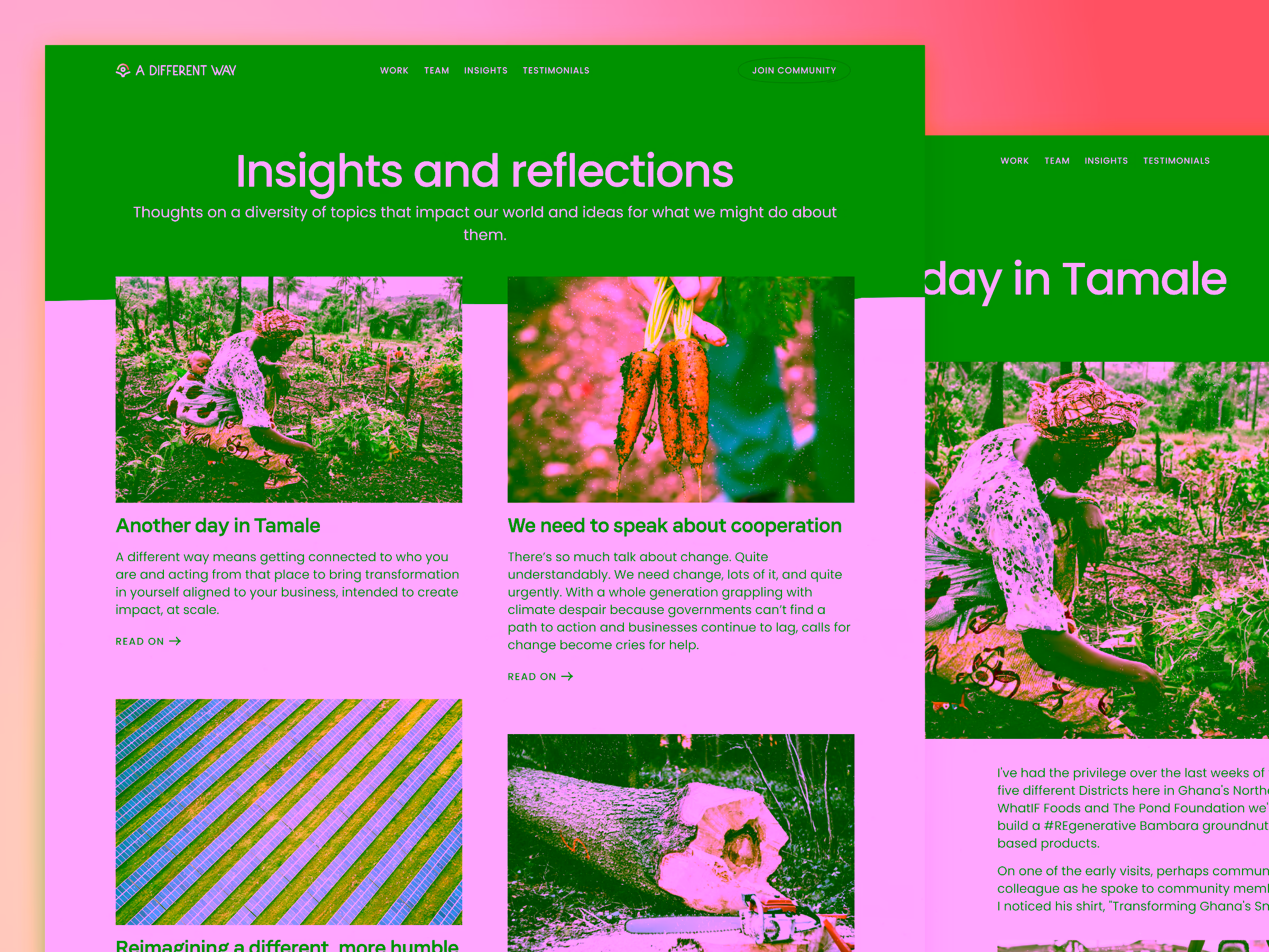
We decided early that less is more. Rather than building a multi-page website, we designed a refined landing experience—clear, welcoming, and centered around storytelling.
The layout guided visitors through Scott’s philosophy and purpose, leading naturally to his writing and community platform. It wasn’t a website that spoke at you; it invited you in.
Mimicking the natural world in the digital space
Scott’s work happens mostly offline. It happens in villages, in the fields, in the tangible reality of social change. To bring that energy online, I deliberately avoided sterile grids and perfect geometry. Instead, I designed with curves, asymmetry, and tactile textures, letting the site breathe like nature itself. The result was a digital environment that feels hand-touched, earthy, and alive.
Beyond logo and website
The website was just the first layer. I extended the brand system into Scott’s Circle community, customizing interface elements through CSS to echo the website’s visual tone. This continuity ensured that users moving between the site and the community experienced one unified journey, not two disconnected platforms.
Beyond pixels and code
My involvement went deeper than design. I worked with Scott to refine his brand narrative, aligning copy, tone, and communication style across channels. The intention was to make his authenticity scalable.
And the results spoke for themselves. While many online communities fade, A Different Way continues to thrive, which was a direct reflection of Scott’s dedication to giving unconditional value to every member. His engagement (or as I like to call it, ensagement) rates remain impressively high, proving that design aligned with purpose doesn’t just attract, but it retains.