Overview
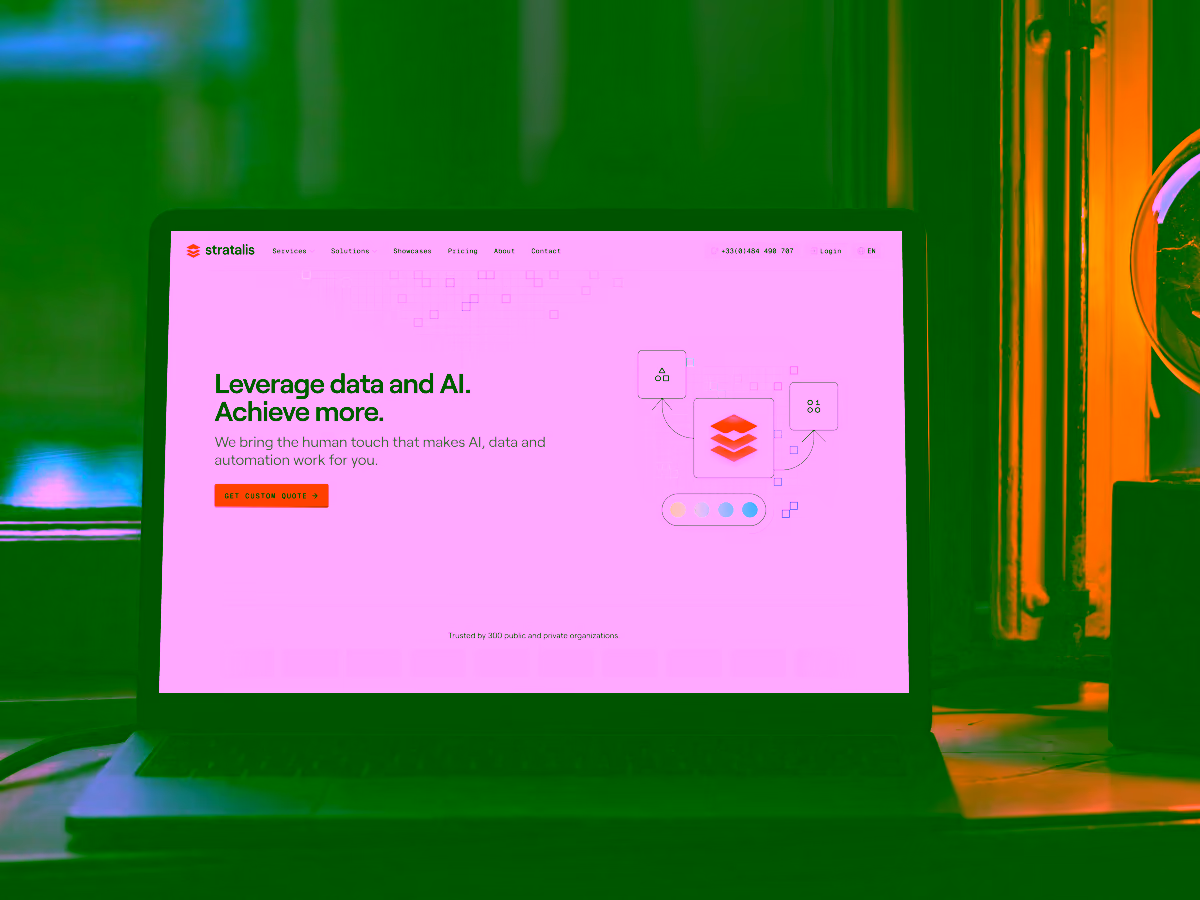
Stratalis is an eight-person team of web-scraping specialists who’ve been quietly powering data for more than 200 customers since 2010. With over 1800 completed projects, they had the expertise and the reputation, but not the brand clarity to match it.
Maxime reached out to give Stratalis a refreshed identity and a website that clearly communicates who they are: reliable, technical, and quietly excellent.
The challenge
After more than a decade of steady growth and over 1800 completed projects, Stratalis had outgrown its original brand. The company was strong, but its visual identity wasn’t keeping pace with the clarity and professionalism of the work itself.
The challenge was to refresh the logo and website in a way that honoured their technical expertise, clarified their message, and made their offering immediately understandable to new customers, without losing the approachable nature of a small, highly specialised team.
Key objectives
- Create a brand identity that conveys the concept of strata (layers), tied to the name and the nature of their work.
- Design a simple, trustworthy website focused on clarity over complexity.
- Introduce visuals and iconography that make technical content more approachable.
- Build the website mobile-first to match their webiste analytics data.
My approach
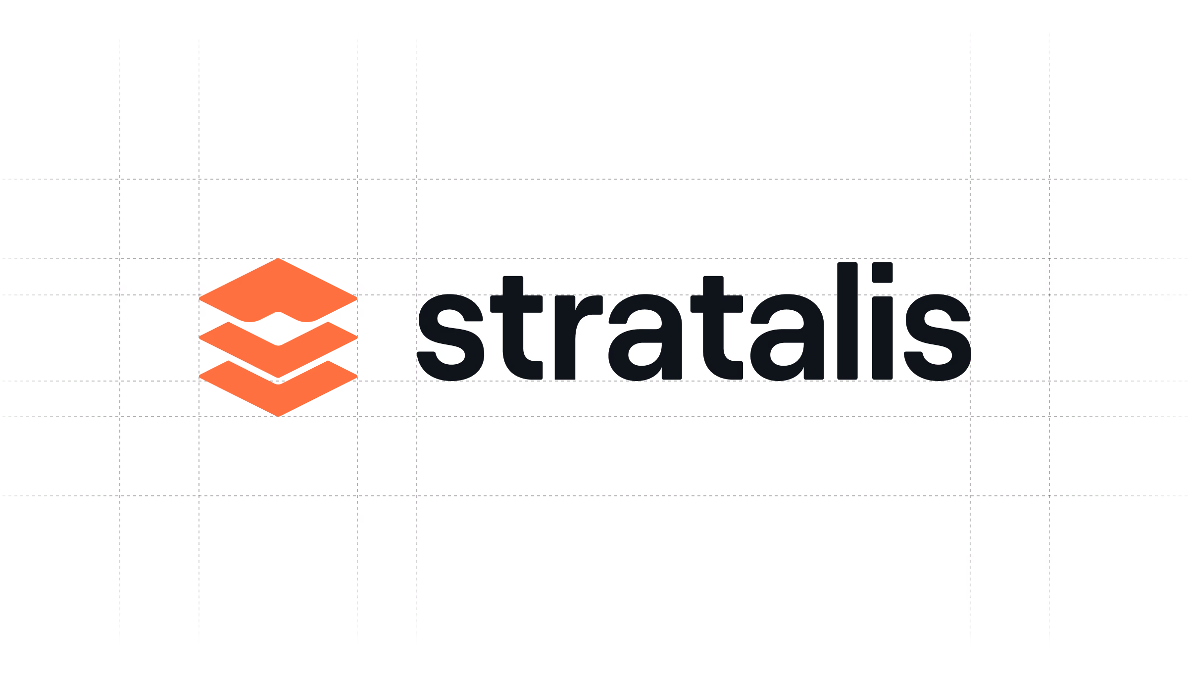
Strata of logo ideas
The name Stratalis naturally evokes the idea of layers, of strata stacked over time. I explored repetitive geometric forms with one differentiated layer to create a memorable rhythm, a mark that feels both structural and fluid.
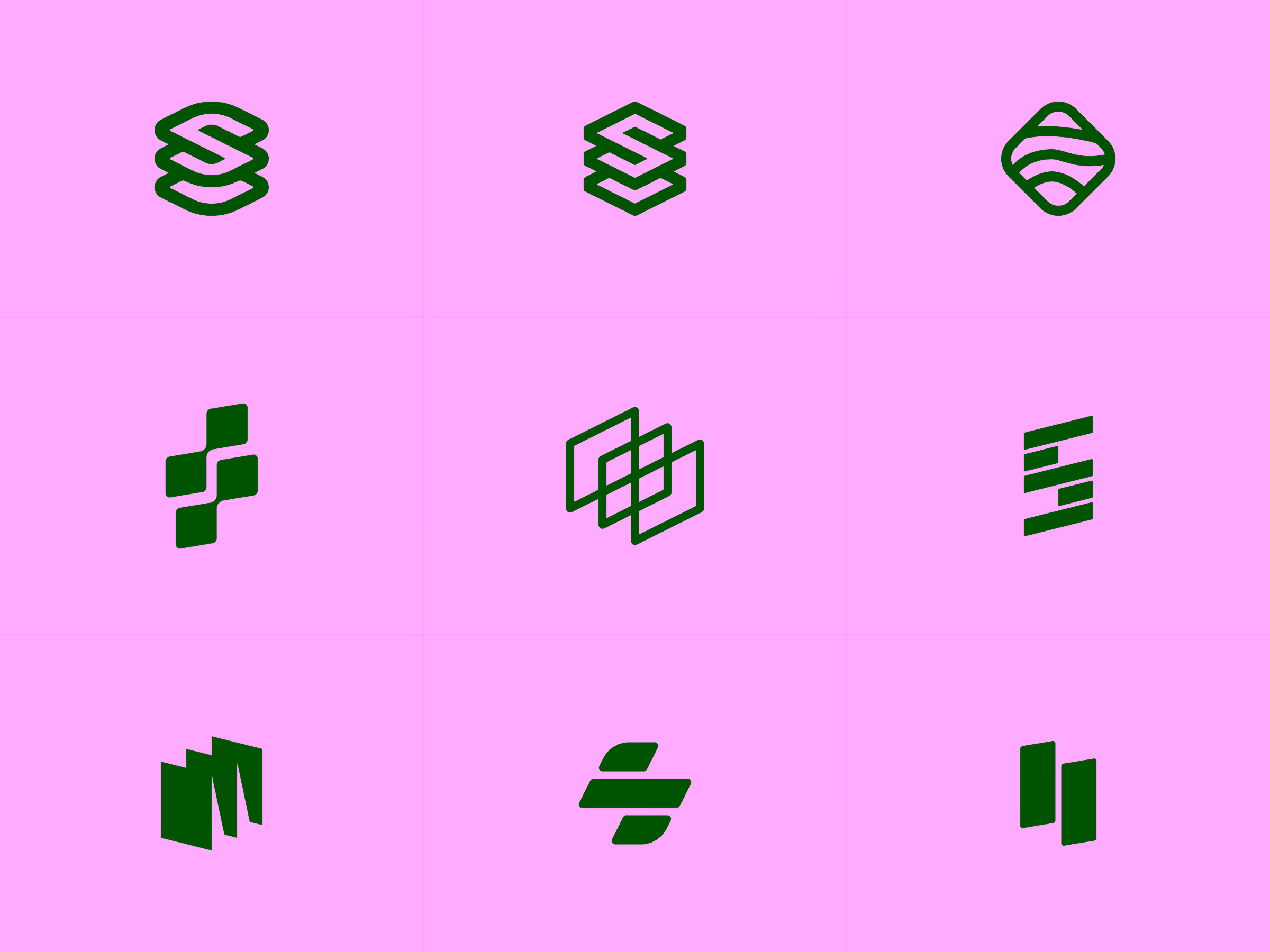
Do you see the mustache?
When Maxime first saw the proposed logo, he spotted something I hadn’t considered: the top fold resembled a mustache. And once seen it‘s impossible to unsee.
A few subtle adjustments resolved the ambiguity. The final mark retains the layered metaphor, adds a touch of character with the curved top, and avoids the accidental facial hair association.
A healthy dose of illustrations
Stratalis’ audience is technical, but even technical users benefit from visual anchors. I brought in illustrator Gintarė, whose line-based illustrative style added personality and clarity without overwhelming the content. Her illustrations became the backbone of Stratalis’ new visual storytelling.
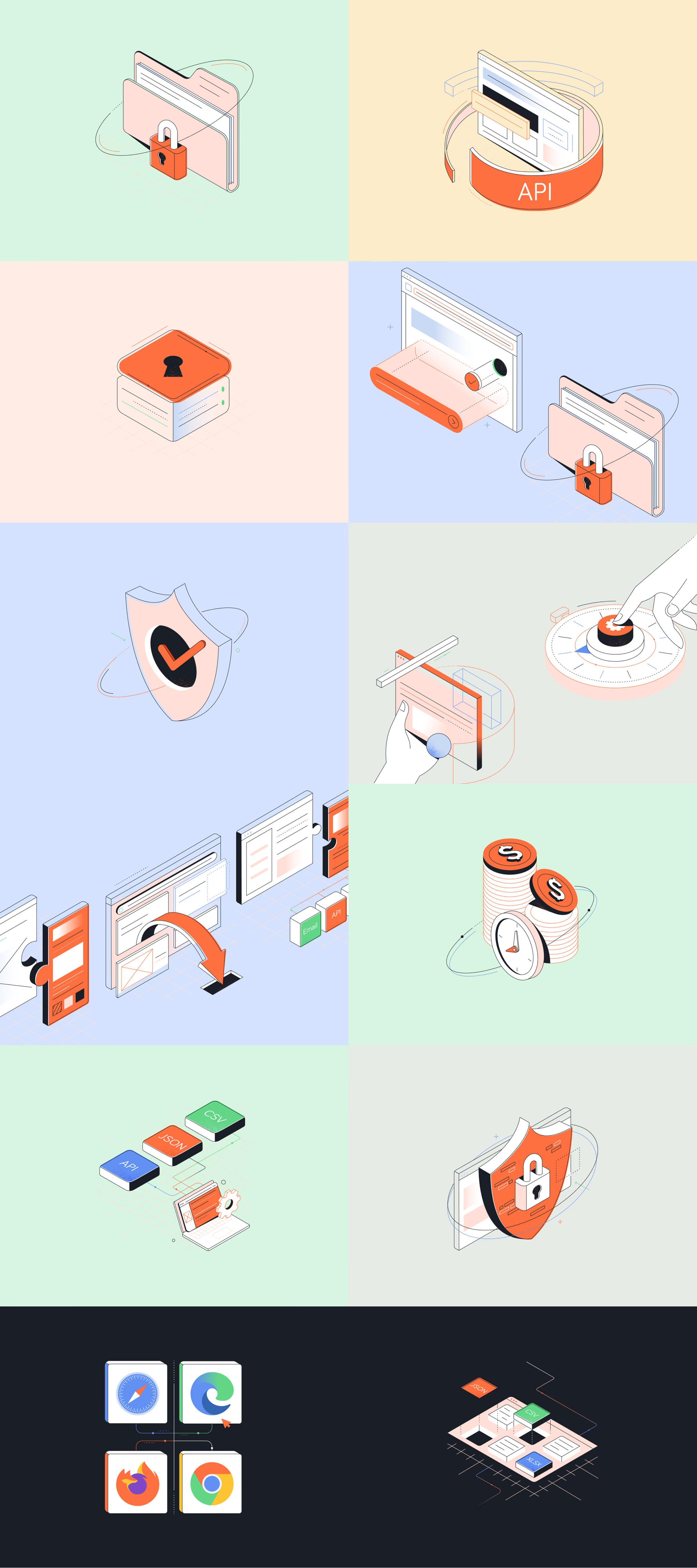
Sprinkled with custom iconography
In places where full illustrations would be too much, I designed a set of complementary icons. These lightweight visuals helped guide users without adding visual noise to become small touches that made the website feel complete.

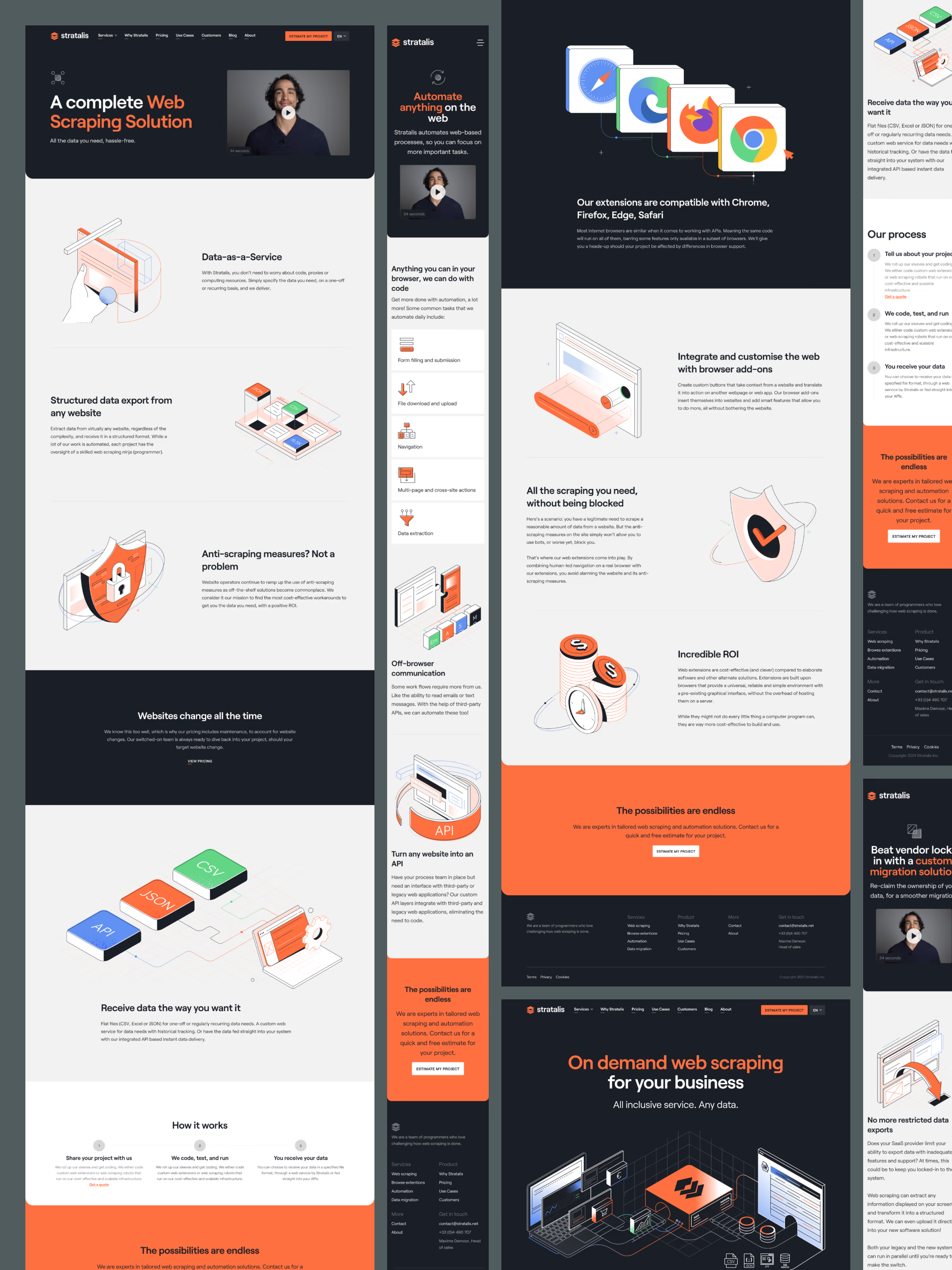
A mobile-first responsive website
Stratalis’ audience often visits the site from mobile devices, so designing mobile first wasn’t a creative choice, but a practical one. Starting from the smallest viewport allowed the site to retain clarity at every size, building upward into a clean, structured desktop flow. The result was a website that’s frictionless everywhere.
Outcomes
Stratalis now has a clear, modern identity aligned to the longevity and profesionalism of their work. The new logo, illustrations, and icons give character to a highly technical space, while the refreshed website communicates credibility at a glance.