Overview
Ontologize is the personal brand of Taylor Gregoire–Wright, built to serve a very specific and very high-value niche: premium courses, training, and educational materials for Palantir’s Foundry ecosystem—software used by enterprises and governments.
Taylor came with a strong vision. My task was to translate it into a brand identity and website that felt trustworthy, technical, and unmistakably premium, while still carrying his personal voice. Together with my colleague for this project—Todor Dimov—we built a scalable, CMS-driven platform ready for years of new content, articles, and training resources.
The challenge
Design a brand that balances austerity with modern digital expressiveness — and build a website capable of hosting a growing library of specialised, enterprise-level learning content.
Key objectives
- Build a brand identity rooted in clarity, trust, and technical sophistication.
- Create a distinctive logomark that subtly communicates “unlocking knowledge.”
- Design a CMS-driven Webflow website capable of scaling to hundreds of resources.
- Ensure the entire system remains visually cohesive across slides, presentations, and marketing materials.
My approach
Setting the brand foundations
Before touching visuals, Taylor and I aligned on Ontologize’s purpose: to become the one-stop shop for high-quality, well-designed learning materials for Palantir Foundry.
We defined brand values, tone, and narrative principles — clarity, precision, and authority — forming the strategic backbone for every design decision that followed.
Exploring a winning logomark
The identity needed to feel austere yet contemporary, using limited but confident colour accents. This kind of tension — between strictness and digital expressiveness — became the creative constraint that shaped the logomark explorations.
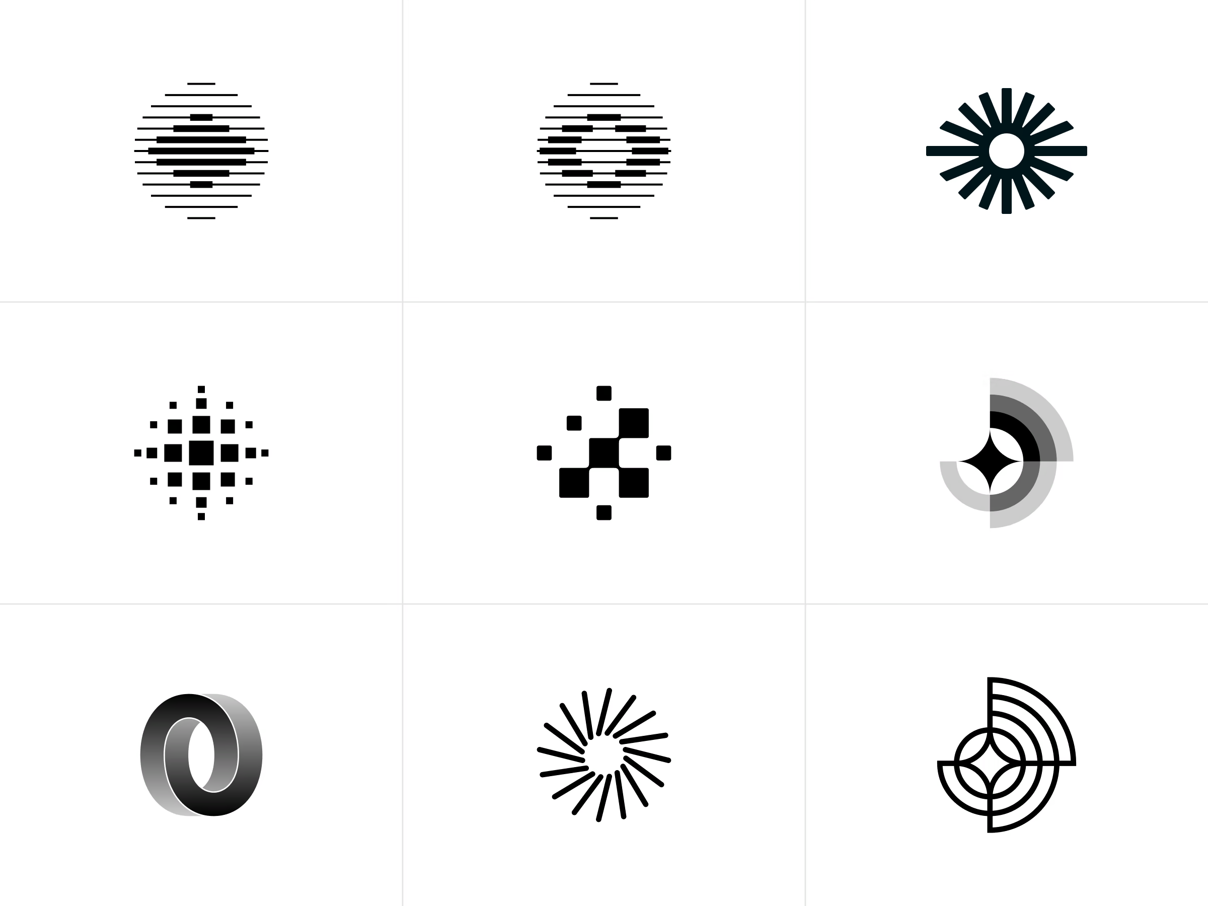
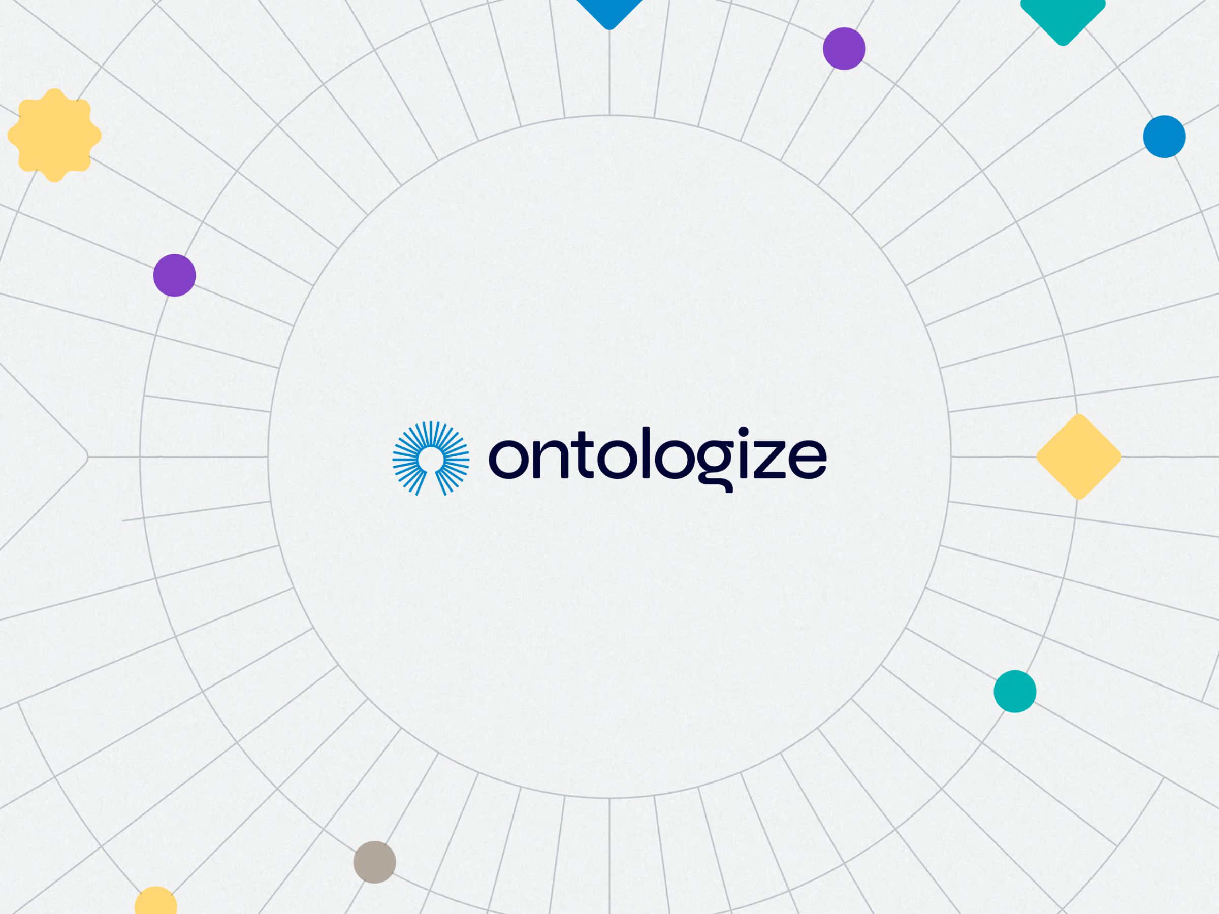
A hidden keyhole to unlock knowledge
After several iterations, we arrived at a logomark with just enough geometry to stay recognisable at tiny sizes. But its most important trait was subtle: a hidden keyhole, a metaphor for unlocking knowledge and mastering complex technical systems. It’s the kind of detail that doesn’t scream — it rewards attention.
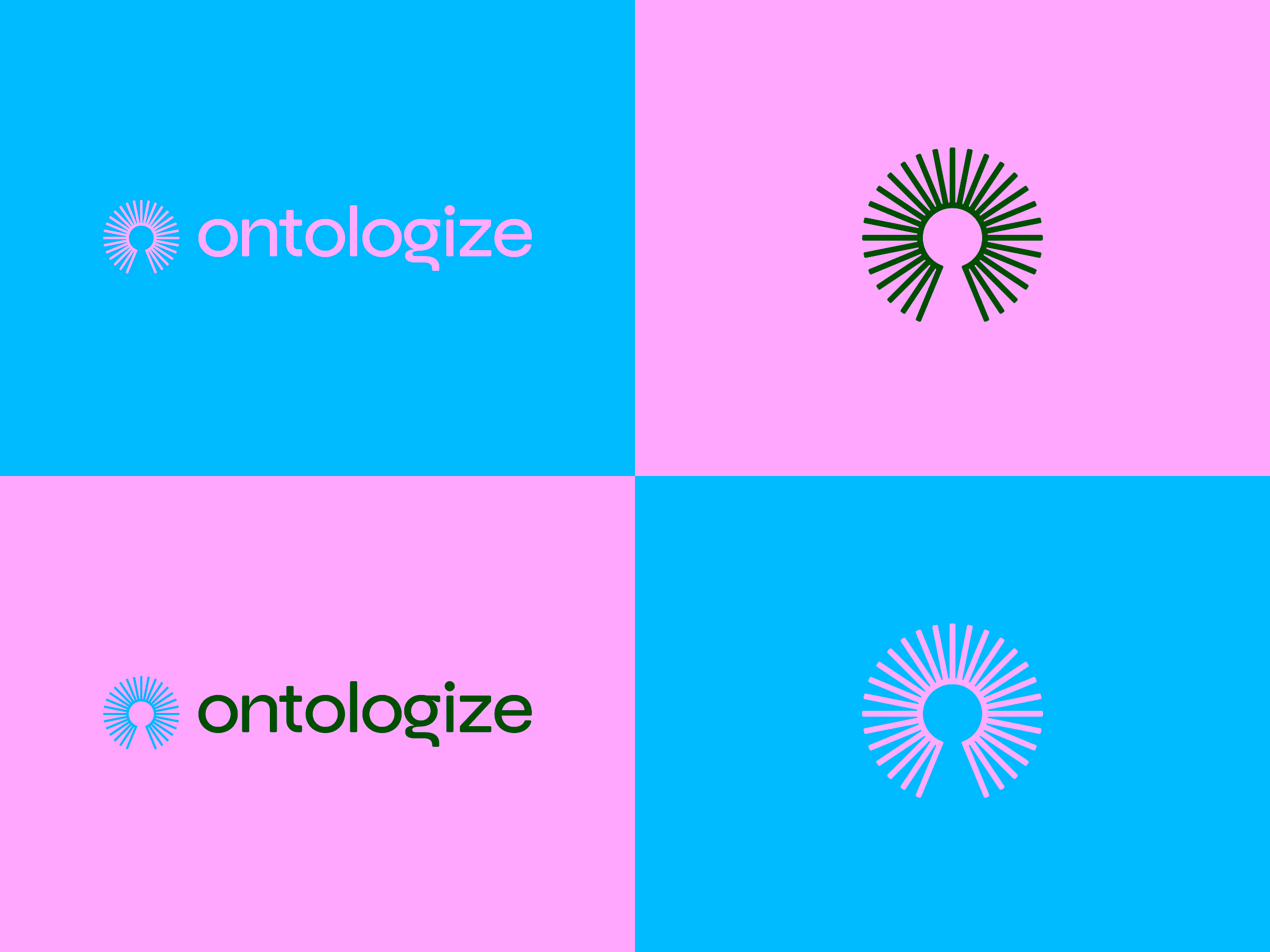
It comes with a logo guide
As with any identity system, I delivered a structured visual guide covering logo usage, colour pairings, typography rules, and iconographic direction — providing Taylor with a coherent foundation he could grow with.
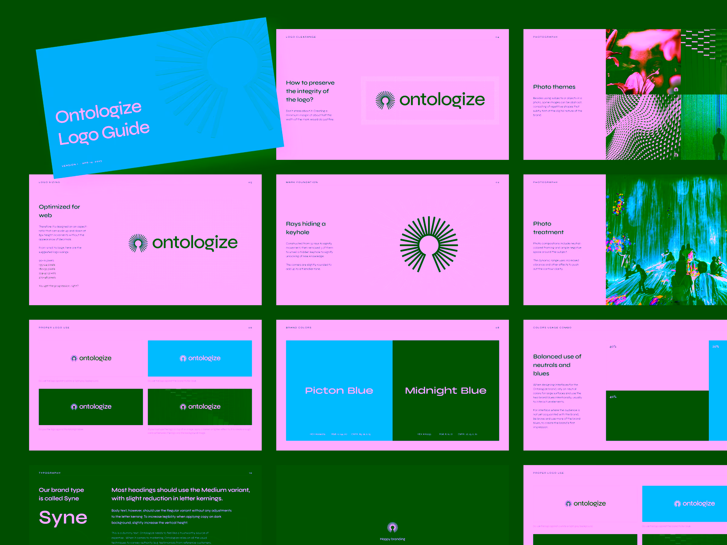
Picking the right brand font
Typically, my brand identities use premium typefaces — but in this case, the perfect choice was hiding in plain sight: Syne, a free Google Font with expressive geometry and a personality that elevated the wordmark, especially the letter G.
It became both a practical and aesthetic win.
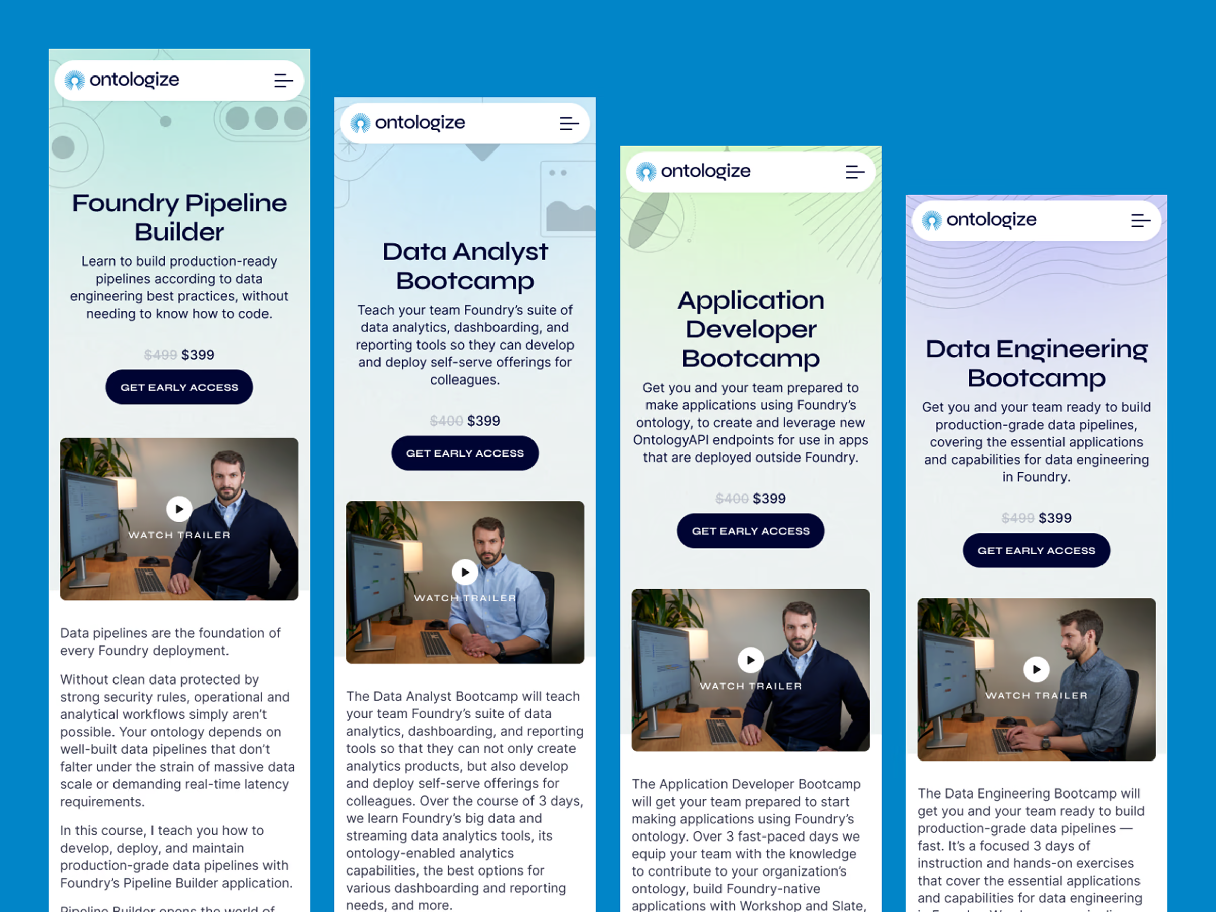
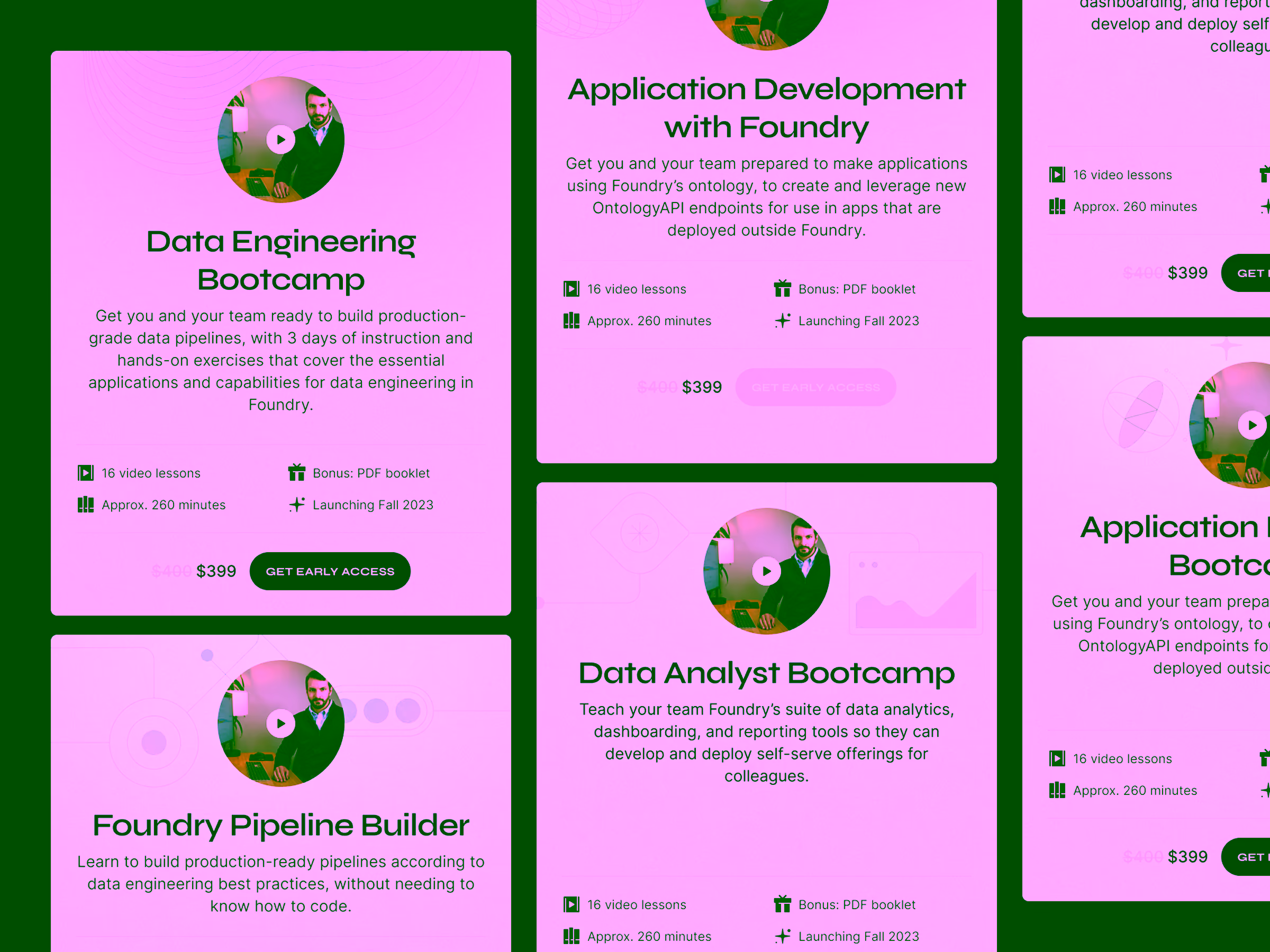
A website that feels personal and professional
The website continues the brand’s playfully restrained aesthetic: expressive enough to feel personal, strict enough to convey authority. Legibility, clarity, and visual rhythm guided each layout, ensuring the site supports deep reading and discovery without visual noise.
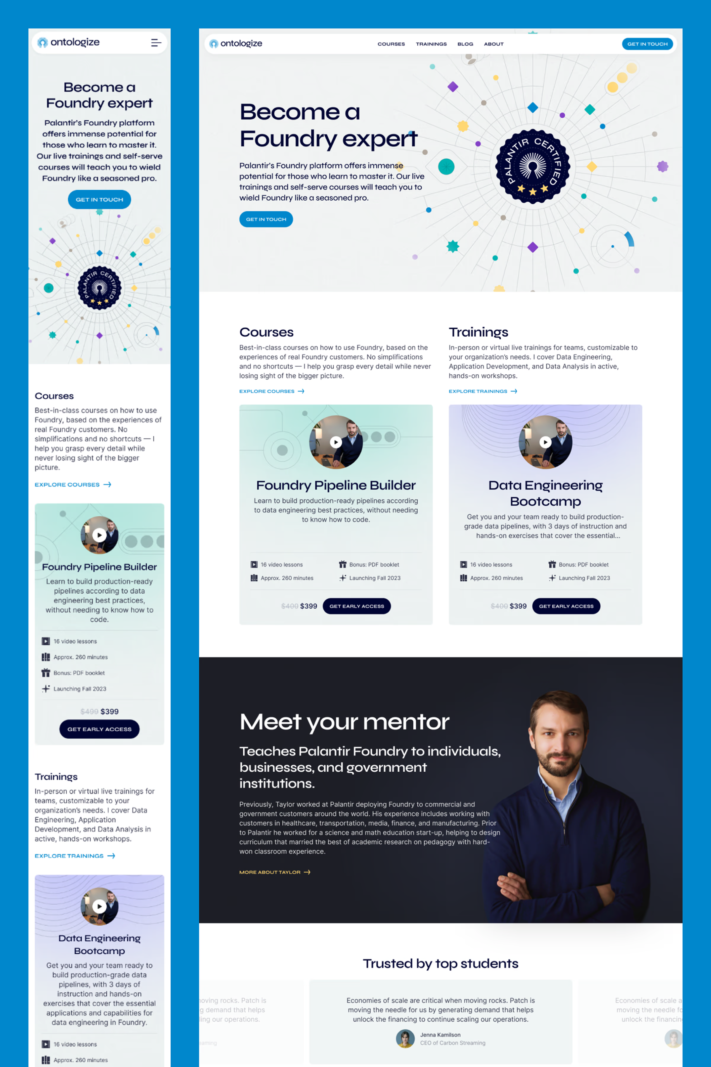
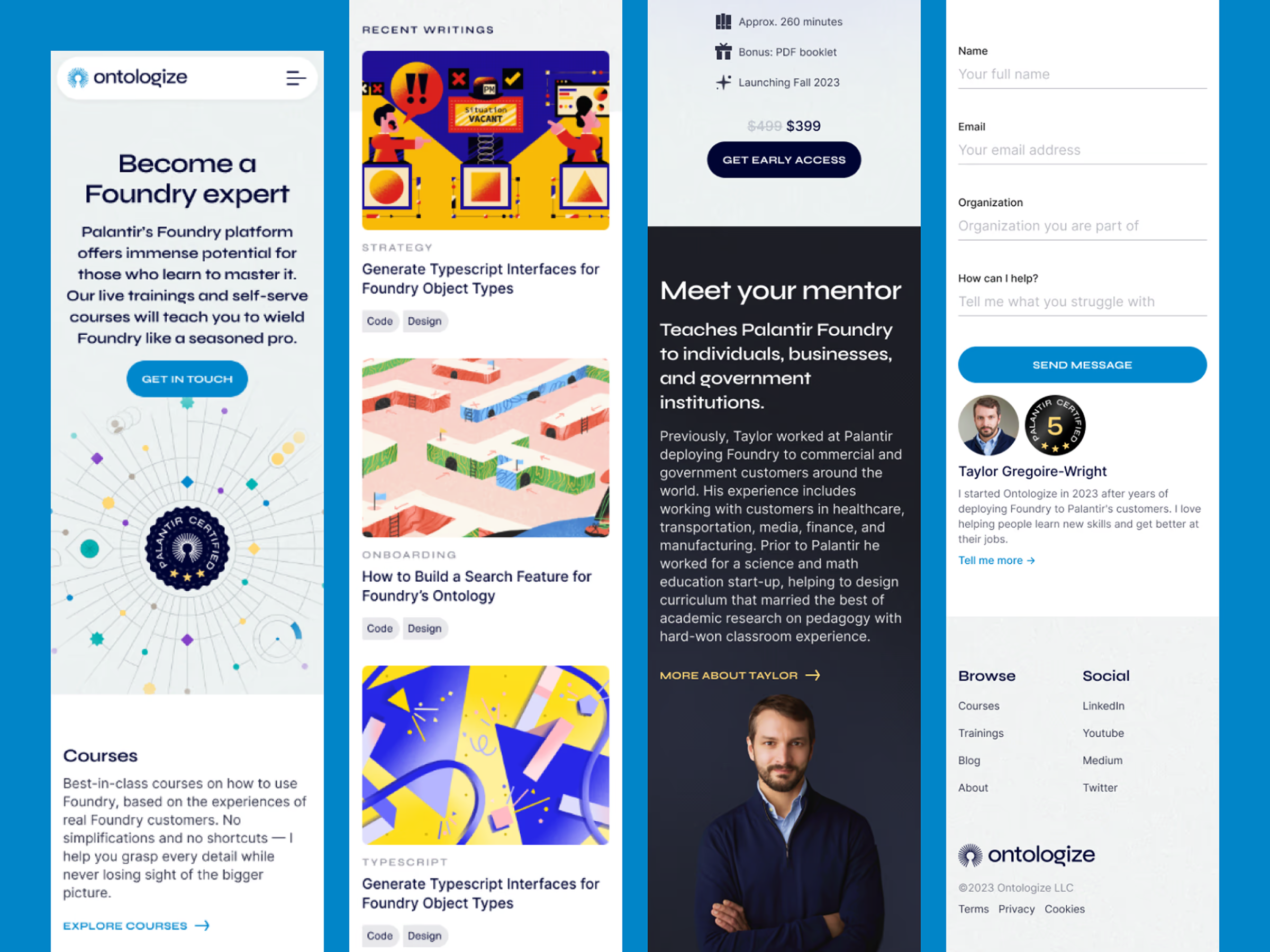
An online hub for training, courses, and articles
With Todor Dimov pushing Webflow’s capabilities, we built a flexible CMS architecture for courses, training modules, and long-form articles.
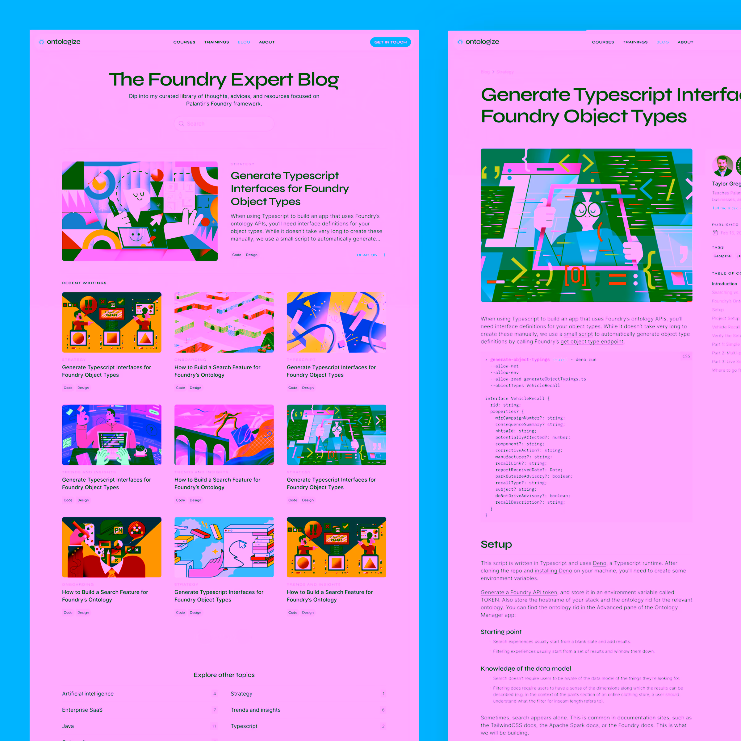
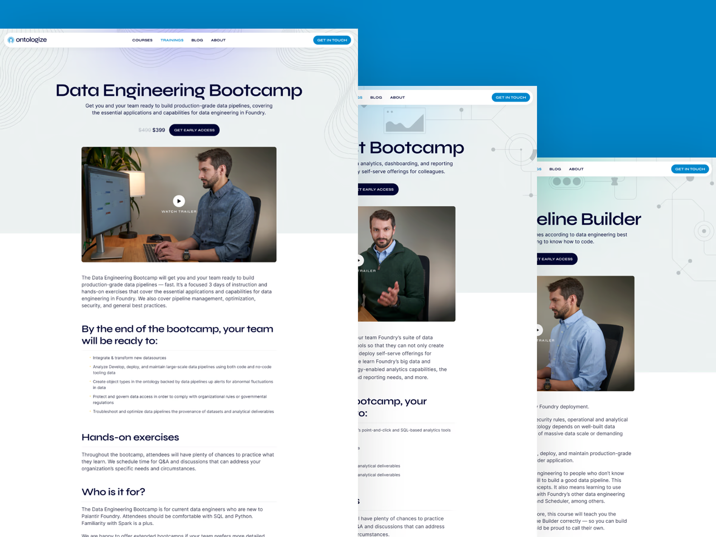
The structure prioritises SEO, readability, discoverability, and cross-linking — essential for an educational platform that needs to grow over time and remain easy to navigate.

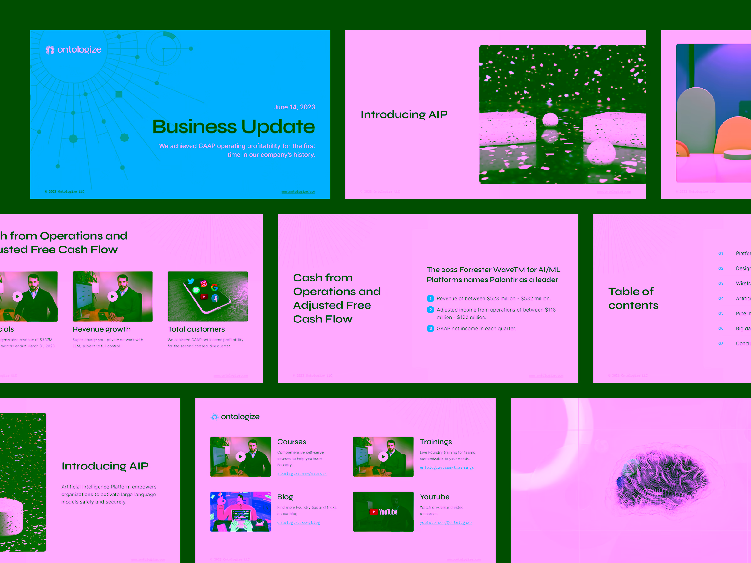
A template for presentation slides and user flows
Before wrapping up the project, I created a templating system for presentation slides, training decks, and user flow diagrams. These ensure Ontologize presents itself consistently across educational content, video materials, and marketing channels.
Outcomes
Ontologize launched with a distinctive identity, a scalable content hub, and a cohesive narrative, positioning the brand as a premium, trustworthy source in a niche where expertise truly matters.