← Back to case studies

Multiply

Reframing a data-heavy product into a clear & trustworthy brand

Identity
Visuals
Website
Laptop screen displaying Multiply website homepage with text 'Multiply your sales without hurting your margins' and product pricing and analytics interface overlays.
Industry
Cloud / SaaS
Client
Julien Demoor
Timeline
1.5 months
Launched
Aug 2022

Overview

Multiply had a strong business foundation but a weak digital presence. The company offered valuable, data-driven cloud services, yet its website failed to communicate that clearly. Julien, the founder, reached out with one goal in mind: make Multiply’s message as sophisticated and dependable as its product.

The challenge

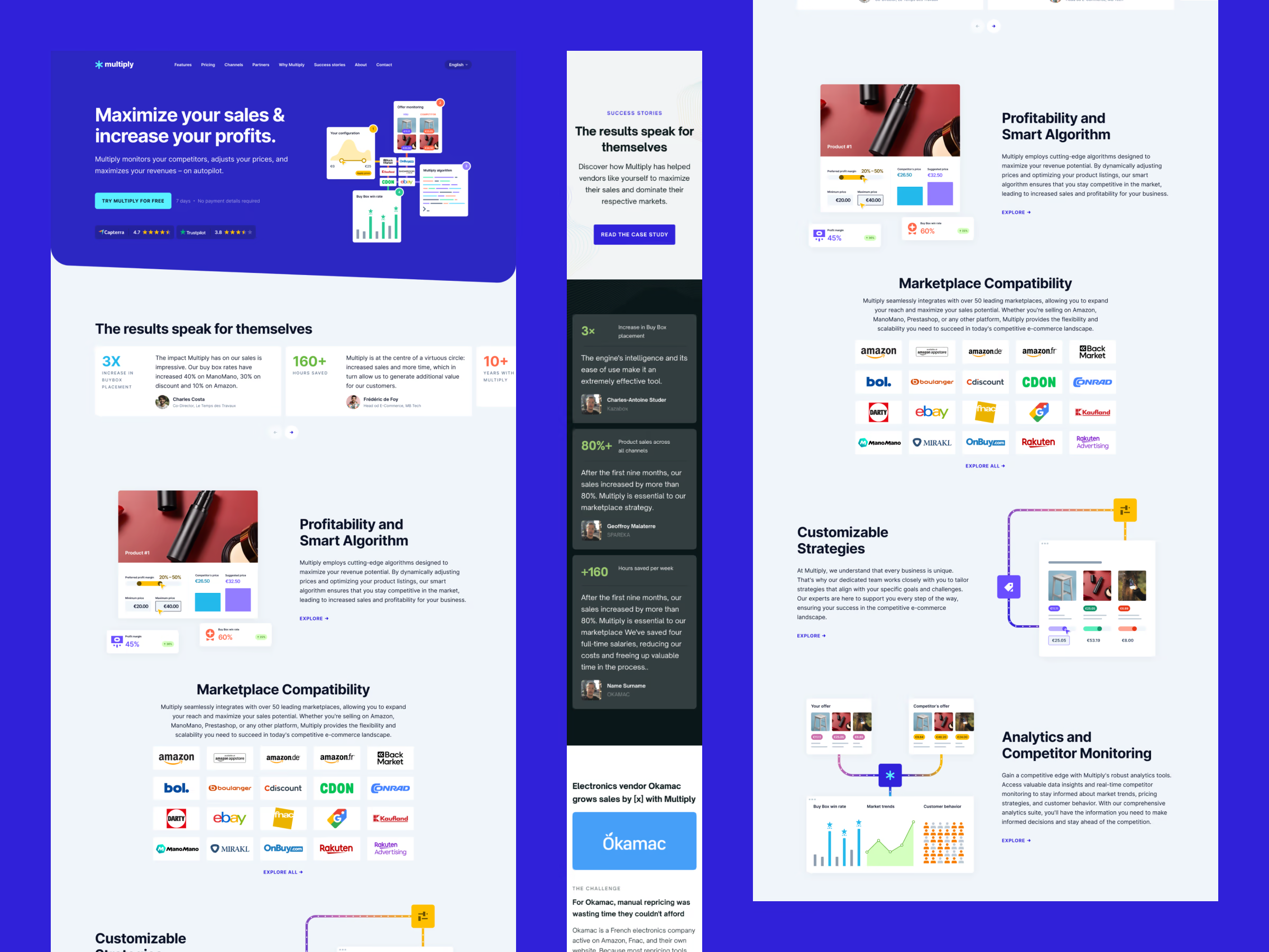
The existing website looked dated and dense. The structure didn’t guide users toward understanding the value proposition or taking action. In a space filled with technical jargon, we needed to translate complexity into clarity and trust.

Key objectives

  1. Redefine Multiply’s visual identity to reflect modern simplicity and credibility.
  2. Design a responsive website that converts visitors into leads.
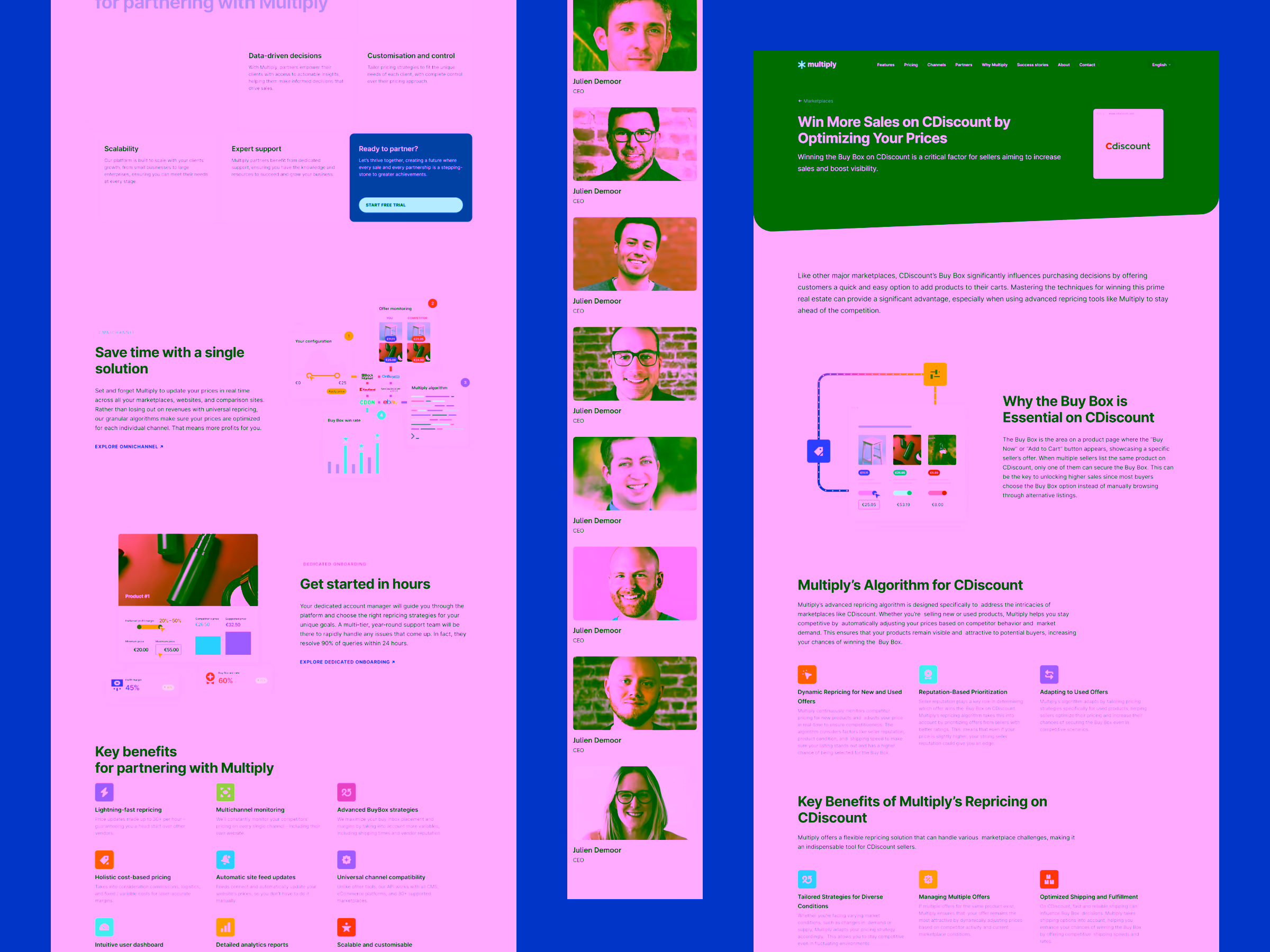
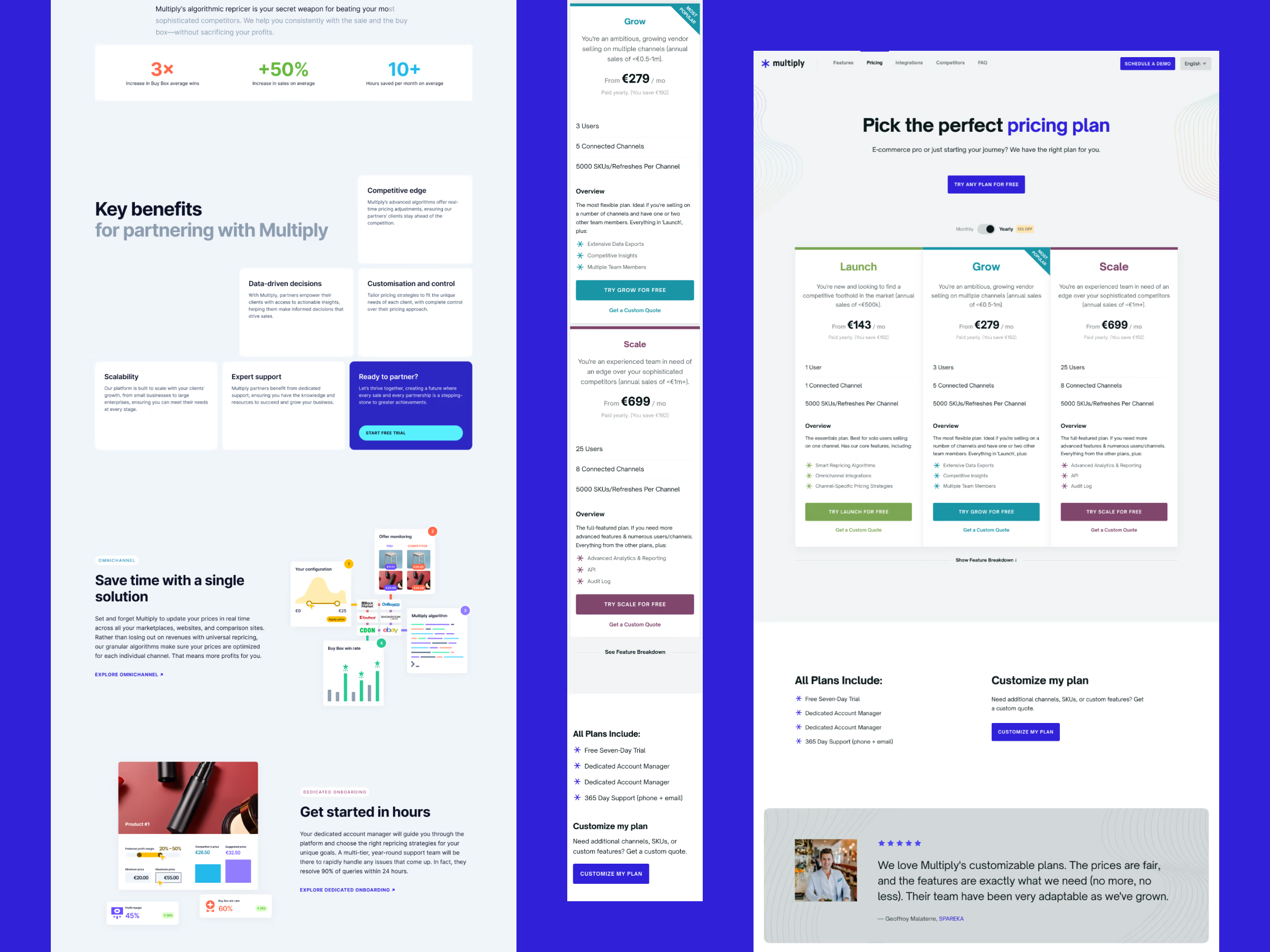
  3. Rebuild the complex pricing tables and onboarding for clarity across devices.
  4. Use visual storytelling to make abstract technical features intuitive.

My approach

Refreshing the identity

Multiply’s logo had potential, but it needed refinement. Instead of reinventing it, I modernized the existing mark, improving proportions and type harmony while aligning it with the new, minimal visual system. The updated logo now felt as clean and confident as the redesigned website.

Multiply logo with a blue asterisk symbol and white text on a blue background.

Designing for responsiveness and clarity

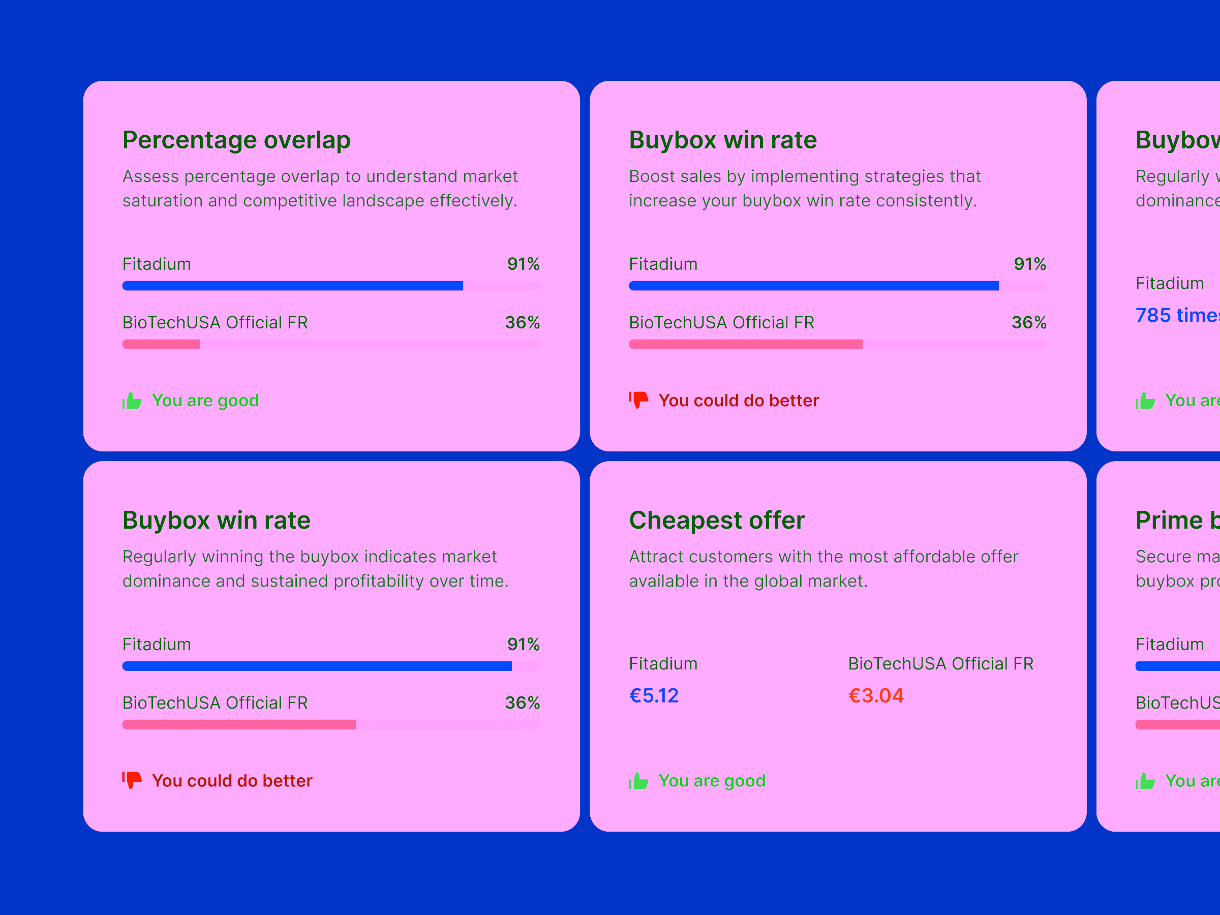
Data-driven content often breaks the usual responsive rules. The pricing table was the biggest challenge: on desktop, it needed to display all plans at once; on mobile, that same layout would become unreadable.

The solution was to rethink the structure per viewport, not just resize it. Desktop users got a clear side-by-side comparison, while mobile users saw a simplified “definition list” format, preserving hierarchy and readability without horizontal scrolling.

Multiply software webpage showing features like sales maximization, smart algorithms, marketplace compatibility, customizable strategies, and analytics with client logos and charts.
Two-page business document showing benefits and case study of Multiply's repricing solution with testimonial photos of Julien Demoor and graphics illustrating features and algorithms for CDiscount sales optimization.
Multiply pricing plans webpage showing three plans: Launch, Grow, and Scale with features, pricing, and user benefits.

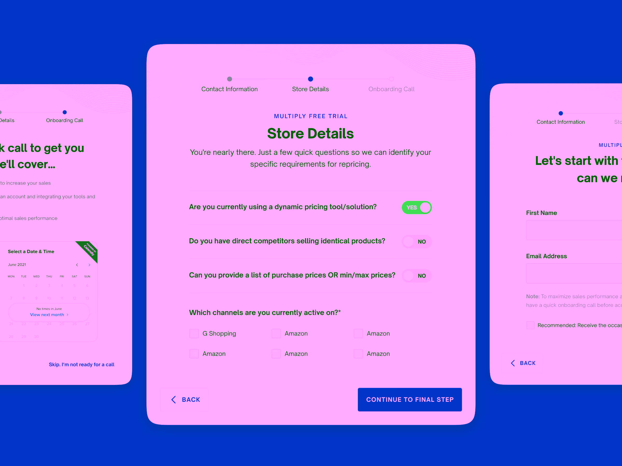
Simplifying onboarding with a stepped flow

Multiply’s onboarding process required guidance without overwhelming users. I designed a three-step process inside a modal window, accessible from anywhere on the site. This separated it from the navigation hierarchy and allowed new users to start or resume their journey seamlessly.

Online form titled Store Details with questions about dynamic pricing tool, competitors, and purchase prices, featuring checkboxes for active sales channels and navigation buttons.

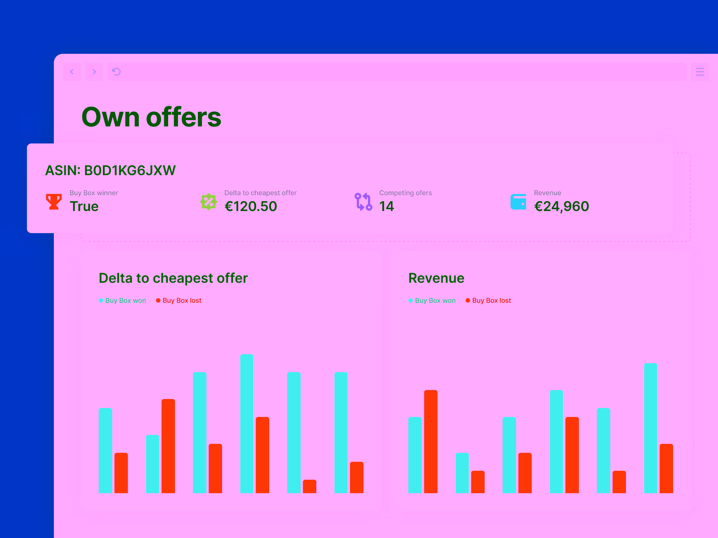
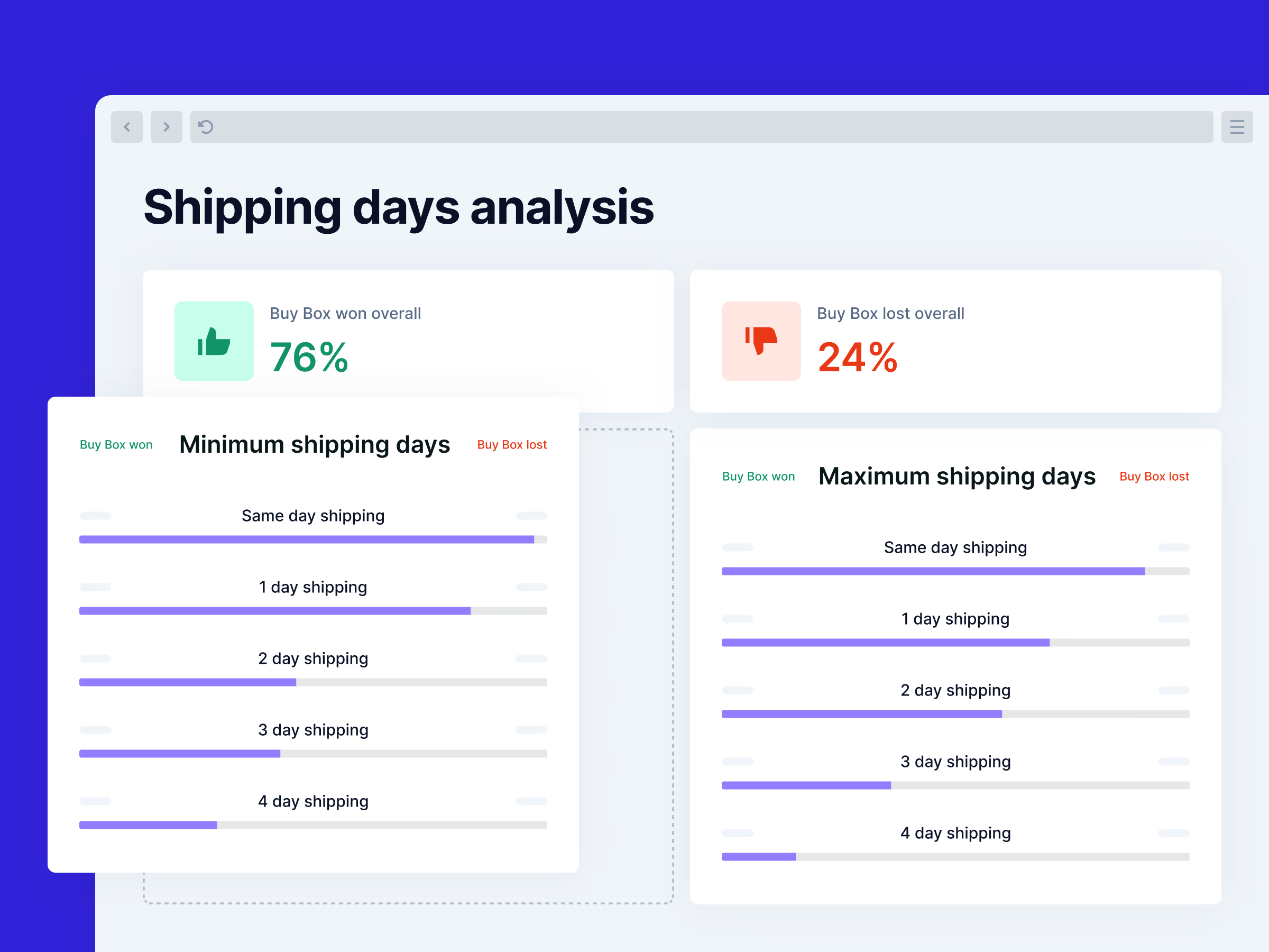
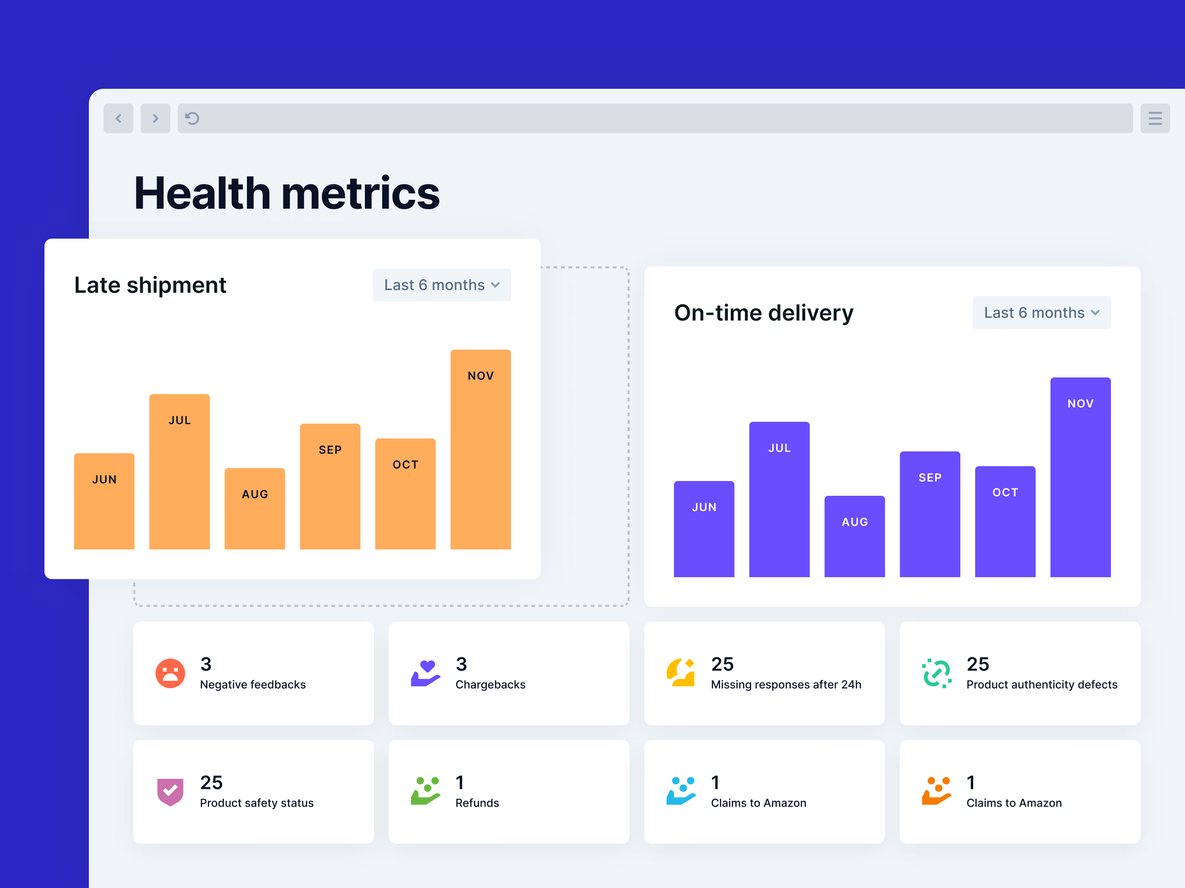
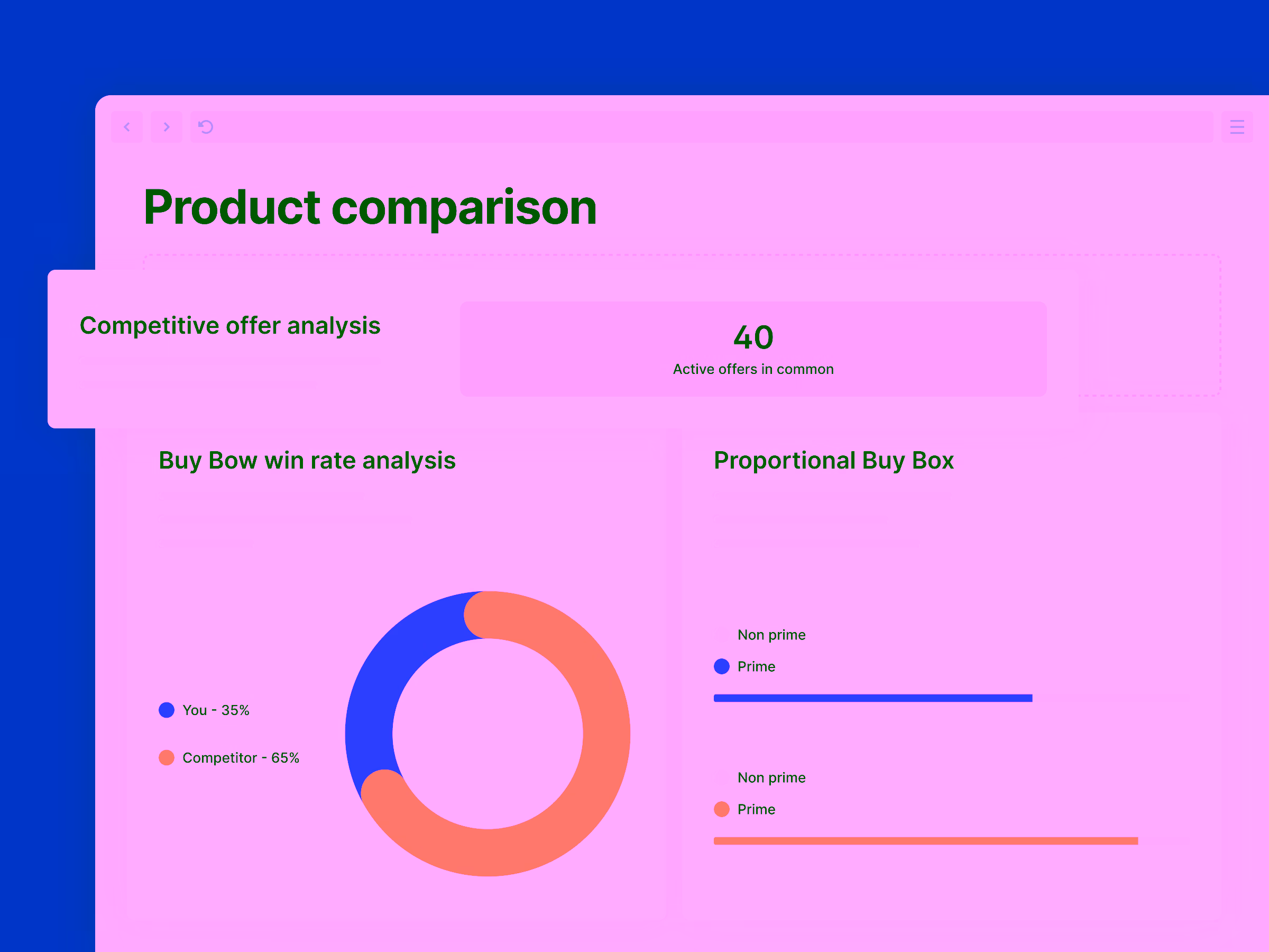
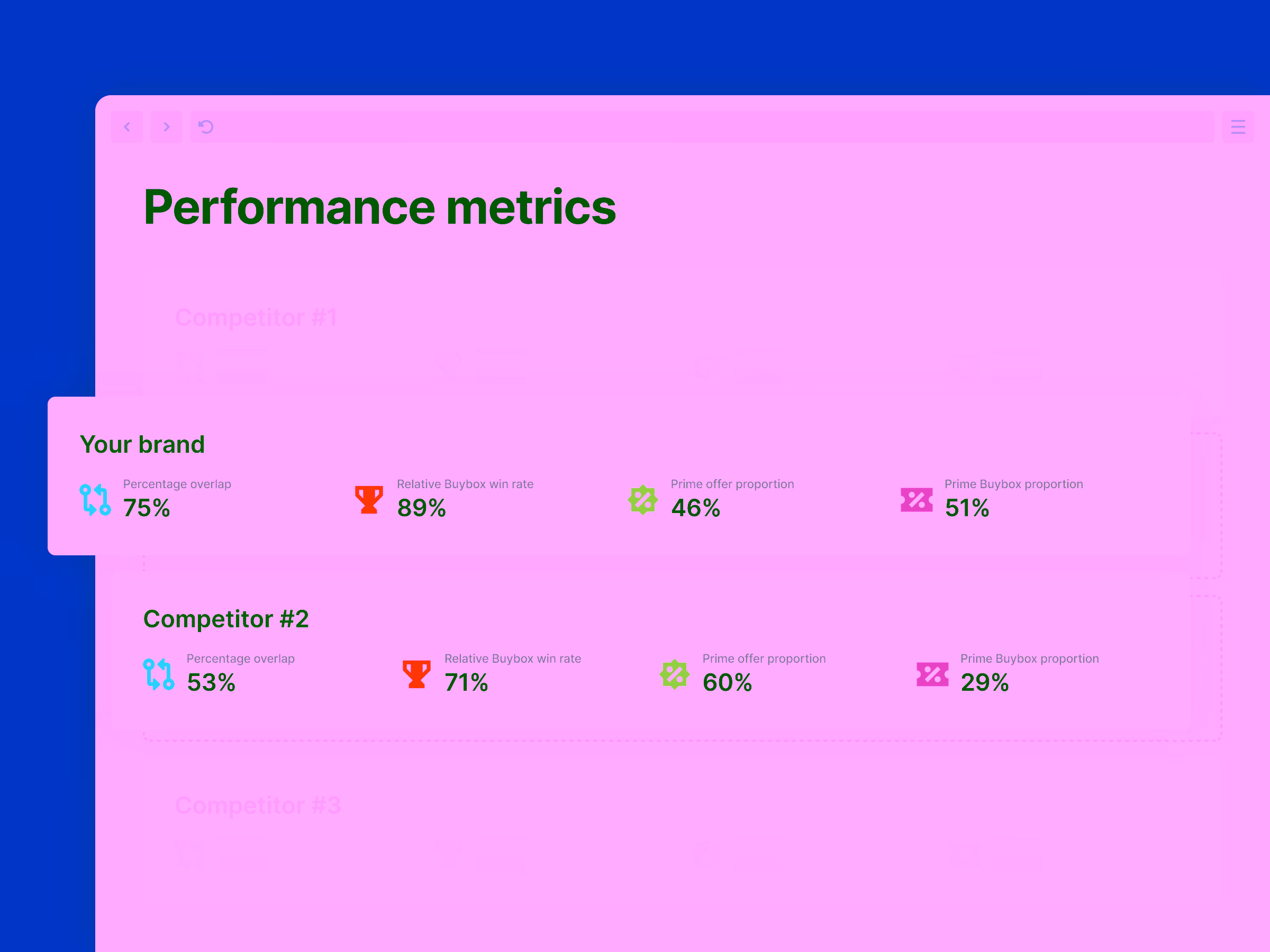
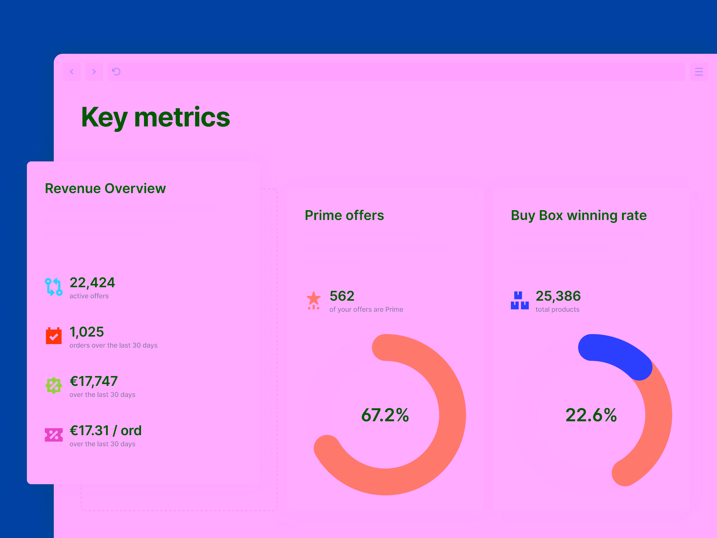
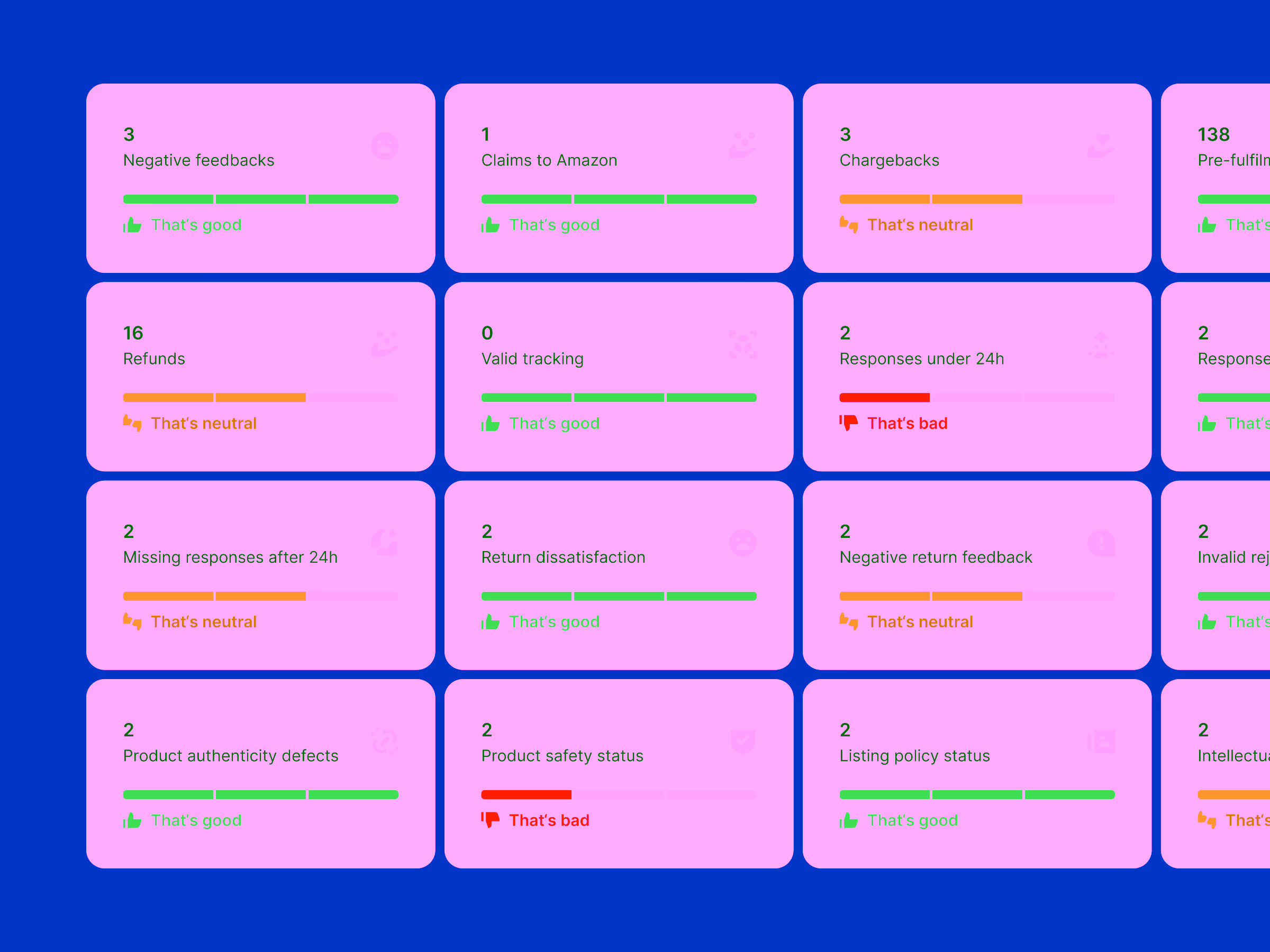
Visuals to explain the invisible

Multiply’s product features were powerful, but too abstract to be easilly understood. To communicate their value, I designed a series of technical illustrations that made invisible data processes visible and understandable. These visuals offered an “aha” moment that text alone couldn’t provide, bridging the cognitive gap between what Multiply does and what customers need to know.

Dashboard showing ASIN B0D1KG6JXW with Buy Box winner status true, delta to cheapest offer €120.50, 14 competing offers, and revenue €24,960, plus bar charts of delta to cheapest offer and revenue comparing Buy Box won and lost.
Dashboard showing shipping days analysis with Buy Box won 76% and lost 24%, comparing minimum and maximum shipping days across same day to 4 day shipping.
Dashboard showing health metrics with bar charts for late shipment and on-time delivery over six months, and status cards for feedback, chargebacks, missing responses, product defects, safety status, refunds, and claims to Amazon.
Product comparison dashboard showing competitive offer analysis with 40 active offers, buy box win rate donut chart with 35% you and 65% competitor, and proportional buy box bar graphs for non prime and prime sellers.
Performance metrics comparison showing Your brand with 75% overlap, 89% Buybox win rate, 46% prime offer, 51% prime Buybox; Competitor #2 with 53% overlap, 71% Buybox win rate, 60% prime offer, 29% prime Buybox.
Dashboard showing key metrics: Revenue Overview with 22,424 active offers, 1,025 orders last 30 days, €17,747 revenue last 30 days, €17.31 per order; Prime offers at 67.2%; Buy Box winning rate at 22.6%.
Dashboard with comparison cards showing market metrics for Fitadium and BioTechUSA Official FR: Percentage overlap and Buybox win rate with bars and scores; Cheapest offer prices with color-coded euro values; feedback icons indicating performance quality.
Dashboard showing various metrics with numerical values, status bars, and performance indicators labeled as good, neutral, or bad.
Dashboard showing revenue overview with 22,422 active offers, 984 orders in the last 30 days, and revenue of 17,451.12 euros. Prime offer section shows 56% prime offers, with 4 offers being Prime.

Outcomes

Within days of launching the new site, customers reported a clearer understanding of Multiply’s services and smoother navigation through pricing and onboarding. The brand perception shifted from technical and dated to professional and trustworthy—a visual reflection of the quality Multiply had all along.

Julien‘s avatar thumbnail.Julien‘s avatar thumbnail.
Featured testimonial

During the design process, Zlatko shared ideas and sought feedback often, which helped ensure that the design and illustrations fully matched our intended message. He spent the time needed to ensure that every detail was just right across the website, and he made himself available when needed during the implementation phase.

Julien Demoor
CEO・Multiply.cloud

Post launch success

Improved customer comprehension
Customers immediately expressed that Multiply’s offerings were easier to grasp and compare after the redesign.
35% higher lead quality
Post-launch feedback showed that new leads came better informed, saving the team time in calls and increasing overall sales conversion.