Overview
While designing SaaS products for BitComplete and their clients, I was also invited to help brand and design one of their internal experiments. BitComplete occasionally dedicates part of its team to creative side projects—small innovations meant to test trends, explore new technologies, and attract new clients through clever, unexpected ideas. CV Studio was one such experiment.
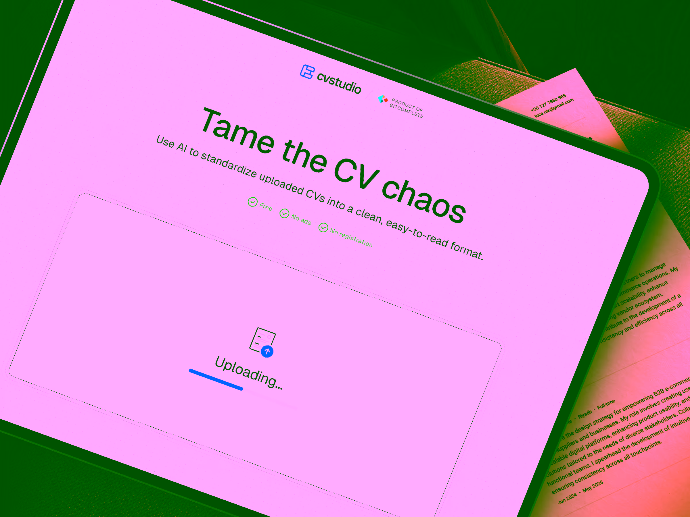
The premise was charmingly simple: upload your static PDF résumé and watch it transform into a fully responsive web experience. But simplicity is deceptive—especially in product design.
The challenge
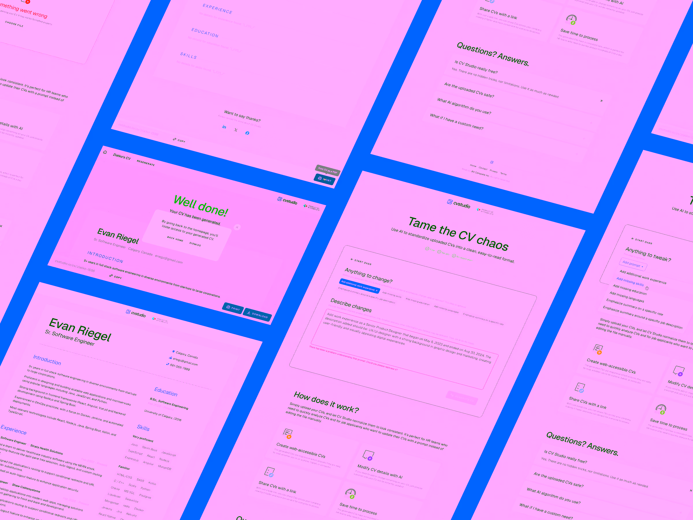
CV Studio looked straightforward from the outside. Three screens, a file uploader, a few loading states—done. Or so everyone thought.
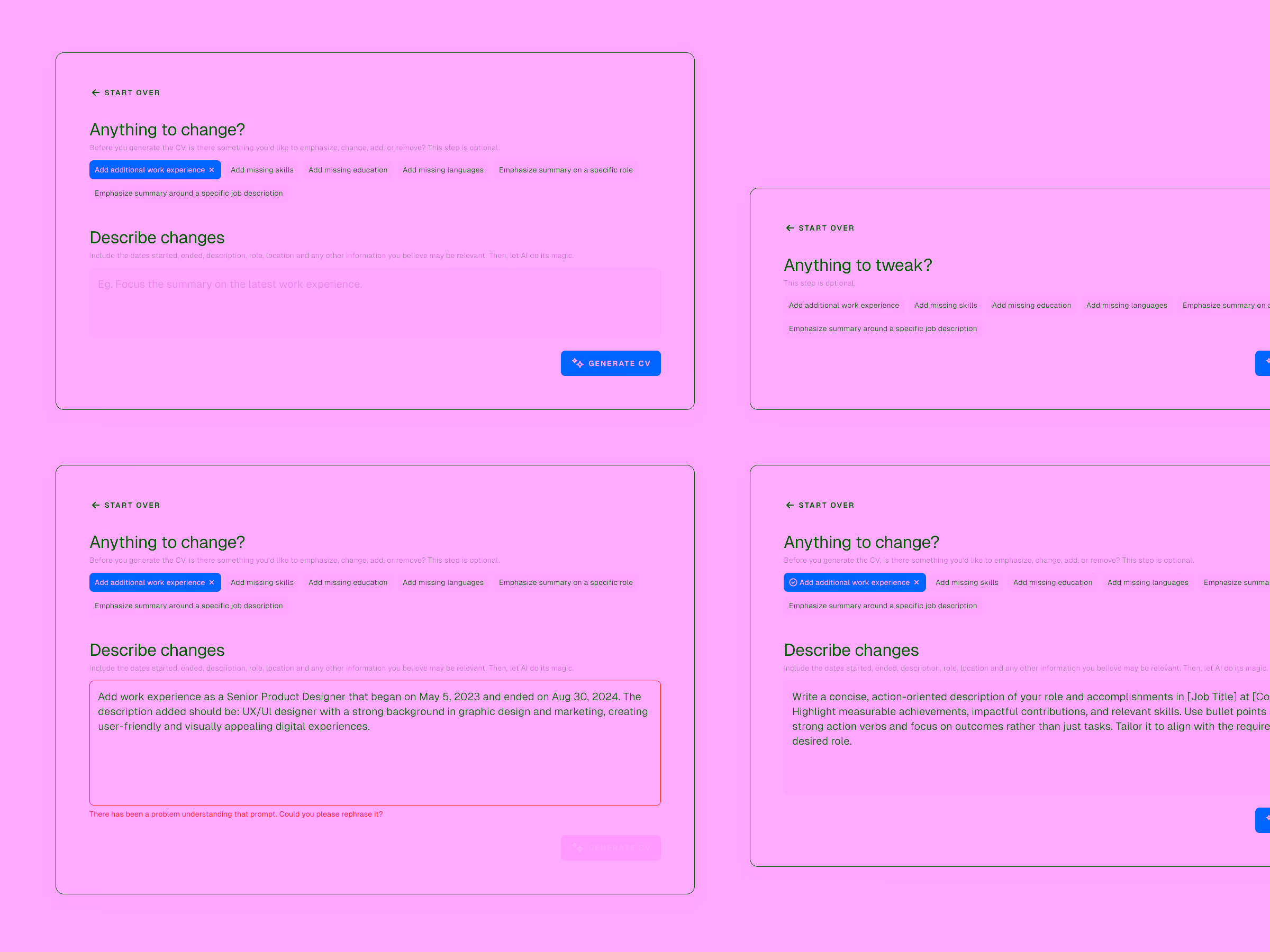
My experience told me otherwise. Anything that accepts user input—and then hands it off to an AI—will inevitably produce dozens of edge cases. Every scenario is a potential dead end if not thought through. And if you don’t discover those dead ends during design, customers will find them for you.
So before a single pixel was exported, I set a few objectives for myself.
Key objectives
- Identify every possible edge case during the design phase.
- Design solutions for each scenario to avoid dead ends in the user journey.
- Create a lean, memorable brand identity that elevates the product without distracting from its simplicity.
My approach
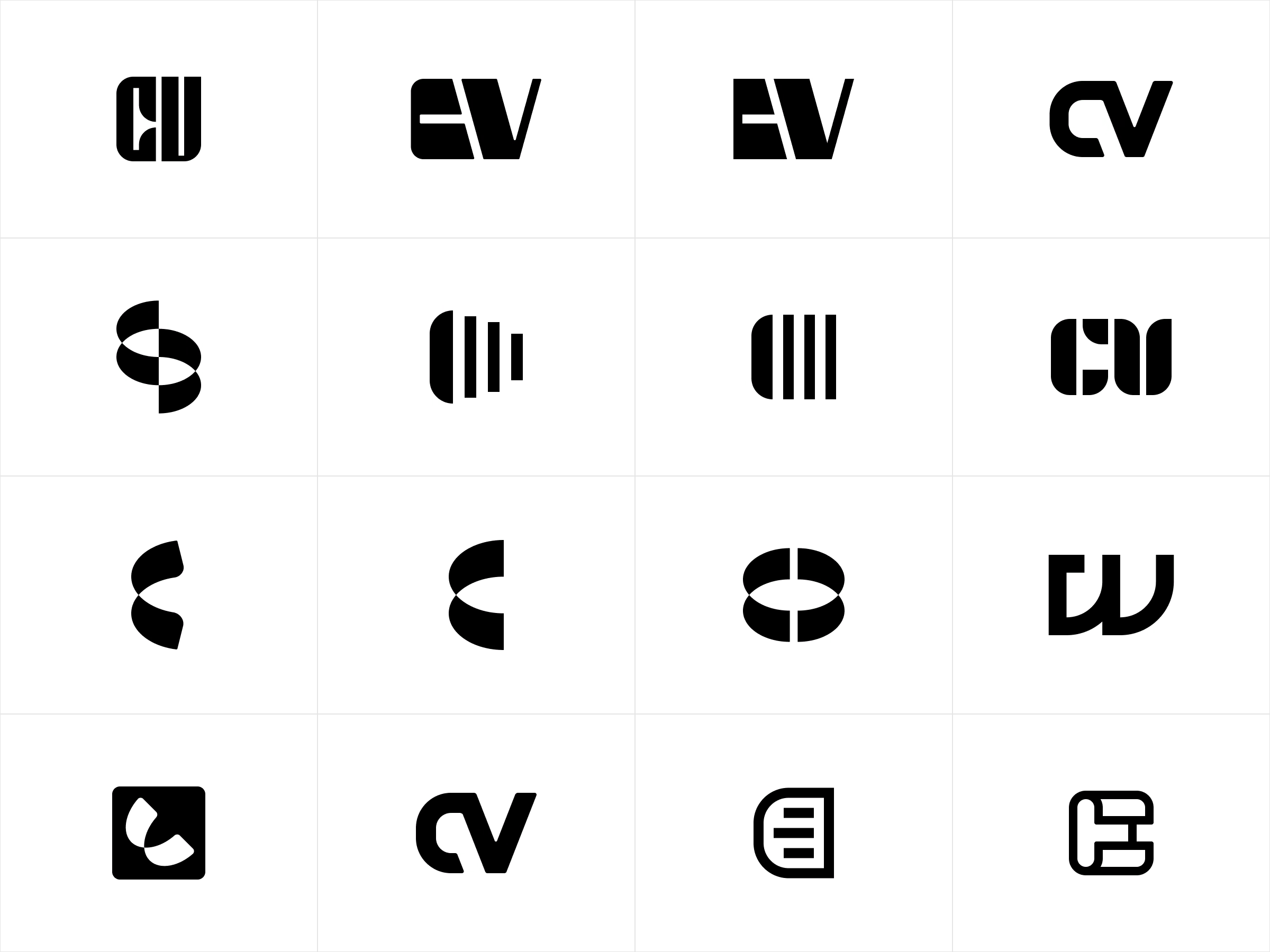
Starting with the logo
Branding wasn’t the core priority here, but even the simplest product deserves a face. I explored lightweight, memorable logomark options that could represent CV Studio without overcomplicating the visual identity.
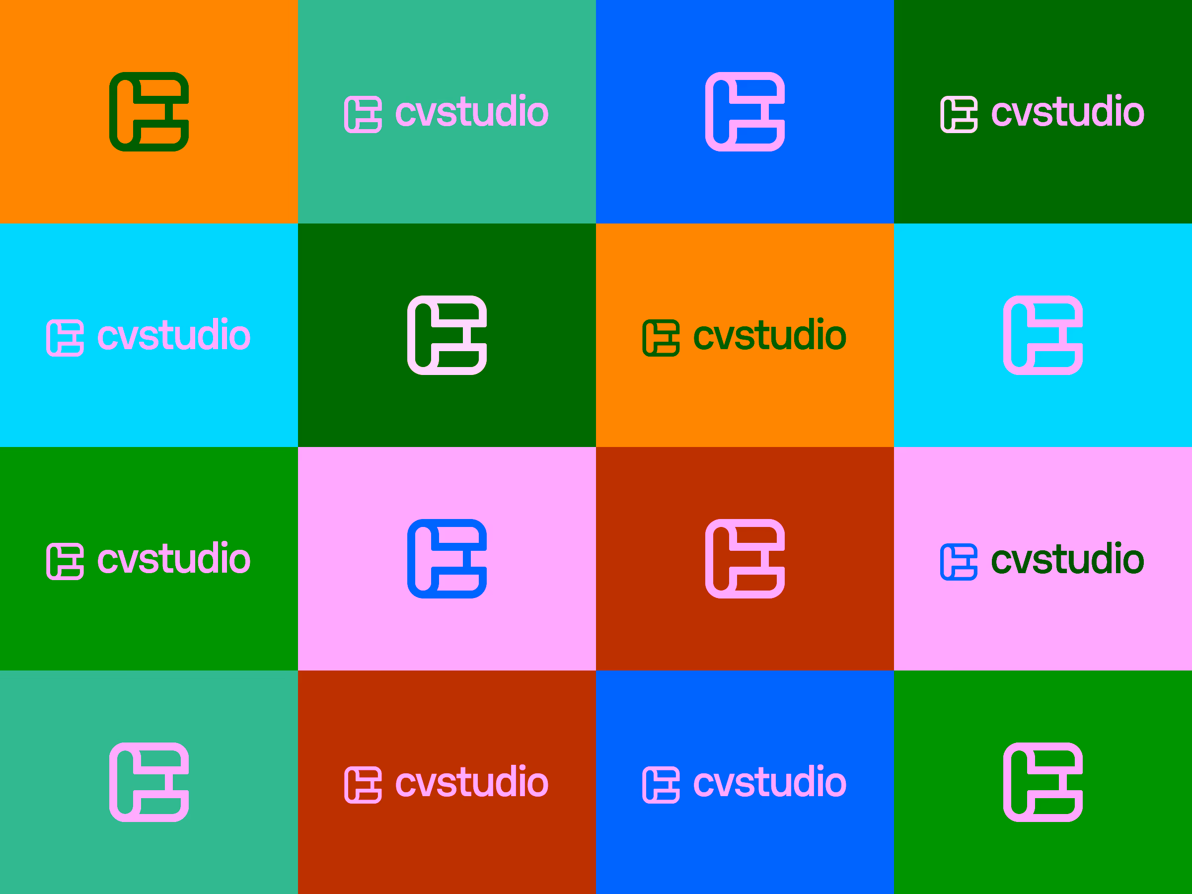
Finding a colour combo that works
We explored a dozen directions before settling on blue—the timeless, business-forward colour that feels familiar and trustworthy for something handling personal career data.
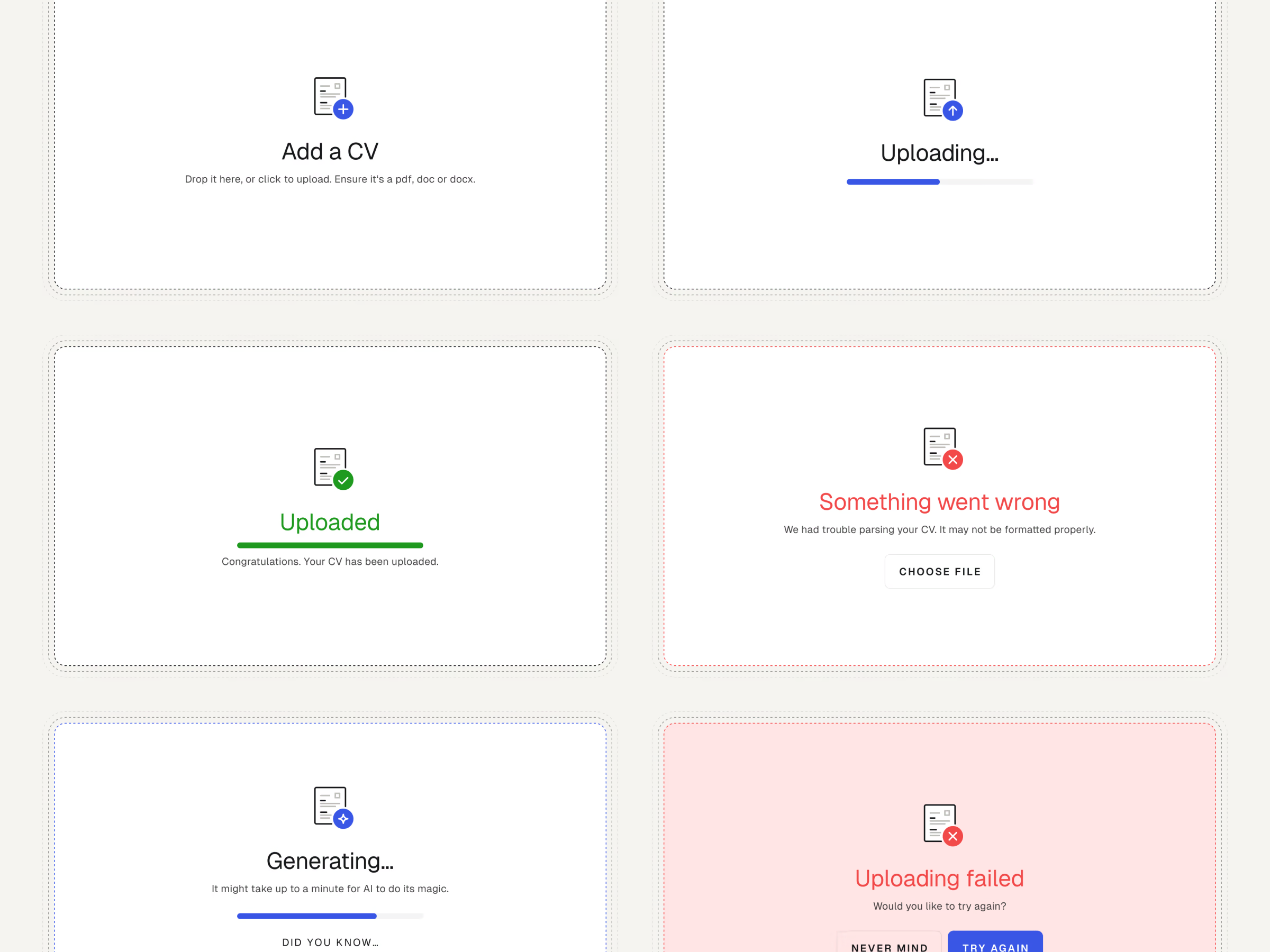
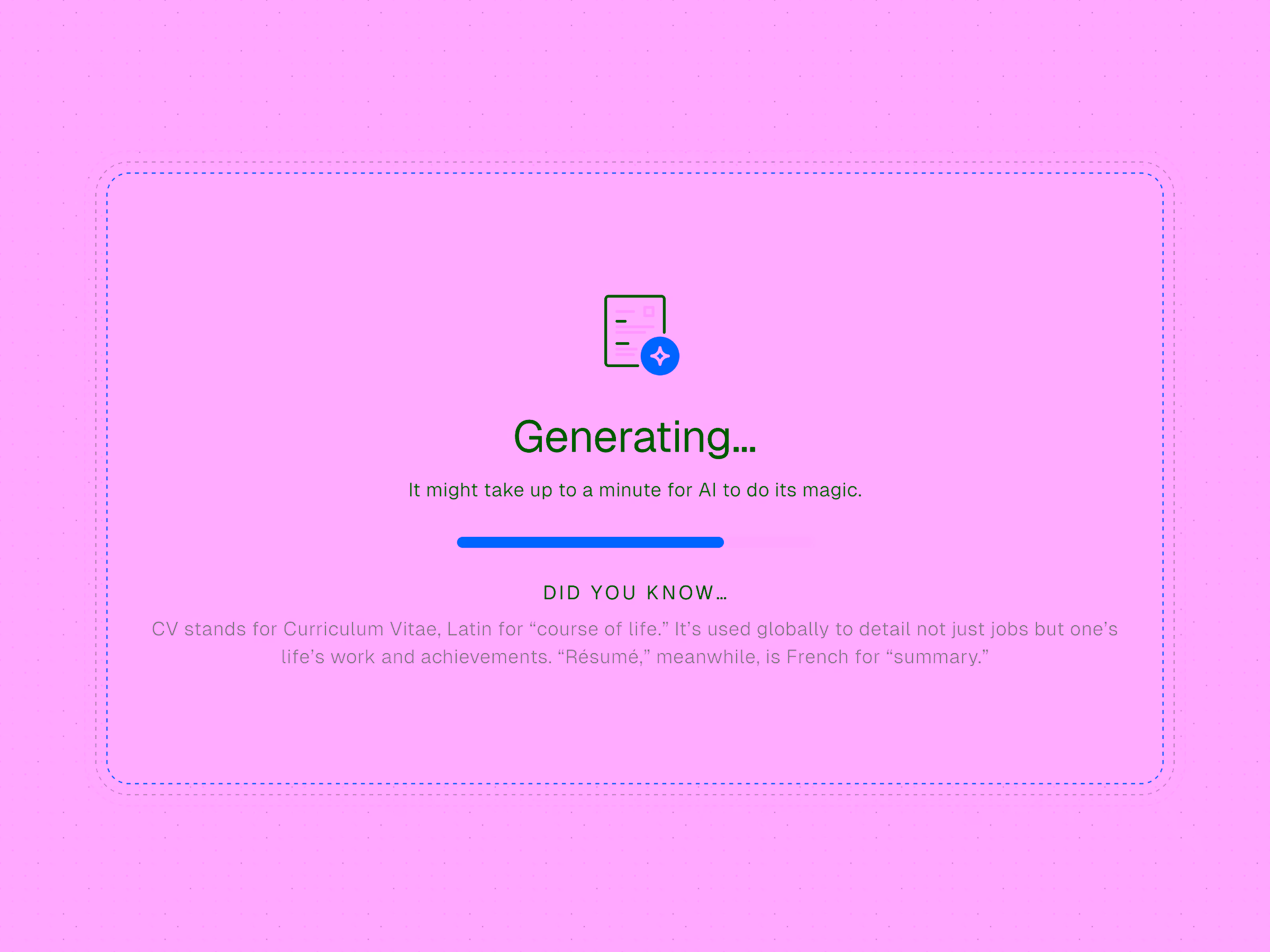
A web app with more scenarios than screens
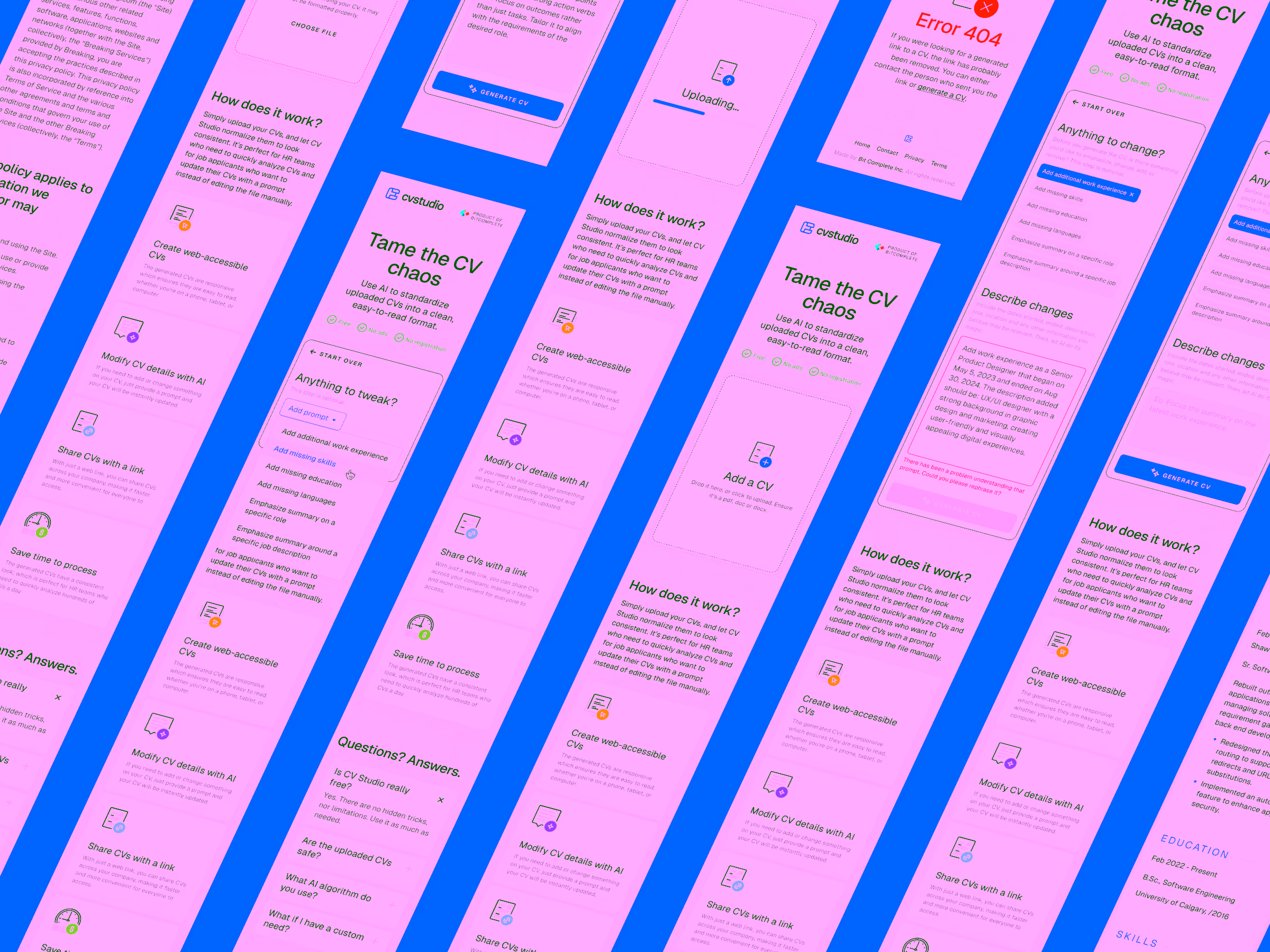
Though the product technically had just three primary screens, each carried its own cluster of possible states. Take the uploader alone: idle, uploading, parsing, generating, canceling, error handling, success—and variations within each. And that was before we considered what happens once the system interprets user input or an unpredictable AI prompt.
Sweating the little details
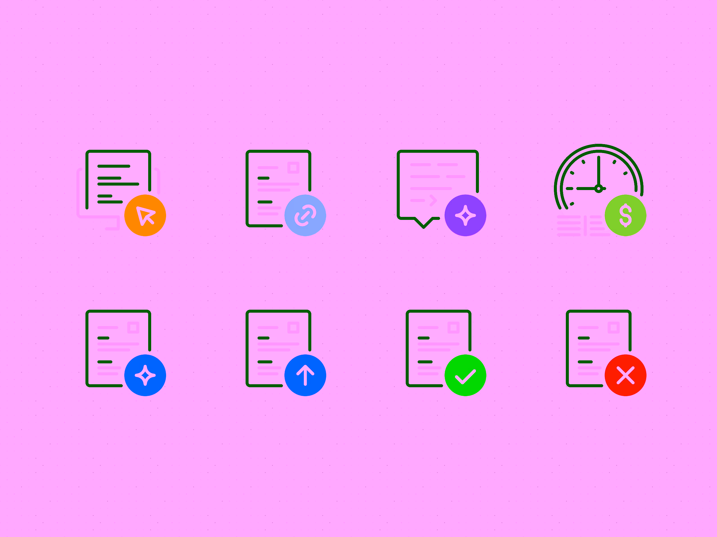
To make the experience feel cohesive—and occasionally delightful—I designed a series of custom icons and micro-moments. Some clarified system states; others added personality to an otherwise utilitarian flow. These subtle touches made the app feel more considered and less mechanical.
A fully responsive résumé experience
Even though most users would interact with CV Studio on desktop, I ensured mobile and narrow viewports weren’t overlooked. A responsive résumé experience should remain just that—responsive—no matter the device.