
Amidst all the chaos of life and the hustle and bustle of work, the symbol of a pond acts as a sacred place for organisations to find calm and make wise decisions. Founded on that premise, Pond Foundation has grown into a global mission-driven brand, guiding organisations to strong climate action.
But to ensure their brand messaging was delivered properly, Pond Foundation needed a brand new logo and a website redesign. So, Scott and Sam decided to go with me not only because of the quality of work I provide but also because we clicked on a deeper level—our seemingly naive but very much-needed drive for service to others.
Let the ripples begin
A pond creates ripples, just like good ideas create an impact. So my initial logo exploration was gravitating around that metaphor, alongside similar ones, like a lotus flower in the middle.

How about a responsive logo?
While the idea might be neat and innovative, I realised the riskiness of such a creative decision, as it poses a risk to brand memorability. No matter how visually appealing the logo looks, it‘s not the wisest approach to go.

The imperfect-perfect circle
What‘s the simplest way a pond can be represented visually? Do I hear a circle? That‘s right. One might say a circle is too simple of a shape for a logo, but when you put the circle in the proper context and pair it with a font that is the perfect match, it begins to whisper you a story.


Minimal, organic, with a dash of grunge
Taking the logo as a starting point, the website follows the same direction—minimal, accessible, and a bit rough around the edges to hint at the natural world just enough.
You won‘t find anything pitch black—nor pure white. Instead, the main layout tone is a very light and pale beige that pairs so well with the specific type of blue I picked for the brand colour.


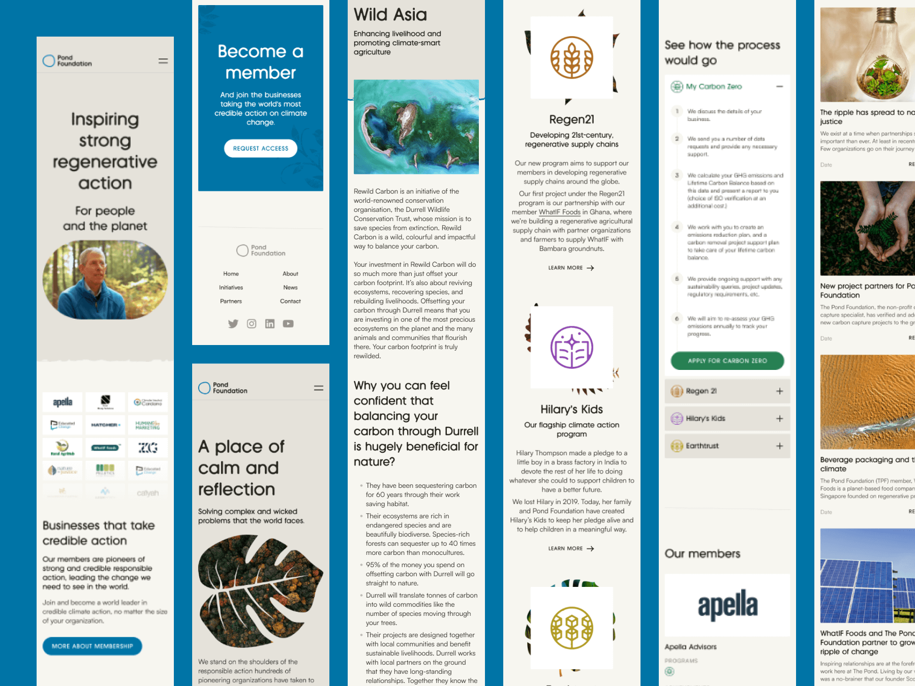
A website is nothing without the little visuals
That‘s why I paid particular attention to the iconography used on the website. The spot icons are taken and adapted from my 2017 bestseller icon library.

Themed icons
For the Pond Foundation, the Initiatives offered to organizations are essential to their marketing efforts. So, I designed a sort of logo for each and dedicated a specific colour for each. Now, the challenge for the future is that I won‘t run out of colours as the Pond Foundation launches new initiatives.


But a website is also more than the little visuals
There is much more to crafting a successful website than the visual and technical side of things. Following my website checklist, I paid meticulous attention to the alternative text for images and used proper colour contrast for accessibility, using SEO tags and descriptions for each screen, and the list goes on.
But we needed to launch. And I‘m happy to share that Sam decided to adapt my suggestion of moving away from the old domain at thepondfoundation.org, adapting a succinct and memorable domain name—pond.foundation.

Zlatko developed a new website and logo that really captures the essence of our work, and was exactly what we needed as a growing organization. He was a pleasure to work with, and more than exceeded our expectations!